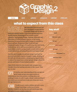
Hello and thank you for being part of J465 this semester. Together, we will undertake a series of projects and assignments that are meant to build your abilities as designers and increase your expertise in the core Adobe programs that are the tools of the trade. You will be designing logos, illustrations, layouts and animations that will showcase your creative vision and your unique personal style.
You will use this site throughout the semester to post your work, as well as descriptions of your creative process and analyses of the finished products. As authors, you may post additional thoughts and reactions any time you see fit. As part of the class, you will also be designing and maintaining your own J465 website, showcasing your project and exercise work. To read the full syllabus for J465, please visit our syllabus site at www.stevelayton.net/j465/s24.
Good luck — and once again, thanks for being here.
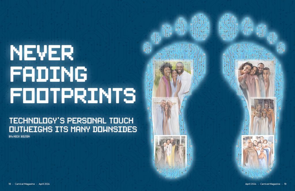
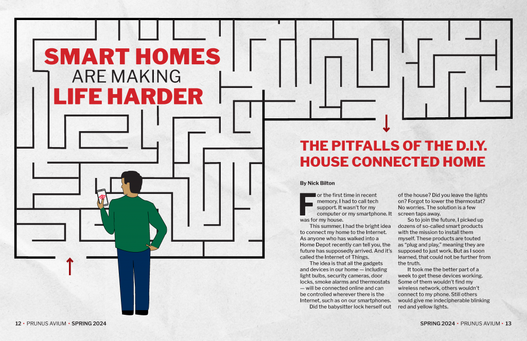
To start my creative process, I first picked the story that I could resonate with the most which was the personal one after reading it. In the article, the idea of a digital footprint was mentioned so I knew that I wanted my conceptual drawing to have something to do with a digital footprint. To make the print look digital, I used a circuit board type texture inside of the feet as well as made them pixelated. I also gave them an outer glow like a phone screen has. I finally chose the color blue to represent the “blue light” that comes off of our phone screens. Lastly, inside the feet are family photos that are melting away but, they persist on inside of the digital footprint. This goes with the theme of the story: being able to remember moments of people from their social media even after they are gone. I did most of the feet in Photoshop except for the texture and actual drawing of the feet which were done in Illustrator.
The font is also pixelated on the opening spread to match the pixelated feet. I also gave the text here an outer glow like the feet have. In the background I also used the same circuit board texture from the feet to give a little more depth to the spread and not just have it be a solid color.
The headline itself came from the fact that as it was told to me, people may not pick up immediately the digital footprint idea so I had to put it in the headline. “Never fading footprints” was chosen because people always tell us to be careful what we put online because it stays there forever hence, “never fading.”
Even though the article was more about the personal touch of social media, I chose to lean more into the digitalization of memories for my theme as can be seen in the opening spread. I continue this idea by making a very organized and almos computer like layout for the article. It is a three column page but, text only takes up two of the columns where a more literal image of social media takes up the two innermost columns and has the “screen glow” like the feet from the opening spread. I also use the same texture that is on the opening spread as well as inside the feet as a background for the page but I lowered the opacity so it wasn’t as hard to read the article. Coming from the central image, I made the same circuit like lines that are in the texture but I connected them to the words on the article to keep up with the digitalization theme. After the article was over, I put the social media by the numbers side bar to take up the remaining space. There was still a little bit of awkward white space after this so I put the feet from the opening spread along the bottom to fill it and make the design even more cohesive with the opening spread.
To finish off the design, I had it looked over and, at first, I had the headline in the middle of the page but, it was pointed out to me that people would not be able to read this in a real magazine so I moved it to the left and have what we see here now.
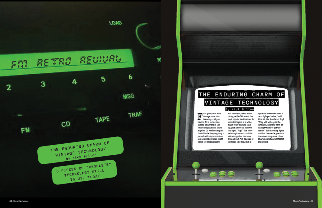
I have always enjoyed doing magazine projects. Although, I struggle in the beginning, I tend to find my stride and come up with some of my favorite designs. For this design, I wanted to make sure I stuck to a theme for the entirety of the spreads. I chose my theme to coincide with my story and everything is a reference to vintage technology. I originally had the main spread covering the entire front two pages, but I did not like the idea of someone opening a magazine and seeing 2 full pages as if they were a title page.
With this idea, I decided to reduce my title page to the left and to have a teaser story on the right. I was attempting to find ideas on how to format the idea on the right and so I decided to encase the story in an arcade machine. For the rest of my story I went with more of a minimal design with some artistic elements in difference spaces. I did not want to overload my 4 pages with a bunch of visual elements. I figured this would take away from the story itself so that is where I came up with the plain text element.
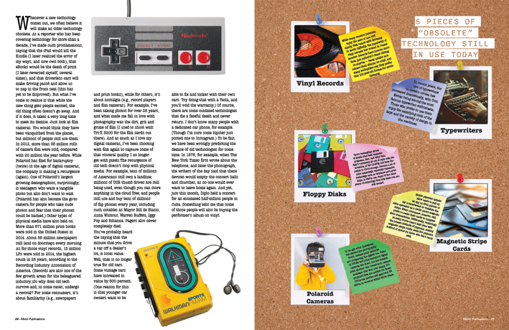
For the alternative story form / sidebar I decided to format the small story into the visual element itself. I wanted to take the “5 pieces of “obsolete” technology” and place them onto polaroids in some form or another. I ended up taking the design and covering it over an entire page because I did not want to compress the text further to where it was almost unreadable if I had it as just a sidebar. This creates a sidebar effect but in a proportion that is still legible to the reader.
This project was fun because I created/altered every graphic composition except for the NES and Walkman. It was fun to take elements of nostalgic tech and implement them into a story format. I think my title page could be done better to be more cohesive to the page next to it, but the deadline approached faster than I expected.
I really enjoyed this project; it felt very simple and took me back to basic graphic design skills that we had learned in J365. What I particularly enjoyed was the creative freedom we had with the conceptual design. I could have chosen to include actual pictures in Photoshop and change the pictures, or choose a classic “drawn” graphic. I had a lot of fun playing around in Illustrator to come up with my two visual elements that tied in to the story and gave the story another dimension. It was tedious to design because, although it is very simple-looking, there were a lot of different details that went into each graphic. The other detail that I had trouble with and had to play around with for a bit was the fact that the journalist story was really short and there was not much text to fill in white space. For this detail, I tried to play around with a minimalistic design, and then it also gave me another opportunity for a second graphic on my second spread. Looking through magazine examples before starting my project, I saw all these minimalistic, very simple designs and wanted to model mine off of that, partly because I liked the design but also because I figured it could speed up the design process if I was not putting too much on my pages. This is very deceiving. For me, holding true to this type of design style proved harder than it looked. I think because I was trying to put less on my pages, this may have been harder than a busy design because you have to make sure each of your elements is cohesive and working together, and everything has to be placed, particularly because if one detail is off, it will be very noticeable. Rather, if I were to model a more busy design, detail could get lost, and there is not as much pressure to make everything look exact. Overall, I enjoyed the process of designing this project and am proud of the end result. It challenged me to think more critically about design elements and how they interact with each other, and I learned a lot about balance and cohesion in design.
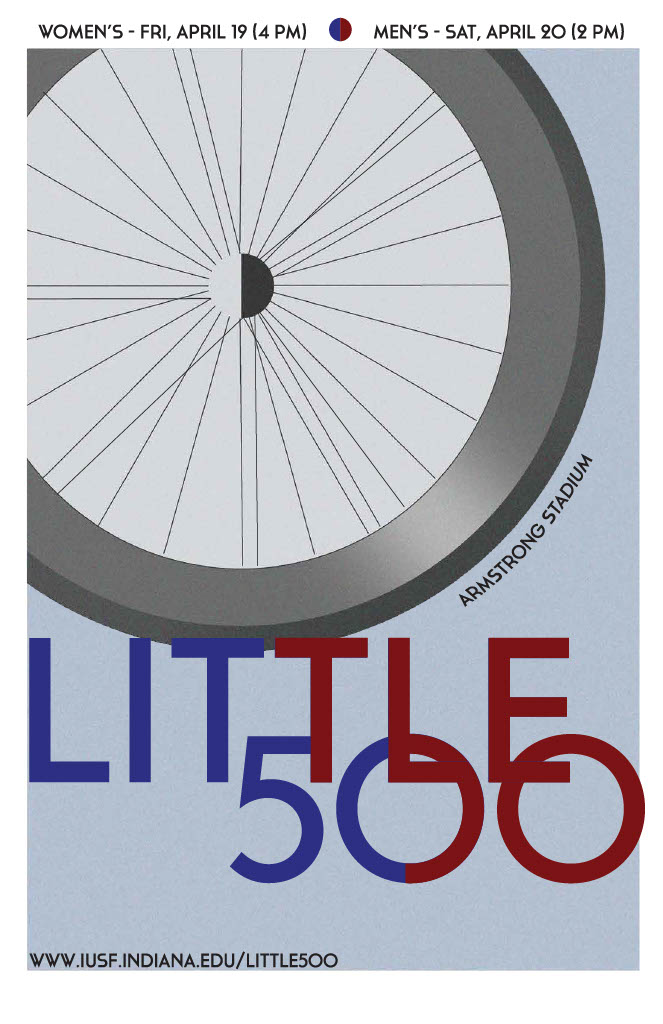
For the Influence poster I was influenced by art deco designer A.M. Cassandre. He is known for his shading, bold typography, geometric forms, and striking imagery to create visually dynamic compositions that captured the attention of viewers. Some of his most famous works include posters for companies such as Dubonnet, L’Atlantique, Yves Saint Laurent and the Compagnie Internationale des Wagons-Lits. Cassandre’s designs not only promoted products but also elevated advertising to the level of fine art. His contributions to graphic design and poster art have had a lasting influence on the field, and his work continues to be celebrated and studied by designers and art enthusiasts around the world.
I wanted to use a wheel to implement the Little 500 design into my poster. Cassandre has a poster with a record, and I thought that after seeing his design and the poster that it was perfect. The hardest thing for me to add to the poster was the shading. I really wanted to make the shading to look good but not to blocky. So deciding the proper coloring was rather difficult. I also had trouble not having the texture go over everything. I did not want to the font to have a texture.
One thing that I am very proud of is the geometic font, I think that I did a really good job of executing the font. I found a font that it looks like he could have used without copying the fonts he created. And I added the colors red and blue, due to the fact that it looked like colors that he would have used.
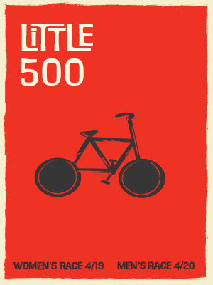
For this project, I had difficulty finding an influence. I don’t have a favorite designer or know of any. I looked up graphic designers and came across Saul Bass. I had heard of that name and when I looked at his work, I recognized a lot of it. He designed one of my favorite movie posters, West Side Story. I really like how simple yet effective his work is and how it has some darkness to it. When finding an influence, I also wanted to find an influence that would match my level of design. I didn’t want to do one that was very intricate, so I thought Saul Bass would be a good influence.
When starting I had no idea what I wanted to do, I looked at all of Bass’ work to try and get some inspiration. I came across the posters for “Anatomy of a Human Murder” and “The Human Factor” and took inspiration from them. I liked how simple they were with just one image and the words not center. I wanted to draw a simple bike that didn’t have much detail, almost like it was cut out of paper. I chose red because most of Saul’s work uses red in the background and black and white for the pictures. The type I used was FilmotypeMaxwell, this was the most Saul Bass font I could find on Adobe. I would say most of his work is noticeable by the font he uses. I wanted to make sure I found the right font.
Overall, I think I did a good job capturing Saul Bass’s influence. I think there is still room to improve, but I do think my graphic design skills are improving. I did enjoy the final product, and I will say it was a challenge to not take one of his posters and just use that one and make it Little 500. I enjoyed this project, I thought it was fun to look at famous designers and make a poster of our own with their influence.
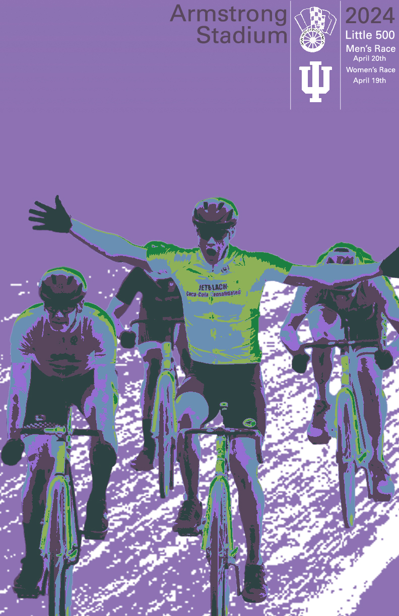
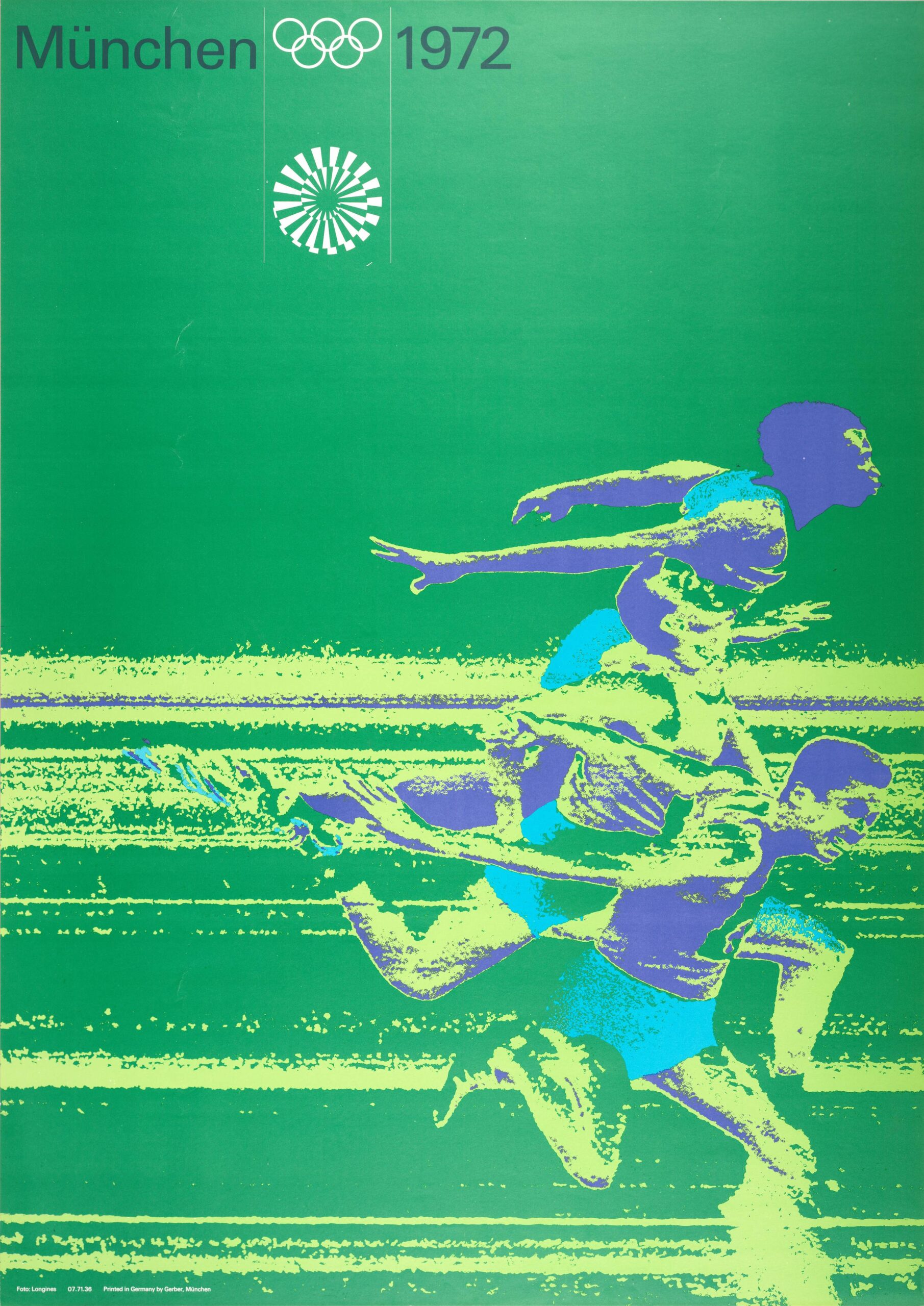
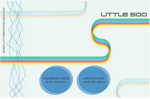
For this poster, I struggled with finding a designer. I was attempting to discover artists that I knew I would be able to take influence from as well as be within my skill as a designer. As my graphic design career was blooming, I had watched a design video about thresholds and working with layering them. I had worked on a personal project a few months prior where I worked on thresholds. As I was deciding who to design, I found Otl Aichers 1972 Olympic designs. This solidified my influence of choice due to the fact that I knew I would be able to take influence and create a design in my own style that was similar to his work. At the time I was designing a lot of musical posters and I had designed the poster below.
Click to view full image
With designing the poster on the right, and utilizing layering of thresholds, I knew that I would be able to recreate an Aicher style design. The process for my Aicher Influence went smoothly and the only thing I really struggled with was my ability to determine color scheme. I researched Aicher’s full designs and I did not notice any that were dominantly purple. This gave me the idea to chose this color. With my background color in choice I moved onto my layers for thresholds. I began with selecting the lowlights with appear as the forest green on the riders. I moved onto the highlights which are represented in the slime-like green on the riders. I struggled with finding colors that worked together so I opened Illustrator and utilized their color palette and the recommendations that they offer.
Click to view the full design
After I finished the layering of my hero image, I had the bikers and their respective colors on a plain purple background. I was lost on what to do as I had used the selection tool to grab each rider and placed them on an empty image. I went back to my main image and decided to remove the riders from the image and take another shot at thresholding the track itself similar to the design to the left. I got the design placed behind the riders and it made a major difference. I played around with color and it did not make any sense to add color because it washed away the riders and did not blend well due to it not being a compliment of purple. If my background color was similar to the design on the left I think I would have been able to do something similar but I wanted to do something that was my style rather than taking his design and recreating it. Lastly I decided to take my main text at the top and I chose to do a dark style similar to the design on the left. I originally had all of the text white, but I asked my roommate and a few friends which one they preferred and they all said the darker purple made the most sense. I am extremely pleased with my final design as I think I did a wonderful job of taking influence from Aicher yet making it still my own work.
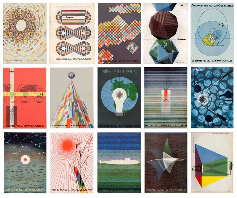
For my influence project, I chose the Swiss graphic designer Erik Nitsche as my influence. I chose Nitsche because I noticed multiple of his designs were in a book that got handed around in class, so I looked at his work online afterwards and really enjoyed his General Dynamics posters and thought they would be fun to use as inspiration for my own project. I felt like a lot of the themes within his work related to what we have been discussing in class, such as the Bauhaus style of design that utilizes many bright colors and geometric shapes. As seen in the thumbnail of Nitsche’s General Dynamics posters below, Nitsche uses these elements in his work along with many others.
Some other elements that commonly appeared in Nitsche’s work are similar background colors, being white, tan, pale blue, and beige as the most common. He also used many transparent shapes overlaid on designs/other shapes, as well as using many circles, ovals, and radial stripes. The color choices for his designs also held many common themes, with many posters from the General Dynamics group having either predominantly blue and green colors or red and orange and yellow. He did also enjoy including broad spectrums of colors, like the rainbow, on shapes in his designs.
Within my own design, I felt drawn to the simplicity of Nitsche’s posters so I tried to accomplish that by only having the necessary text needed to convey the race’s information, smaller text, and non-dominating shapes in my composition. I also felt like I did a good job choosing color for my design based off what Nitsche’s design choices were within his own work, because I stuck to the blue/pale blue color scheme pretty tightly with my background and bike wheels, but also included a rainbow/adjacent pattern on the bike-body stripe pattern to bring some excitement to the poster. I also used asymmetrical balance which was common in Nitsche’s work, and included transparent versions of all my shapes. I also felt that the design composition as a whole, an abstract construction of a bike with two tires and then a curved line for the frame of the bike/its rider, was very Nitsche-esque because much of his work used abstract compositions to represent literal and specific ideas/themes.
Overall I really enjoyed this project, and my favorite part was getting to research my influence designer and find themes within his work. Because his designs aren’t as compositionally complicated as some other designer’s works are, it inspired me to think that maybe I can create work like this someday once I develop my own personal design style.
Above are some of Erik Nitsche’s posters that he designed while working as Art Director for General Dynamics between 1955 and 1960.
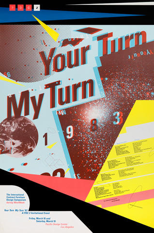
For my influence project, I took inspiration from famous New Wave graphic designer April Greiman. When I was first researching her work, I listed out a lot of things that I found to be mostly consistent in her style: halftone gradients, geometric shapes, layers and playing with opacity, photographic elements, and sans serif fonts. Additionally, in class, we learned that a lot of her style is the result of being one of the first people to integrate technology into their work and whenever that technology made a mistake, she would integrate it into the work.
At first when starting, I had no idea where to start but once I saw the work her WET Magazine cover, I had my main inspiration in putting a centered person to be the main focus. I also knew from the start that I wanted to use the layered 3D text for the “Little 500” font just as she does in the poster below my design. Sticking with the Little 500 theme, I knew stripes would be something that I wanted to use to show speed and also just a lot of uniforms have stripes on them in the race. That paired with tilting my typography as well as the stripes in the bottom with the text on them conveys the speed that I was looking for as well as fit into April’s style of slanted text in some of her work.
Below the stripes, is a checkered flag which since it is a bike race, fits the theme. I added a gradient on it too because April works a lot with gradients and images with a gradient. On the right, is a large circle with a halftone gradient as well, which again is representative of April’s halftone shape and gradient work that is often see in her designs. I also made it a circle because in my mind, it sort of represents a bike wheel which is also a circle. Lastly, the two shapes at the top of the poster are layered over each other with the opacity lowered as April likes to layer and play with opacity as stated earlier. The left shape is a geometric shape that I feel like April might use in her work but the shape on the left, is representative of the podium for first, second, and third in the race just flipped upside down.
Lastly, the middle and background are what I struggled the most with in this project in trying to make it them both look right and cohesive as well as reflective of my influence. For the main middle shape, I traced the IU Student Foundation logo which sponsors the race but, I made it into one shape and did not color it as to distinguish it from any official logos. I then added layered squares around it like is also seen in the WET cover but put my own spin on it in color and placement and layering with the main shape. I added a halftone gradient on the main shape to make it stand out more too. Finally, the photo in the middle is turned into a half tone color image but, I am not sure I love the way it turned out and maybe should’ve made the dots smaller. I covered the eyes of the biker as April has done in her works as well as put the actual bike on top to show the significance of the race. April also likes to use little photographic elements in her work too so I think that turned out nicely. The background was a struggle until I realized in some of her work, she likes to use a paint splatter texture in the background so that is also what I chose to do instead of a solid color or another halftone gradient which might blend in with the circle and main shapes.
Overall I feel that I represented the style well and while some aspects could be improved, I like the overall way it turned out however, when doing an influence project like this, it is hard to not compare yourself to the graphic designer and I had to continuously remind myself throughout the process, and even now, that April is a known, professional graphic designer who has spent decades designing in her own style and this is only my second graphic design class so it was okay for my work to not be perfect.
Image of April Greiman’s “Your Turn My Turn” poster
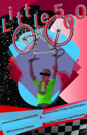
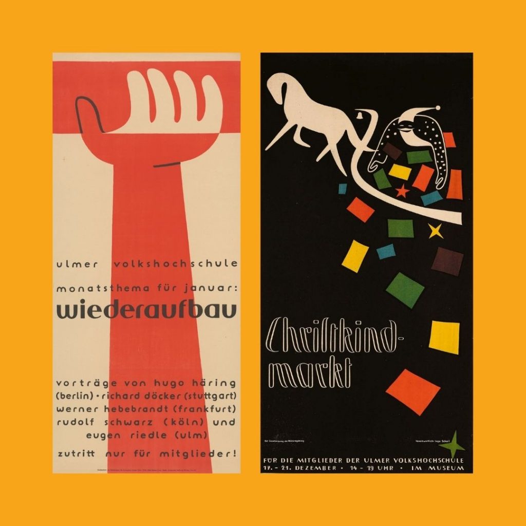
For my Little 500 Poster I was inspired to design like the artist Otl Aicher, a German graphic designer. Originally I took a lot of inspiration from his 1972 Olympic posters which where very bright, colorful, and primarily photo-based. However once I researched a bit more into his work I was really inspired by his graphic work and wanted to challenge myself to create a more illustrative poster.
Aicher’s Christkindmarkt Poster (1947) is where I took the majority of my inspiration from. I liked the simplicity, colorfulness, and how there’s a lot of movement which is perfect for a Little 5 poster. In my design, I decided to change the composition up and add more shapes emerging from the bike path. I decided to make the squares more flowy and dynamic, representing the fabric of the jerseys used. Red and candy stripe jerseys represent the team that raises the most money for the IUSF’s philanthrophy, Student Helping Students, yellow represents the team who won last years’ race, and green represents the team who got the fastest qualification time. I also found it appropriate to add some checkered finsih-line flags as well as the color blue. While blue doesn’t have significance on race day jerseys, it is still a flag that is seen in the IUSF logo. I wanted to add more stars and shapes to my design as my own stylistic choice, I feel like it adds to the sparkle and fun that is surrounded around the greatest college weekend in the world. For Typography, I decided to use a bolder, simpler font than the one that Aicher used because I wanted it to balance with all the colorful elements I used. I feel like the typeface I used still has that retro-feel and also doesn’t clash with the rest of the poster.
Compositionally I am very happy with how this turned out. If I were to go back and make any improvements, I think I could have played around with stylizing the little 500 bike more, making it more artistic and less vector-esque. I believe adding some texture would be beneficial for the look of the poster as well.
Influence: (Left) Otl Aicher, Wiederaufbau, Plakat für die vh Ulm, 1947 (Right) Otl Aicher, Christkindmarkt, 1947