Armin Hofmann Influence Poster – Regan Mathies

Click this image to view PDF

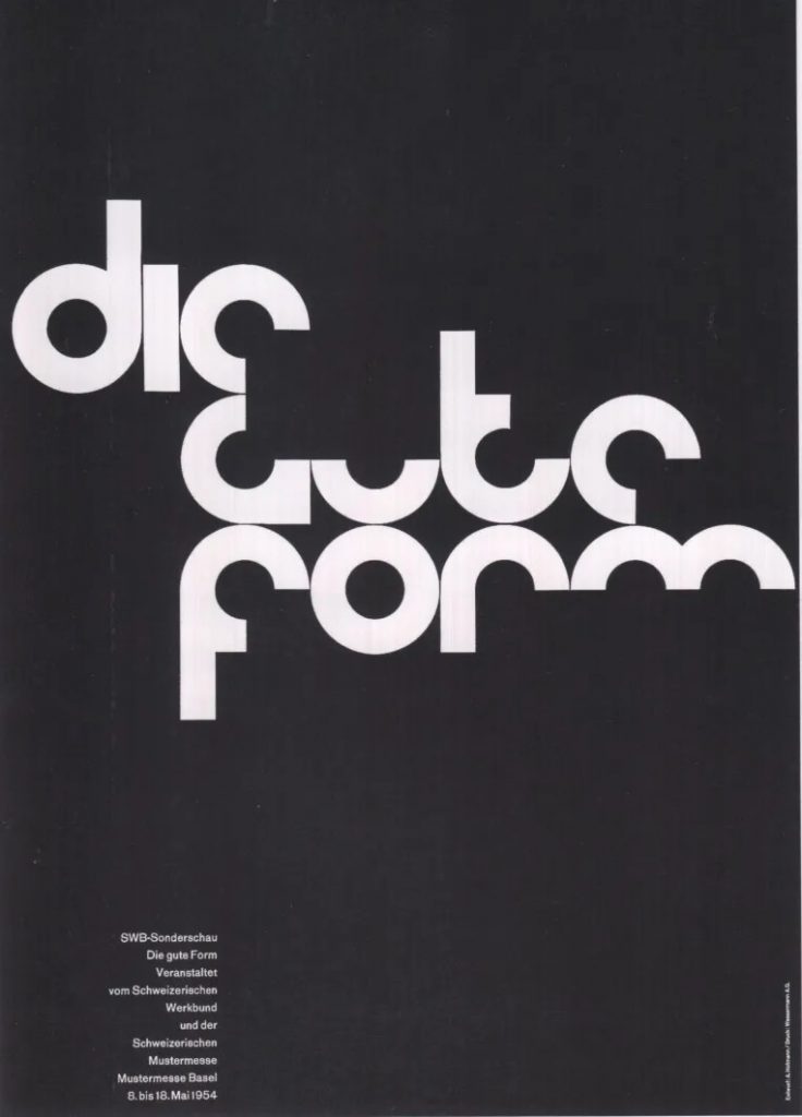
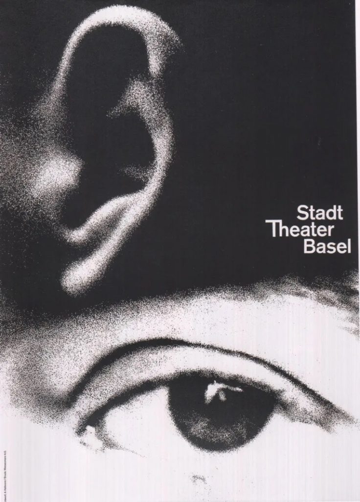
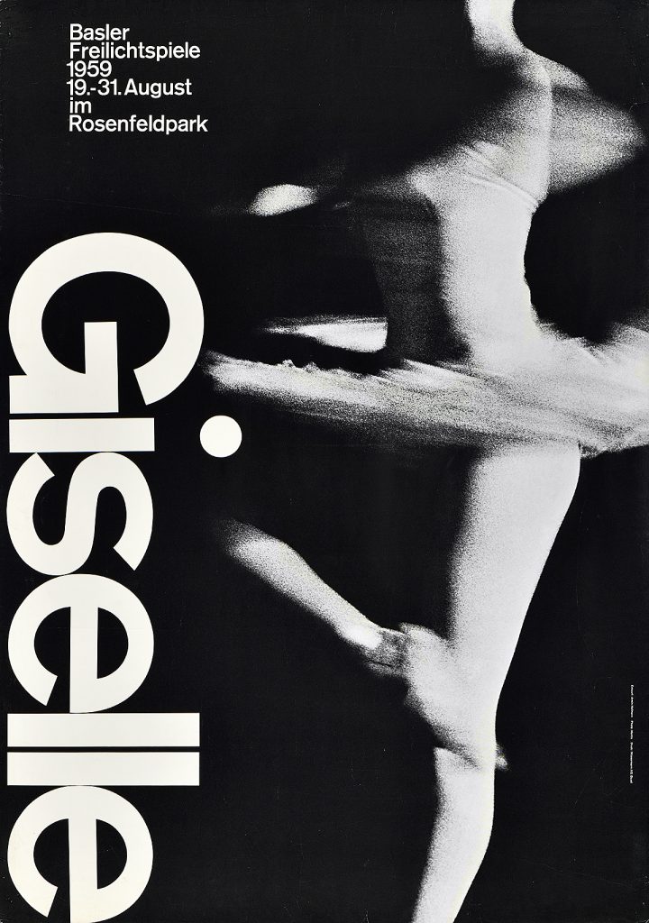
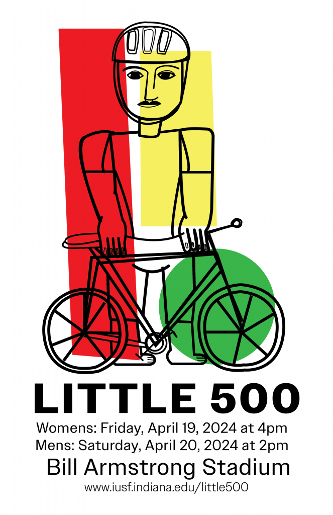
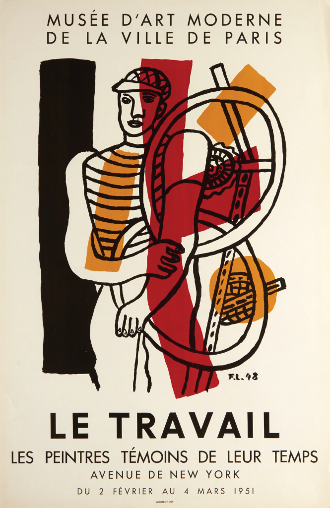
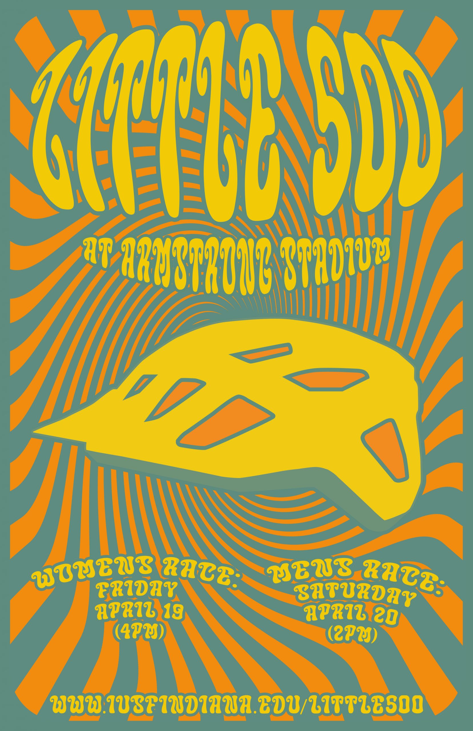
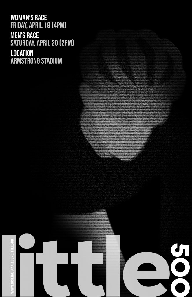
For the influence poster project, I used Armin Hofmann as inspiration for my Little 500 advertisement. Hofmann’s design style encompasses a unique blend of photographic simplicity and typography. More specifically, Hofmann’s designs capture grainy photos that emphasize the ability of visual resolutions and how they can affect the design’s overall appearance. His design style aims to create complex compositions yet allow them to be simplistic and abstract simultaneously. Furthermore, Hofmann was a significant influence on the design style referred to as the “Swiss Style”. His goal was to use his abilities to represent underlying messages of social and cultural issues, along with their values. Overall, I found his work very inspiring and unique for the direction I wanted to take my poster. His design style allowed me to create a Little 500 advertisement that was dramatic and minimalistic at the same time, which I believe helped me achieve the intended feel. 

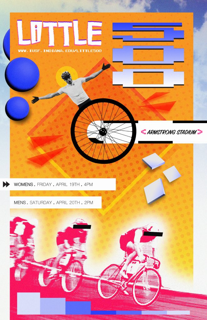
The direction of my overall design concept was driven by Hofmann’s iconic black-and-white palette and his embrace of low visual resolution to evoke a sense of dramatics. For starters, I used the Adobe Illustrator program to craft a minimalist depiction of a cyclist, intending to create a balance between simplicity and visual interest. I integrated this illustration into my project by using Photoshop modifications. Tools such as motion blur, graphic pen textures, line halftones, and levels allowed me to achieve this intended look. To ensure there was seamless integration with the poster’s black background, I used a mask layer to blend the sharp edges of the cyclist, achieving a cohesive composition. 

Following this, I found a font style that is reminiscent of the bold, minimalist typography that Hofmann integrates into a variety of his designs. More specifically, Hofmann’s typographic choices resign in the sans serif genre, with larger width and lack of intricate details. Furthermore, his typography reflects the manipulation of spacing and line heights for added detail and impact. To adapt to this design style for my design, I noticed that I had a large amount of space towards the lower section of the poster. Due to this, I opted to place the primary text within this region. Additionally, I decided to vertically orient the “500”, which mirrors Hofmann’s unconventional approach to text placement. I also manipulated the text “little” in Adobe Illustrator to manually experiment with kerning and aligned the primary text closely to the margins, both to reflect his attention to typographic spacing. Lastly, I decided to create visual contrast in the typography by using various opacity levels, enhancing the type’s visual emphasis. 

Regarding the layout of the secondary information in my design, I strategically grouped related information for coherence. By using varying opacities within the text, I prioritized emphasis on the headers with the following information being of less visual emphasis. Ultimately, I positioned this information in the top left corner of my design to utilize the black background for effortless readability.

Overall, I feel like my poster demonstrates a solid effort to embody Hofmann’s design style: however, I want to also acknowledge that I feel it does not showcase my design skills to my full potential.  Despite being aware of my decision decisions and why I wanted to make them, I was not entirely pleased with my overall execution. With this being said, I was able to challenge myself by stepping out of my comfort zone and approaching this project with a different perspective of design. The project as a whole emphasized the importance of adapting to the preferences and styles of clients rather than personal aesthetics; therefore, while this project may not have met my expectations, I have learned its importance which will help me in my future in the field of graphic design. 

Armin Hofmann’s Designs :

Fernand Léger Influenced Little 500 Poster

click this image to view the pdf

For our Influence project, at first, I had difficulty choosing my influence. I was overwhelmed with the hundreds of possibilities I could choose from and couldn’t decide on just one. I later landed on Fernand Léger as my influence. What drew me to choose Fernand Léger was how simple yet powerful his art was. His use of color blocks in the art was also interesting and I wanted to see how I could do my version of his art.

I had a lot of fun creating this poster and channeling my inner Léger. When brainstorming, I decided I wanted my poster to be of a Little 500 cyclist with his bike. Something I enjoyed was being a little less perfectionist since some of Léger’s work is a little rough but still overall looks clean.

Something I was excited to work on was the color blocks Léger uses. He uses thick squares and sometimes circles to add color to his art. Since the Little 500 is at IU, I knew I wanted red to be the color that stood out the most. I had some trouble figuring out what other colors he uses and how big/small to make the other boxes. I decided to add a green circle on the bottom to also emphasize the wheels of the bike.

Fernand Léger’s Poster

Fernand Léger was a french painter who is known for his pieces in cubism and tubism. Cubism is an approach, famously used by Picasso, used to represent reality using geometric flat shapes. Léger’s art in the beginning was mostly cubism until later in his life where he actually created a new approach named Tubism. Tubism is like cubism, but it uses cylindrical forms.

On the left is an example of one of his works titled, “Le Travail”. I used this piece as a form of influence because this poster was of a cyclist too. Léger created this for the Salon des Peintres témoins de leurs temps which is an annual art exhibition in the Galliera Museum.

Little 500 – April Greiman

April Greiman, to me, represents the attributes of what a designer should be; one that experiments in taking risks, while also embracing design in which can be represented as a period piece. Greiman embraced computer technology, software in which was newly introduced, as a design tool.

Click for View

In Greiman’s work, their is a strong representation of New Wave style as an iconic era for the early 80s. With the implementation of experimental computer software, as well as the overarching addition of the New Wave color pallet, Greiman embraces the time as a period in which the world was also experimenting with fashion, lifestyle, and media (etc.).

In my “Little 500” poster, I wanted to reflect the work of Greiman through the fonts, colors, and halftones.

Kate’s Little 500 Influence Poster

Little 500 Influence Poster
Click on this image to see the full pdf

My project 2 in J465 was all about influence. During this unit, I’ve learned about different design influences throughout history and specific designers who pioneered their own style. For this project to make a Little 500 poster through an influential designer, I chose to use Lester Beall.

About Lester Beall: (1903-1969) Beall was a self-taught graphic designer who began the modernist graphic design movement in the United States. His transformative work for that time period is described as effective visual communication. Beall is most famously known for the work he did for the Rural Electrification Administration, which advertised bringing electricity to rural America. His posters had bright colors and bold typography and were easily recognizable and clearly understood. 

I initially chose Lester Beall as my influence because I was instantly drawn to his designs. As a designer myself, I enjoy taking a minimalist approach and I like bold colors. Therefore, Beall was the perfect fit for my influence and I was really excited to complete this project because it was also a topic that is meaningful to me, the Little 500. 

Most of Beall’s famous posters are for the REA. If you research, there tend to be two approaches he designed for this specific campaign. One features a cutout photo against a primary colored background and different flat shapes and typography surrounding it. The other is similar but is based on an illustration with arrows instead of a photo. The approach I went with is the first option because I think that photography can add a lot to a design and the fun sayings in the boxes above the photos gave me a unique opportunity. For the photo, I found a picture of bikers and cut them out using Photoshop. I also added a sepia look to them since that is what most of Beall’s work had. Originally, I planned to make the background of my poster red for IU but decided against it because I liked how the cornflower blue looked with orange and I feel like it suited Beall’s work. I stuck with similar fonts to his to embody the full effect of his design. I also made sure that the block of text at the top of the page was skewed and not 180 degrees. An “easter egg” I wanted to include was the small type that says INDIANA at the top right part of the poster. On Beall’s posters, he always put his last name in small letters in the same spot, so I thought it would be effective to do the same with mine, but in relation to what the poster is about. One thing I added that his posters did not feature was the text about the men’s and women’s races. I felt like this was an appropriate placement for this information because it aligned with the shape behind it and wasn’t extremely noticeable at first glance.

Overall, I see Lester Beall’s influence reflected in my work by the colors, typography, shapes, and photos I chose. This project opened my mindset to other design elements that could work for me in future projects that aren’t what I would immediately choose on my own.

Bonnie MacLean Influenced Project

For my Little 500 Influence Project, I have chosen Bonnie MacLean and her work as the influence for my poster. Bonnie MacLean created psychedelic art in the 60’s. MacLean’s most popular works include the vintage, psychedelic concert posters we see today. I thought that this would be a fun way to try something new and outside of my comfort zone.

Lucie Downing's Little 500 Influence Project Poster
Click this image to view the PDF version.
Bonnie MacLane Psychedelic Poster
Bonnie MacLean’s work.

While MacLean tends to use human faces as the subject of her pieces, I chose to use a helmet to represent Little 500. Her color usage is typically very vibrant and limited in the amount of colors chosen. I opted to also take this route by focusing on three main colors to emphasize the main subject and text.

Most of her work has an element of symmetry within it and some form of distortion as most psychedelic art pieces do. I chose to use distortion effects on my text and a main spiral in the background to bring in the element of classic psychedelic art while also making my text symmetrical on the page.

I think I was able to encapsulate some core elements of psychedelic art but I don’t feel as though it directly represents Bonnie MacLean, rather it is a nod to her and her work.