J465

Design 2 | Spring 2025

J465

Main menu

Skip to primary content
  • Projects
    • Logo
    • Influence
    • Conceptual
    • Animation
    • Portfolio
  • Students
    • M. Anderson
    • K. Bowens
    • D. Brown
    • M. Carlson
    • M. Greanias
    • S. Harsh
    • E. Hupe
    • C. Ibekwe
    • A. Nitsos
    • J. Paley
    • B. Piper
    • J. Sandler
    • A. Schneider
    • S. Shures
    • C. Sweet
    • G. Thomas
  • Our websites

Post navigation

← Previous Next →

Hi, welcome to Anchor!

Posted on February 24, 2025 by Ayumu Nakajima
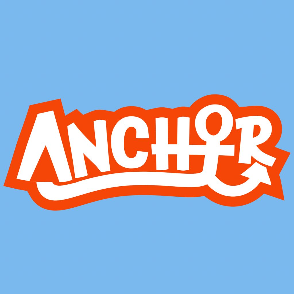
Logo design of Anchor.
Click to view brand guidelines.

Anchor is a publishing company that nurtures young minds and inspires their creativity. To convey the tone of support and stability, the brand features an anchor symbol drawn with a bold stroke.

The color palette of bright orange provides a sense of warmth and welcomeness, along with the contemporary color of blue brings emphasis to the boldness. The use of font Chaloops gives a sense of childlike and playfulness, which illustrates the tone the brand conveys.

Overall, the design of Anchor communicates our goal of providing children with the support to spark their imagination and explore their creativity.

This entry was posted in A. Nakajima, Logo by Ayumu Nakajima. Bookmark the permalink.
Proudly powered by WordPress