For this assignment I had a solid Idea of what I wanted to do from the start. Since my logo depicts two books facing one-another to create a “portal” , I wanted to play with that idea more.
So I animated two books flipping through pages than forming a shape that resembles my logo. I had a very hard time trying to get the bend on them right so the transition is not seamless.
I added a quick animation of a night sky using the colors i used in my original logo. Then the sky fades to reveal my new logo. I updated it so it is more versitale. I also updated my logo type to emphasize portal over publishing. I still could not get rid of that line down the middle, its fine as an illustrator file and is only visible when blown up.
Honestly I think my idea was a little too much for 10 seconds. I also learned that sometimes less is better with the audio, I tried to add a bunch of sound effects at first. I ended up just using a “magical” sound effect I found on youtube as the music and the sound of flipping through a book.
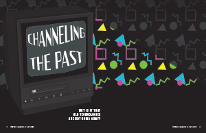
For this assignment, I used the article “Old Tech.” I chose this one because it is something I am interested in. However, it was not the one that gave me the most creative inspiration. During the drawing process, I kept getting more ideas for the wearable tech story, but none of them felt fulfilling. After reading the article the part that struck me most was that we are not getting rid of old tech due to nostalgia. That idea alone was what started the creative process. I began brainstorming things that were nostalgic about old tech for me. I couldn’t get this image of an old TV screen in the dark as its light illuminates its surroundings. I built my entire design of the illustration of the old TV on the front spread. I found a stock image of a TV I felt looked the closest to the one in my head and I built off of that image to create my illustration. For the screen of the TV, I used the grain effect on a box. This gave it a screen-like look. For the title, I used the warp tool and the Silver Streak font. I played around with the bulge effect until I felt they looked natural. I also changed the title of the article to something more fitting of my design angle. I felt that “Channeling The Past” in conjunction with my illustration gave a good insight into what the story was about. To drive home the nostalgia factor I created a pretty standard 90s pattern. Although I was born shortly after the ninety’s they have always felt very nostalgic to me, and I would say they are for a lot of people. I created this pattern by using references from real-world patterns in the 90s and making a small arrangement of the shapes I saw, then using the pattern tool to create the final product you see. By adding this pattern I was also able to introduce a color palette. The color pallet I chose I wanted it to feel tech-like and have the same nostalgia as the pattern I created. Therefore I went with vibrant shades of; blue, yellow, green, and pink/purple. I felt the vibrancy honed in on the technology while the colors captured the ninety as well. For my body text, I wanted to use a standard legible font since my background was already a bit overwhelming, so I used Bitter. For my subhead font, I wanted to also use a standard font, so I used Bebas Neue. On the second page I wanted to use the same pattern but not obstruct the story itself so I made a triangular shape at the top to connect the two spreads. The story text was a lot shorter than I thought It was so I played around with the layout on the second spread for a long time, trying to balance it. I ended up centering most of the story in the middle of the spread and using other visual elements to fill the space. I made the sidebar match the same color already seen in the pattern and used the same fonts I used for the body text just making it a bit smaller. The Last Thing I did was create the two illustrations on the second spread. I realized that I should include some of the technology listed in the sidebar as a visual element so I illustrated a floppy disk and a vinyl record, both of which featured colors already established in the pattern. I placed them in the blank areas and decided I liked the look of the vinyl being enlarged and going off the page. Overall this project was fun and allowed me to learn more about magazine design. I would say I should probably have used a lighter background color but I played around with using white instead of black and it didn’t look good to me. I also think I could have laid the second spread out better.
For this project, I took I took Inspiration from April Greiman. Greiman was a pioneer in embracing computer technology as a design tool.
She was born in 1948 in New York. In 1970 she graduated from the Kansas City Art Institute with a degree in Graphic Design. Shortly after graduating, she then enrolled in the Basel School of Design, located in Switzerland.
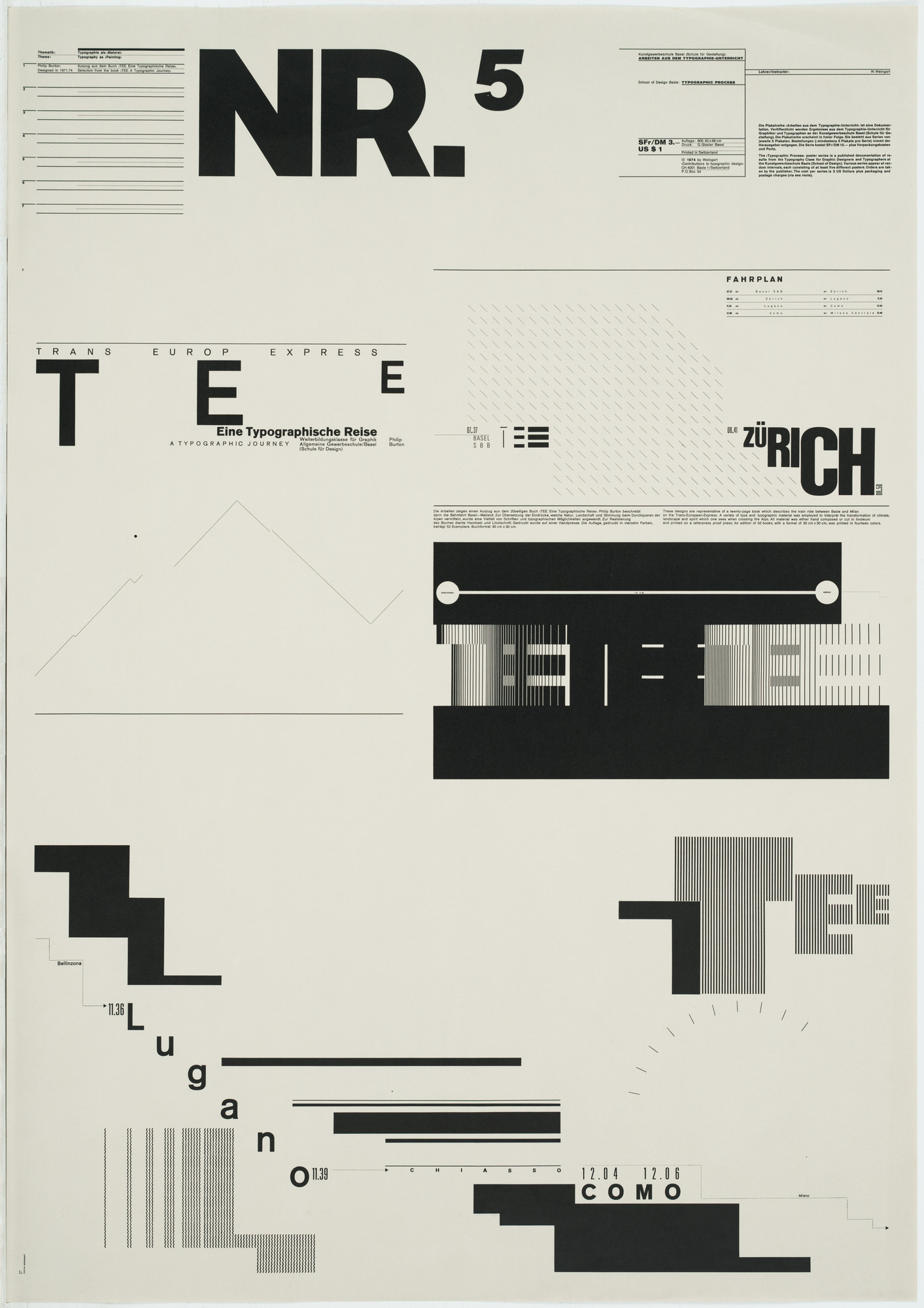
There she was mentored by Armin Hofmann and Wolfgang Weingart. Hofmann specialized in grid-based designs, that were minimalistic. Weingart’s work focused on typography and he was later dubbed the father of new wave typography. Both of these artists’ works were very representative of Swiss graphic art at the time.
Wolfgang WeingartArmin Hofmann
Greiman’s art style is categorized as New Wave, and she is known as the one who introduced this style to the US. Her style combines a lot of the analog techniques of her mentors and the digital techniques of her time. She blends bold post-modern aesthetics with technology.
Her work often features vibrant colors, often red, blue, green, yellow, and pink. Her work features a lot of photographic imagery mixed with geometric shapes. She layers opacities in a way that creates its own pattern. She is also known for using experimental typography. She embraces texture.
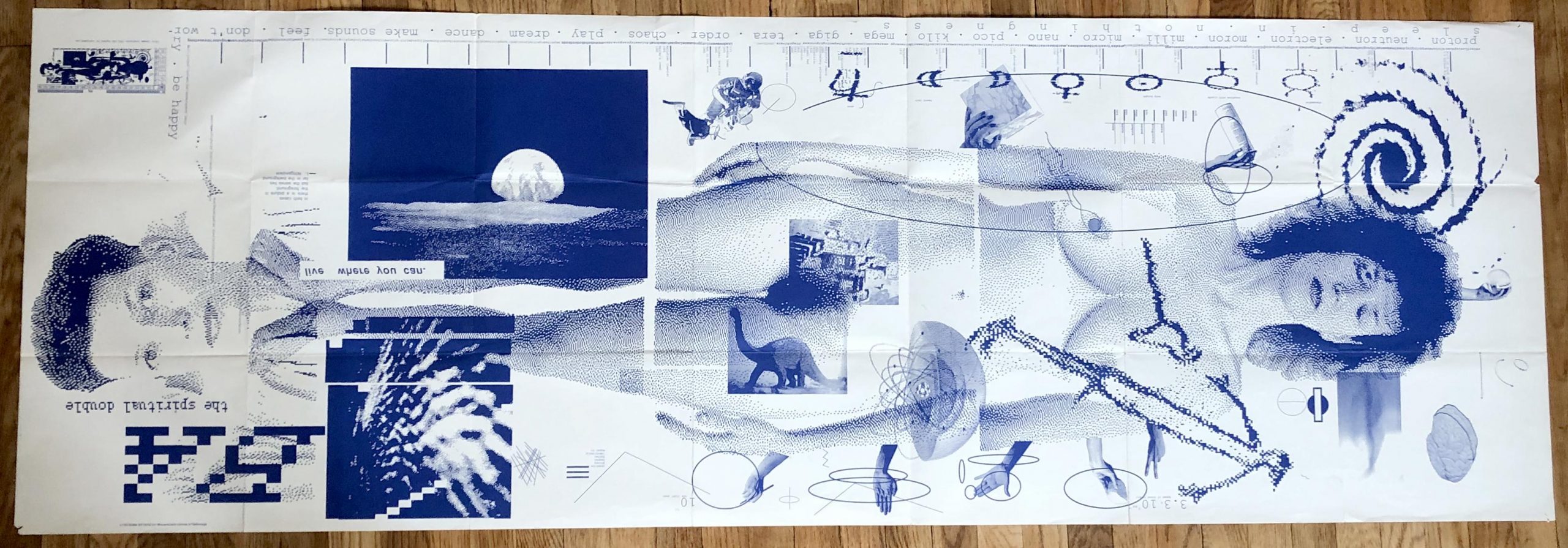
One of Greinman’s defining pieces was a design for an issue of Quarterly Design. The piece is titled Does It Makes Sense? and was produced using MacDraw in 1986. She layered textures of pixilated videos, text, and environmental imagery to create the piece.
Does It Make Sense? April Greiman
I chose April Greiman because I wanted to learn more about female Graphic Designers because I feel like I haven’t learned about many in my classes. I chose her because I loved her use of vibrant colors and how chaotic her works look at first glance. This might be an insult, but I don’t mean it to be. When I look at her work I see a grown-up Lisa Frank Illustration. Her work gave me the same feeling I got when I was little and saw Lisa Frank’s work. It was fun, happy, and bright. Below are a couple of Greiman works I took inspiration from to create my poster.
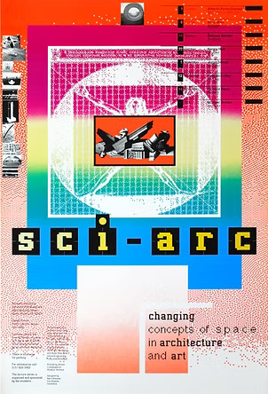
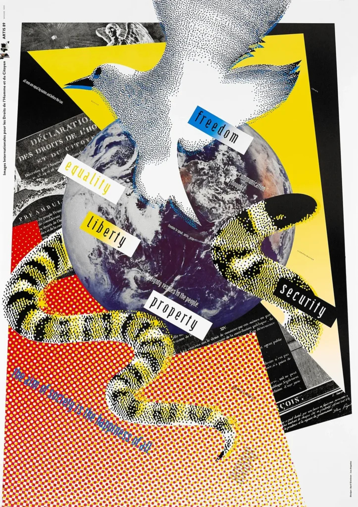
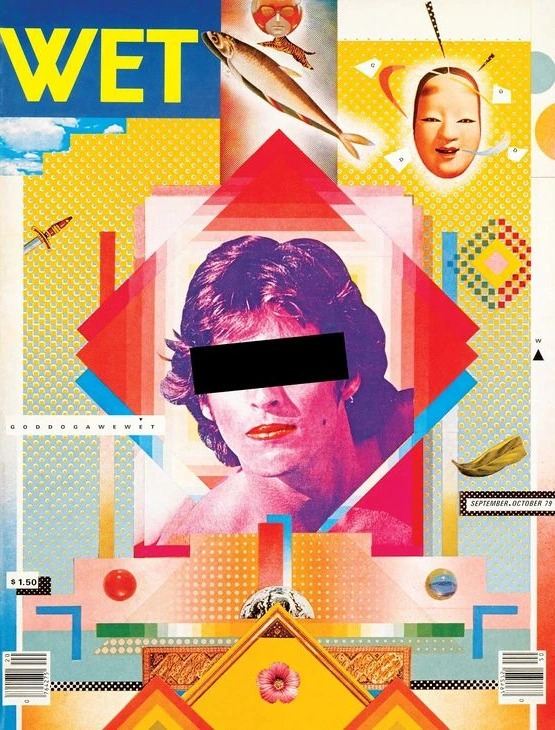
sci-arcFreedon, Equality, Liberty, Property, SecurityCover of WET Magazine
COLORS
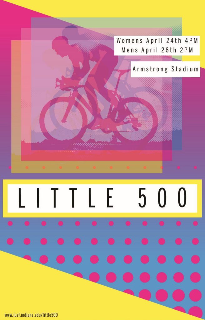
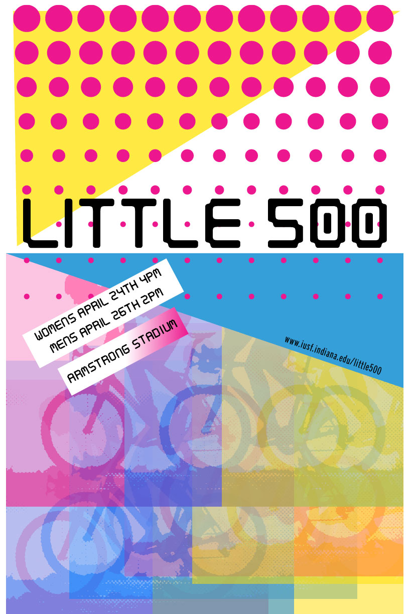
When choosing colors I had a lot to choose from. Greiman’s pallet is large and often untamed. I decided to tame mine and stuck with three colors, cyan, magenta, and yellow. I felt these colors worked together in a harmonious way. They also reminded me of the new wave aesthetic even though the CMYK color model came out long before Greiman was born.
I also chose these colors because of the emotions they evoke. They are vibrant and lively and if they could move I’m sure they would move fast. I felt these colors worked perfectly in the context of a bike race.
TYPOGRAPHY
For my typography, I took inspiration from Freedom, Equality, Liberty, Property, Security, and the cover for WET Magazine. I liked how the typography was placed on colored boxes. This reminded me of fortune cookies. I also liked the typography she used, in the WET cover. She uses a mix of bold and light sans-serif fonts. I like the simplicity of the light font against the dramatic background, so I used light fonts throughout, Benton Sans, to be exact.
VISUAL ELEMENTS
For my visual elements, I wanted to incorporate the use of layered opacities. I did this by taking a stock image of a bike racer and doing a halftone pattern. I made three copies, one pink, one blue, and one yellow. I then set their opacities to roughly 60% and arranged them in a fashion that created movement and three-dimensionality.
I incorporated white-colored blocks around my text, much like Greiman. I also wanted to incorporate the use of a gradient. Therefore I made the background a gradient from cyan to magenta. I also wanted to incorporate some sort of pattern, so I added the rows of dots. To add even more movement. Lastly, I wanted to incorporate geometric shapes, so I made the images square. Added a defining box to the title text, and added two triangles to the corners of the piece. This not only added clutter, to resemble Greimans work but also it balanced out the poster.
REFLECTION
This project was fun! I liked researching Greiman and learning about how she got started, and what her inspirations were. In regards to my poster, I worked on this for a long time. I actually had another completed poster that I was going to turn in then changed the layout because I felt my first one was hard to follow.
First Draft
I liked exploring these vibrant colors, as I tend to stick to strict and simple color palettes. In my earlier draft, I also used a digitalized typography that resembled the type in Freedom, Equality, Liberty, Property, Security but ultimately did not like that typography on my new design.
I had a hard time figuring out how to create the dot grid and ended up doing it in a way that was quite tedious. I’m sure there is an easier way. I ended up making a row of dots that got progressively smaller then using the grid pattern to extend them past the first row.
Overall I like my design and I think it takes a step back from Greimans. It’s much simpler than her work but still has multiple nods to her work. I feel I did a good job of combining my style and skills with inspiration from one of the women pioneers of graphic design.
When I was brainstorming for this project, I kept coming back to the word portal. It was the word that encapsulated a great read. When reading an excellent book it’s hard not to feel like you have stepped through a portal. The word also has a lot of creative energy, so there were plenty of references.
I enjoyed this simple star shape I kept coming across and was constantly playing with its shape in my head to try and incorporate a book-like image. A couple of days later I was reading and laid my book on the bed. When I saw it I recognised it looked like the exact half of the shape I wanted to use.
I created this logo with the idea that it would be two open books facing one another with a shape that resembles an abstraction of a portal between them. I chose these colors because I wanted them to feel reagal, or adjacent to vintage fantasy books. I also chose them to be very inviting, since we want to invite people to read our books, and step through a ‘portal’.
I had a lot of fun with this project; its creative freedom made it enjoyable. I did face challenges though. I had a hard time making things symmetrical. There are imperfections in the logo that if I had put a little more work into wouldn’t be there.