Tech. Conceptual Illustration

For our second to last creative project in this class we were tasked to create a four page magazine article (two spreads) choosing one of the three stories we were given, our main priority was to crate a conceptual illustration for the article of our choosing and display the story text in a creative way. the three stories we could choose form were:


DIY HOME: A story about the perils of making your own home a “smart” home.

OLD TECH: A story about why obsolete technologies — like vinyl records and film cameras — are still with us.

WEARABLE: A story about the inevitable junking of wearable tech.

out of the 3 I decided to go with Old Tech (seen in my spread below)

Click the Image above to see my 2 full spreads!

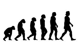
When thinking of concept ideas I first thought of an image like the one show below, the evaluation of man walk thingie, but that idea died quickly because of how dumb I think things are when people just put legs and arms on inanimate objects and personify them.
After that idea I then thought the irony of buying old tech on new tech, I know I’ve done it to buy an old camera thats most likely worst quality them my iPhone Im buying it off of, its a funny concept to me. This was I the idea I then decided to base my main illustration off of, I thought it would get the point across of what the story is about. I also thought the tea line I chose for the illustration went perfectly with it all. Past being the old cameras and vinyls we still hold on to after years of new and “better” tech, Pixel being the new and improved tech we have available now.

when it came to displaying the story and imagery around it I thought about a cool way to show past tech right next to new tech, a side by side.

I think it’s an interesting and different way of showing both Past and present, while also framing the story text.

As for the side bar info. I wanted to think of another interesting way to frame this information inside of having a colored rectangle indicating to the reader that this is different info form the story around it. I began to think of things on theme of this tech story thats also a rectangle… a phone screen!

To show some different/ to better block the information in the side bar I decided to show it as a text thread so it’s easier to fallow.

I had fun with this project, I don’t get to work with text/ magazine layouts that often so getting to do a project like this is always fun to me. it helps me better my thought process when it comes to layouts, visual elements, and overall flow of a project. if I was able to do anything thing different I would try and push myself with the visual a little more, I like the final version I have I would of just liked seeing it maybe a little more cleaned up. But overall I’m happy with I created in the end.

Under the influence of Lucian Bernhard

Click here to see my Poster!

For this project we looked to some of the greats to get inspiration for the Little 500. Little Five is a famous bicycle race held annually at Indiana University Bloomington. It started in 1951 and is modeled after the Indianapolis 500, but with bikes instead of cars. It’s argued as the biggest week here at IU, and with that it’s advertised and talked about the whole Month of April. We were tasked with creating a poster for the event but in the influence of a famous graphic designer.

When looking at some designers to get inspiration from I found myself circling back to Lucian Bernhard and George Olden, two amazing designers with vary different styles. because I was so stuck with who I would pick I decided to sketch some of my ideas down and see what style my vision would look best in, muted black and white photo collages or sketch style colored designs. I the end I went with Lucian Bernhard.

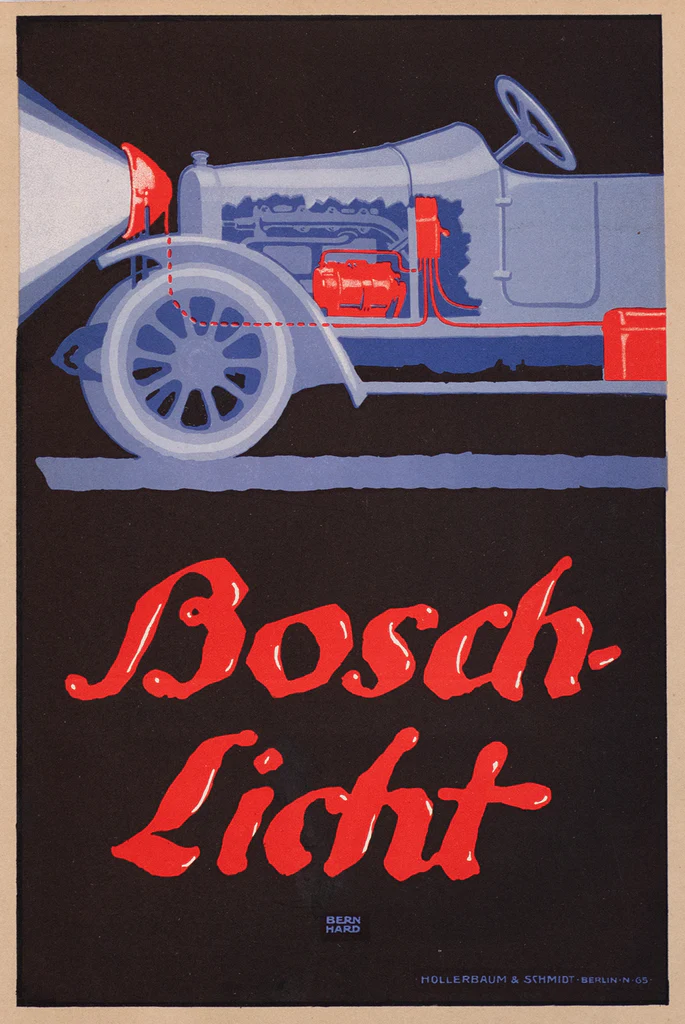
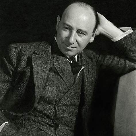
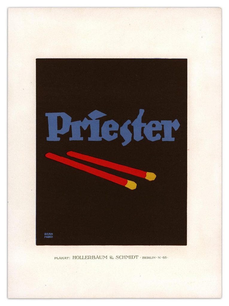
Lucian Bernhard was a German graphic designer, type designer, professor, interior designer, and artist. He is best known for pioneering the Plakatstil or the poster style movement, characterized by bold, simple designs with flat colors and minimal text. ​

With my designer now picked it was time to work on my poster. like I said before I already sketched out two ideas one was a close up on a bicycle seat and the other I wanted to do a race track with a racer on it.

The bicycle seat one was pretty straightforward, the only thing that stumped me was choosing the color way. I know I wanted to stay with the cream, red, and black color palette, I just didn’t know how to format it the way I wanted.

In the end I narrowed it down between these two color ways

next I worked on font and copy placement, I wanted to do a similar fort to one you find in Lucian Bernhard’s designs. I found a font called Attic Antique Italic, I thought it resembles perfectly with fonts Lucian Bernhard uses. but also for fun I went with a simple font called Transat Black just to see. in the end I went with Attic Antique Italic, I just looked better and more cohesive to me with the design.

And these were the final designs I turned in because I couldn’t ick what color way was better.

at this point of the project I was just messing around with more ideas I had so I ended up making another post for this project. this poster shows more of the racers. and combining 500 into the actual drawing of the racer.

I stared making the design as a vertical poster but I looked too smushed so I switched it to horizontal and it was much much better.

click to see the poster better!

this is the final design for the horizontal poster and I think it Turned out perfectly.

overall I have a lot of fun with this project, even though we have to “copy” a creative style I still felt like I had a lot of creative freedom.