Animation Project: Love More Publishing

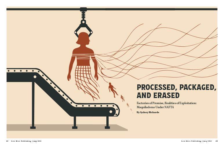
Creating the animation for my “Love More Publishing” logo proved to be one of the most challenging but fulfilling creative experiences I’ve encountered this semester. Right from the beginning, I had a vivid idea: I aimed to design a brief animation where a butterfly flies into the screen and lands on a flower, leading to a fade to black that showcases my logo text. What appeared to be a straightforward concept, was harder than I thought. One of my primary challenges was making the butterfly’s wings flap in a way that appeared natural. Initially, I attempted to use rotation keyframes on layers imported from Illustrator; however, regardless of how I adjusted the anchor points or expressions, the wings continued to spin awkwardly rather than flap smoothly. I decided to abandon the original wings and recreate them directly within After Effects using solids and simple shapes. This decision allowed me to take control over the animation, and it finally began to resemble my vision. It taught me that at times, the best solution is to start anew with a simpler method.

Timing presented another obstacle. I had to coordinate multiple keyframes for position, scale, opacity, and audio to ensure everything transitioned fluidly over 10 seconds. The landing bounce, fade to black, and text reveal all needed to feel cohesive. I also faced difficulties with audio initially, uncertain about where to find royalty-free music and how to integrate it into After Effects, but once I found the YouTube Audio Library, that finishing touch truly helped tie the piece together.

In spite of the challenges, I’m proud of the progress I made independently from creating layers and utilizing expressions to resolving export settings. I realized how much consideration and technical precision go into what may look like a simple motion. I take pride in the warmth and character I infused into this animation, and I believe it effectively reflects the brand’s essence. In summary, this project illustrated that animation can be challenging, but also incredibly rewarding. I now have a better grasp of how to break down a vision into manageable steps, and I’ve recognized my growth not only as a designer but also as a creative problem-solver.

Conceptual Illustration: Maquiladoras Under NAFTA

Click on this image to view the full PDF!

When I designed my conceptual illustration, my intentions were for the design to embody the deep betrayal that maquiladora workers, particularly women, faced under NAFTA. The narrative extended beyond factories; it showed the illusion of opportunity and the harsh reality of exploitation. I decided upon industrial colors to illustrate erasing workers’ identities, leaving only the bland production machinery. The viewpoint of women employed in these factories was nameless; they were recruited for their ease of control, closely monitored, and ultimately discarded when they became a burden. I aimed for my design to produce a similar feeling of being destroyed by a system that valued them for their labor, not as human beings. I examined actual photographs from maquiladoras to provide a visual foundation for the story. Observing pictures of tightly packed sewing stations, where workers cramped beneath bright lighting, influenced my perception of the physical environment I aimed to show. The infinite lines of machines and individuals highlighted that these factories were not hubs of opportunity; they represented an empire of endless labor. This understanding impacted the repetition and structure of my final work.

Women working in maquiladora factories symbolized how individual identity was erased under NAFTA’s system. The overwhelming scale of maquiladora production lines stretches endlessly without regard for the workers inside them.

Early sketches.

I examined authentic photographs taken within maquiladoras, but the design evolved once I began to sketch. I was determined not to show violence. The genuine heartbreak portrayed was in how the exploitation became almost routine. During my initial sketches, I explored the concept of workers blending into the machines, gradually losing their human characteristics. These sketches influenced how I constructed the final layout, duplicating the human figures with the mechanical structures until they nearly vanished.

As I moved further into the design, I understood the importance of illustrating the emotional and social repercussions and highlighting the physical effects endured by workers. Incorporating health statistics anchored the project even more effectively. Charts depicting the elevated rates of respiratory ailments, gastrointestinal issues, and injuries among maquiladora employees made it clear that the damage was not a hypothetical but a real-life tragedy. The comparative graph illustrating the differences between maquiladora workers and other demographics, such as housewives and those employed outside maquiladoras, emphasized how significantly worse the conditions were within these factories. I strategically placed this evidence toward the conclusion of the design, as it served as a compelling final argument against the notion that NAFTA generated genuine opportunity.

Health data shows maquiladora workers faced major health risks, including respiratory illnesses, injuries, and long-term health problems.

This was a part of my ASF side-spread. I wanted to include real-life data showing the detrimental effects the maquiladora factories caused workers. This graph shows health data maquiladora workers faced major health risks, including respiratory illnesses, injuries, and long-term health problems.

Comparison showing maquiladora workers suffered far worse physical health outcomes than other working groups.

This graph illustrates a comparison of health issues across work groups. Compared to housewives and non-maquiladora workers, maquiladora employees report significantly higher rates of musculoskeletal symptoms, difficulty breathing, and other health issues. These disparities highlight the physical toll of factory work under poor conditions.

Reflecting on the final piece, I believe it encapsulates the complex betrayal central to the maquiladora system. It went beyond merely broken promises; it included lives taken, health compromised, and identities destroyed for profit. Through my choices regarding color, structure, and the elements I decided to include (and exclude), I aimed for the design to prompt viewers to face the human toll frequently obscured by trade agreements that typically present only one perspective.

Influence poster: Otis Shephard

Click on this image to view full PDF!

When I began designing the Little 500 poster, I aimed to capture the vibrant energy of the event while honoring Otis Shepard’s design principles. I was fascinated by Shepard’s talent for turning simplicity into something impactful, and it seemed ideal for the Little 500 event, which is a fast-paced, energetic event that requires a design reflecting its intensity. One of the initial aspects that crossed my mind was typography. Shepard had an incredible ability to use fonts that weren’t fundamental to the overall design. His typography consistently featured a clean, bold, and intentional quality, which I aimed to mirror. For the Little 500 poster, I opted for a modern sans-serif typeface (Futura Condensed) that I believed expressed a lot of Otis’s work. I wanted the text to stand out but also blend smoothly with the rest of the design, so it wouldn’t take over the other elements while still grabbing attention. Typography transcends mere legibility; it’s about establishing a tone, and I wanted it to reflect the dynamic energy of the event.

When it comes to color, this is where I really felt Shepard’s influence. I remembered how he used bold, contrasting colors and bright, primary ones that immediately catch your eye. I went with red and blue because they’re both vibrant and timeless. Red brings energy and grabs attention, reflecting the excitement and speed of the race, while blue helps balance things out, making the design feel more grounded. I used some cream and yellow and that helped the poster come together the most, in my opinion. The color contrast wasn’t just for looks; it was meant to make people feel something. I wanted the poster to give off a sense of urgency and excitement, so the colors had to work together to create that feeling, just like the race itself.

Otis Shepard’s Chicago Cubs graphics!

I also took inspiration from Shepard’s minimalist style. His designs were simple and to the point, never overcrowded. I knew my design needed to highlight the most important things: the cyclist, the event details, and the energy of the race. I worked hard to keep the composition clean, letting the cyclist’s image and the text stand on their own and tell their stories. It wasn’t about adding every detail I could think of; it was about focusing on what really captured the spirit of the Little 500.

Working on this poster really made me reflect on my design style and helped me focus more on making intentional choices. It’s easy to overcomplicate things, but this project showed me how powerful simplicity can be when done right. Like Shepard, I realized there’s a certain elegance in keeping things minimal, and that sometimes less really is more.

I’ve included two early sketches I worked on. They were a way for me to try out different ideas, like layout, the main image, typography, and color choices. I think they give a peek into how I tried to blend my own ideas with Shepard’s influence.

In the end, this project was more than just making a poster. It gave me a chance to really understand the power of restraint, clarity, and being intentional with my design choices. Shepard’s influence wasn’t just about copying his style; it was about embracing his mindset and applying it in a way that felt true to the event and my own creative process.