The Making of EyeLeaf Publishing
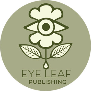
For Project 1, I created a logo for EyeLeaf Publishing, a fictional book publishing house that represents insight, growth, and creativity. The goal was to design a brand identity that reflects thoughtful storytelling and organic discovery. The eye leaf symbol was inspired by the idea that books broaden perception, much like a third eye, while also nurturing growth, like a leaf. The eye represents vision and awareness, while the leaves and ink droplet tie back to nature, storytelling, and publishing.
Click this image to see full pdf!
The design process for EyeLeaf Publishing began with sketching various eye leaf concepts by hand, allowing me to explore different visual interpretations of the brand’s identity. Once I identified the strongest design, I digitized it in Adobe Illustrator, focusing on refining the symmetry and balance of the elements to create a polished and cohesive look. For typography, I experimented with multiple fonts before selecting Beloved Sans paired with Montserrat, achieving a modern yet inviting aesthetic. To complete the design, I chose an earthy green color palette, inspired by nature, to symbolize wisdom, creativity, and the organic essence of storytelling.
The final design is simple yet symbolic, adaptable across various branding materials. I created five logo variations, including vertical, horizontal, and monochrome formats to ensure versatility across print and digital applications. Mock-ups demonstrate how the logo would function on book covers, websites, and marketing materials.
This project taught me how to balance symbolism and simplicity within brand design. Through refining my Illustrator skills and experimenting with typography and color, I gained a deeper appreciation for brand identity and cohesion.

