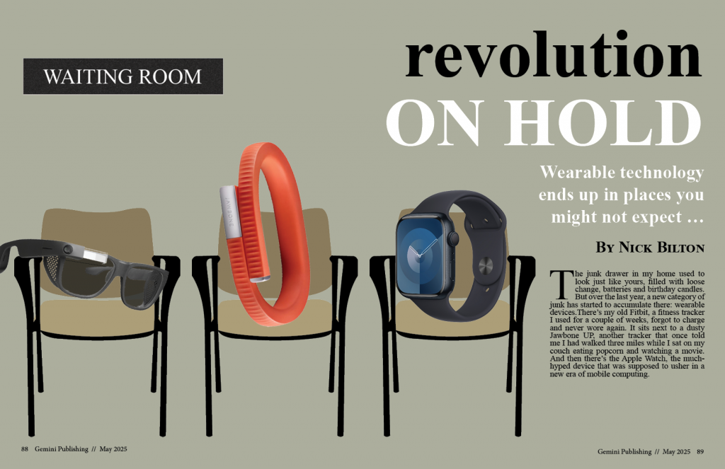
I enjoyed the animation project, it was a lot of fun learning the basics of After Effects. For this assignment, I took the fish from my Gemini Publishing logo and made them swim around, accompanied by water drops.
To begin, I used the pin tool to create a puppet effect on the tail and fin of the first fish. Then I changed its opacity on the timeline to make it appear like it’s coming up to the surface. I made a copy of this fish layer and reflected it to make the second fish. I changed the opacity of this fish to make it come up later in the animation. Combining these two layers made it easy to make the fish swim in a perfect circle because all I had to do was rotate the object 360°.
For the text layer, I wanted it to have the same effect like it were coming to the surface, so I put a mask on it and changed the feather to do this. The “water drops” are created using the radio wave effect. I messed around with a lot of the settings to manipulate the shape of the waves, notably the expansion and frequency. I changed the life span of the wave so that it would fade out like the ripples in water. I added a distortion effect to this layer to make the fish look like they were underwater, with how their shape was being contorted by the water drops.
The audio was pretty easy to do. I faded the background music in and out in Audition, and I cut up the original audio of the water drops and placed them in the timeline to match up with the ripples. This was my favorite project this semester.