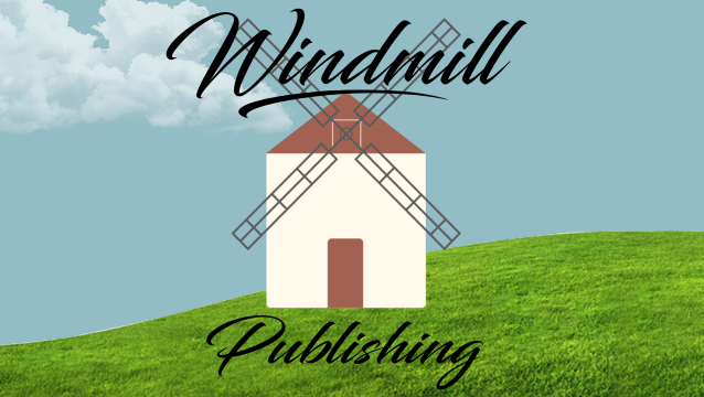
For the animation project, I animated the arms of my windmill and added wind sounds in the background to create the sense that the wind is turning the arms. The word “Publishing” is written out to match the calligraphy of the font. Before “windmill” appears on the screen, I made sure to have the actual windmill logo stand in for the word windmill for a few moments before “Windmill” fades in. As a last minute addition, I added the cloud movement to fill in the background space and add more motion aside from the windmill arms. I chose a Spanish guitar riff to stick with the Spanish roots that inspired the logo design.
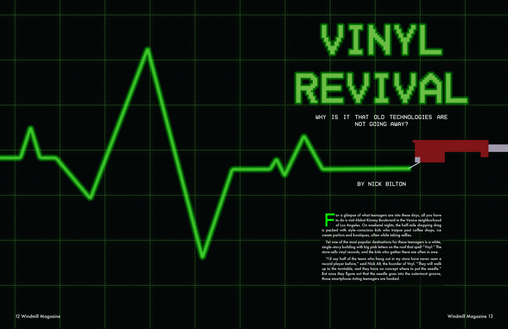
For project 3, I chose the story on old technology. The main idea of the story is about the increasing demand for older technologies, such as, vinyl records and Polaroid cameras. Vinyl records are the main focus of the story, which is why I chose “Vinyl Revival” as the headline, since there has been a rise in demand for vinyl records after years of slowing dwindling sales. To conceptually convey the idea of v records making a come back, I looked for inspiration in heart monitors to show that vinyl is not yet dead. I subtly used the rising and falling pulses to convey the diminishing demand of vinyl and then a sudden jump up to show that there is still a want of vinyl, by consumers. I also added a recorded needle to make it clear that the pulse is being created by vinyl records. For the headline font, I used a 16-bit font face to convey a sense a downgrade to draw upon the old technology concept. The green color I used was from the color palette of the film The Matrix (1999), I felt that the bright green is not only eye catching, but also provides a retro feel, drawing on the old computer screens with bright green code on a black background. Finally, for pages 3 &4, I took the grid background on the spread and used it in the side bar. I also added the pulse and record needle to the bottom the page to further connect the opening spread image with the remainder of the story.
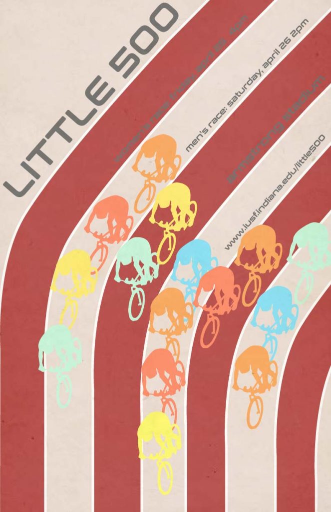
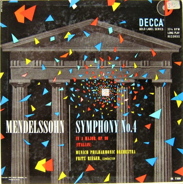
My influence of choice for Project 2 is Erik Nitsche. The Swiss designer, famous for his posters for General Dynamics, drew my attention by the dull and dark backgrounds contrasted by bright primary colors. In my own work the color of the cyclists draw inspiration from the color used on the album Mendelssohn created by Nitsche. I wanted to create a similar color collage as the one on the album. Sticking to four cyclists per lain, I wanted them to have that same scattered feeling as in the album along with the color inspiration.
Album cover by Erik Nitsche
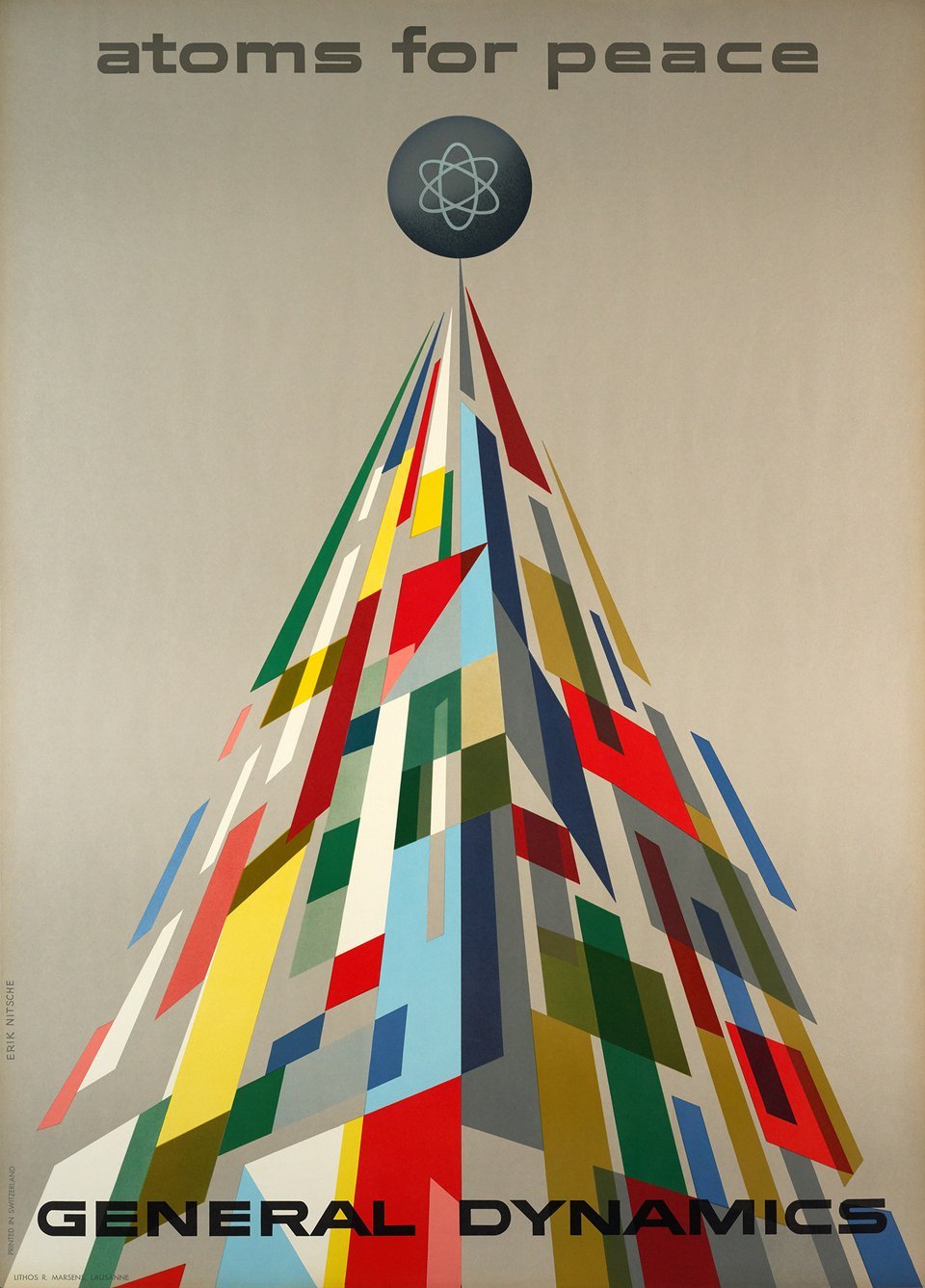
Nitsche’s Atoms for Peace poster was another inspiration for my poster. Nitsche’s poster has vertical motion directing the eye to the top of the poster presenting the message. I used the cyclists to create motion moving down. The sans serif font I used in my poster, Conthrax, was inspired by the font Nitsche uses in the Atoms for Peace poster.
General Dynamics poster by Erik Nitsche
Erik Nitsche started designing around 1936, working in Hollywood, on magazines. In 1955 Nitsche designed a series of modern and sleek posters for General Dynamics in order to outshine competitors in a blossoming atomic age. Nitsche’s modernist and clean, sleek is what drove me to choose Nitsche has my poster influence.