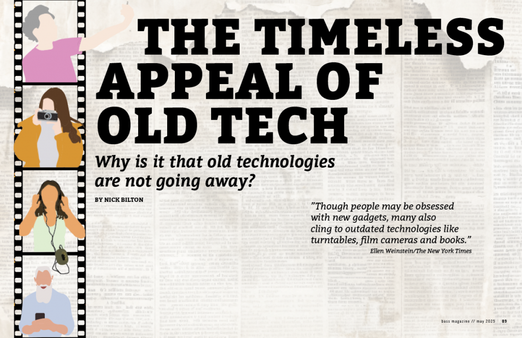
Making this magazine was a bit of a challenge. It took me awhile of on and off designing and drawing before I finally got something decent. I wanted to make the style of my spread customized with a hand drawn style. Alongside that I wanted to experiment with the idea of random fridge magnet letters that you might see in a junk drawer. To me it was a random but creative way of adding a unique touch to the overall design of the magazine spread. The rest of the text I used the Bitters font for a simple but serious legible font for the reader to view.
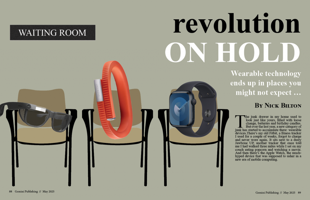
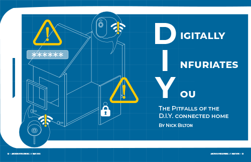
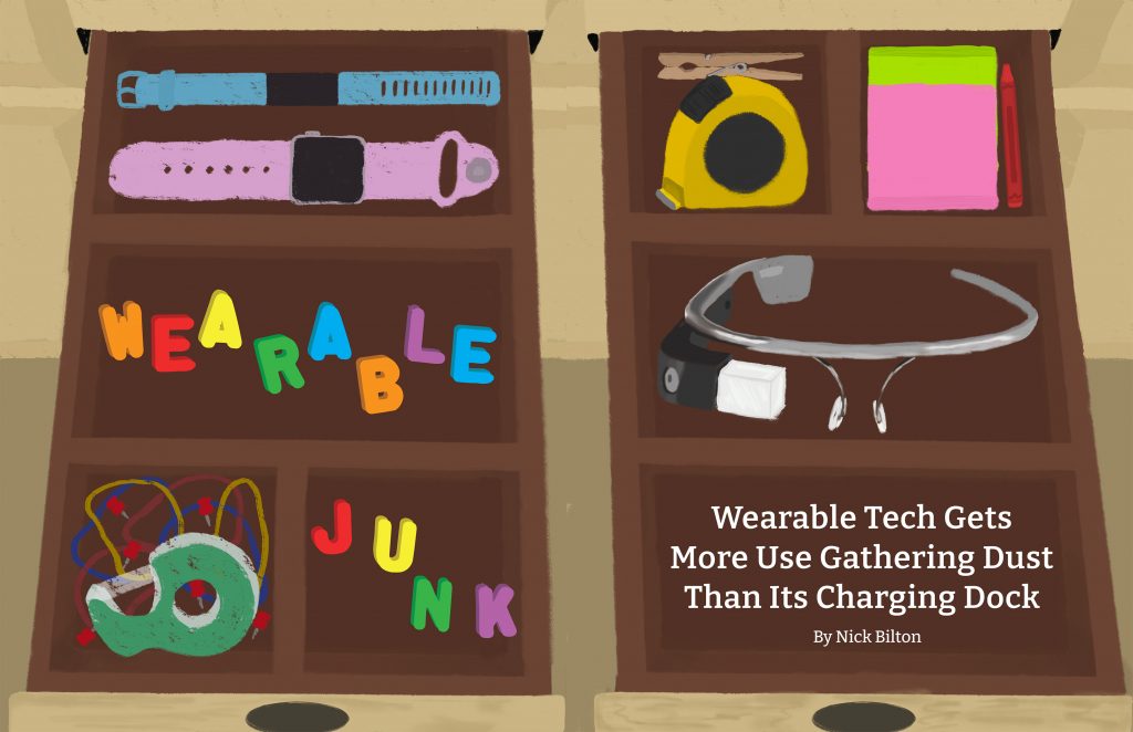
The article by Nick Bilton references the Apple Watch, FitBit, and Google glasses. So, likewise I wanted to try my hand at drawing those gadgets to add to the opening spread. Everything but the text is hand drawn by me. I chose to illustrate two junk drawers next to each other for the opening spread and added some recognizable items that are common to find in a junk drawer. You can find a tape dispenser, push pins, rubber bands, measuring tape, post-it notes, a singular red crayon, and a singular clothes pin. Together they all resemble items in a junk drawer as well as emphasizing the metaphor that Bilton uses referencing wearable tech being not usable enough except for decorating the junk drawer.
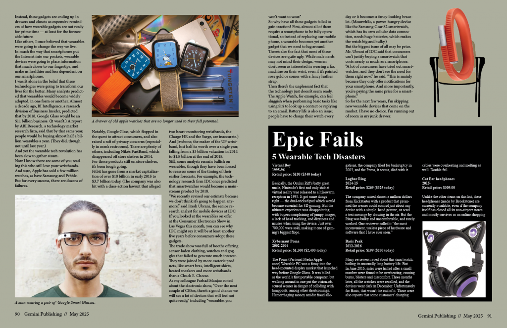
The second page of the spread has the familiar looking tech from the opening spread as well as some “junk” decorating the page. I also added some of the optional sidebar in the spread. It was a bit of a challenge with the main text not being very long. I wanted to just have the main text and no sidebar, but after 30-45 minutes of frustrated fiddling with sizes and measurements, I realized I needed to bite the bullet and add some sidebar to the spread. I didn’t have a lot of space and I didn’t want to squeeze everything in as it took away from the overall cutesy and simple design of the page. So, I removed some things while still getting the main gist although I do think there’s still some space that could have been more creatively utilized if I had kept experimenting with it.
Overall, it was a challenging and dragging process (on account of myself) but I really put myself out of my usual creative comfort zone. In doing so I was able to take the reigns of how I wanted the overall conceptual design to look and I think I did a good job.