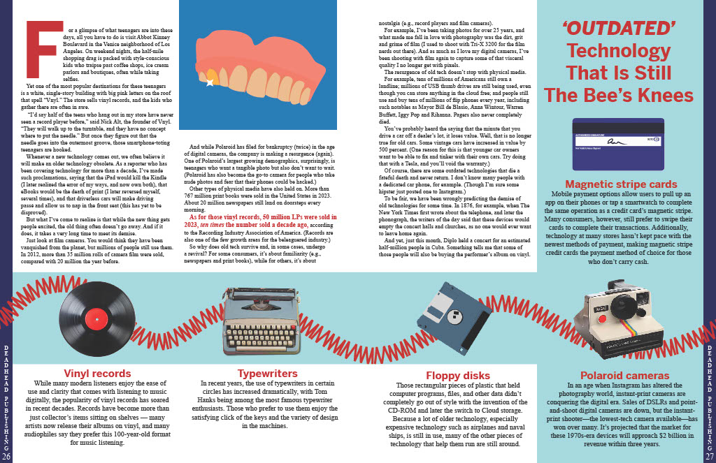
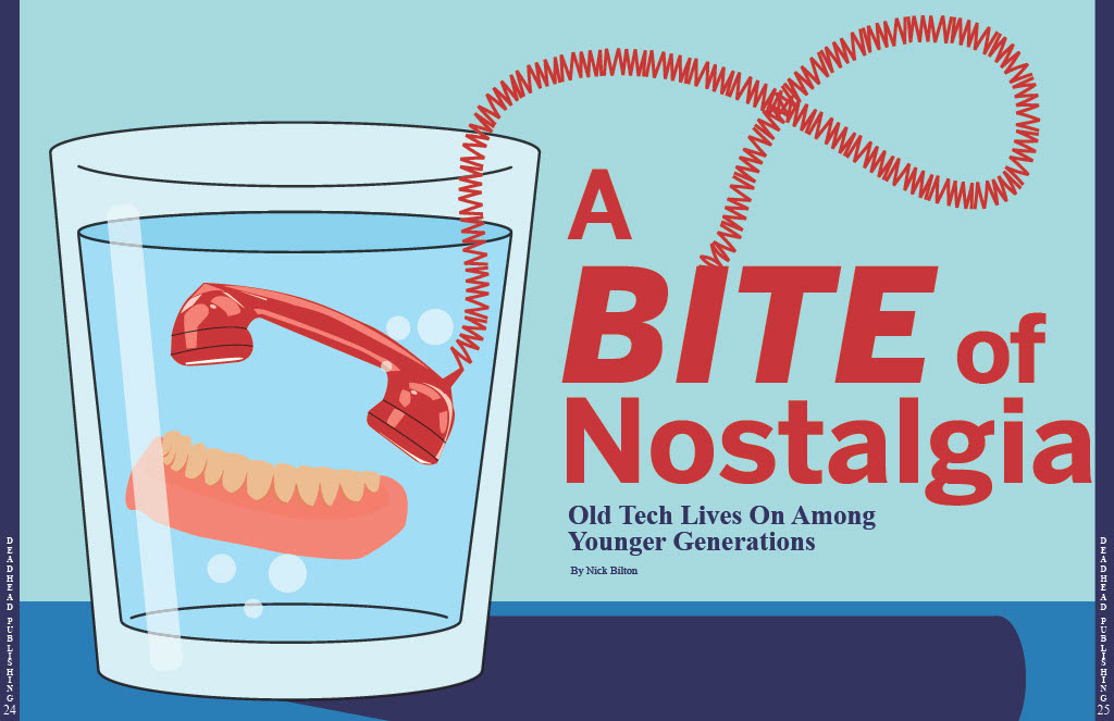
For this project, I designed a conceptual illustration for the “Personal” story. This story is about how social media’s personal touch outweighs its downsides. It highlights examples where social media has helped people to feel connected to loved ones who have passed away. The story conveys the message that although these people are no longer with us physically, social media helps keep their memories alive in the digital world. I wanted my conceptual illustration to convey this same message.
I began my creative process for this project by sketching different conceptual images that all convey the message of the story. I eventually decided on this image of a social post of a family on a laptop. I felt it effectively illustrated the idea of connection via social media with loved ones who have passed. In this family photo, I added a halo above the father and also pixelated him while leaving the mother and son unpixelated. I made these design decisions to convey that the father had passed away, but social media kept his spirit alive and connected to his wife and son.
Next, I decided on the headline Connected Through Loss. I felt it effectively reflects the story’s message while also grabbing the attention of the reader. Lastly, I formatted the layout of these magazine spreads. I used blue colors from my illustration throughout both magazine spreads so that everything in the article was visually tied together. Additionally, I feel like blue can be related to heaven, and therefore relates to this story about social media connecting people with those who have passed on.
Overall, I am happy with my final design for Project 3. Designing a conceptual illustration is more challenging than many other graphic design projects I have worked on. I felt that it encouraged me to push my creativity even further than usual, however, I had fun working on it and am proud of the way it turned out.
For this project, I chose to illustrate the “Old Tech” story. The article explained how technology is always advancing, and yet some older pieces stick around long after they’ve become obsolete.
The most difficult part of this process was deciding how to represent the technology best. The concept of revival or resurgence was challenging to design without feeling too cliche or overly illustrated. After lots of trial and error, I landed on the idea regrowth, shown through plant imagery. This seemed like a simple but effective way to illustrate old objects finding new life. I also decided to focus the deck on Generation Z as I felt it was the most important part of the article. Yes, these pieces of tech have stuck around with the generations that used to use them, but it’s the new generation who are causing the resurgence, thus making them most important to the story.
This is the first spread, click the image to see both in full.
When working on this spread, I was so grateful for the large amount of good quality photographs of the technology. This lead me to focus on photos as opposed to full illustrations for my concept. I wanted to highlight the technology existing in a modern space, and high quality photographs felt like the best way to do so.
Once I had all the images together, I had to tackle fitting them together with the story. The story was shorter than I had expected, leaving me with more room for the side bar and quotes. After lots of rearranging, I found a balance between the sidebar information and the copy that felt even.
The minimal style of this spread felt like the best way to keep the technology as the focus. There was an iteration of this project that had leaves crawling all around and through the story and sidebar, but in the end it was too busy, and I felt that it took away from the intricacies of the old technology.
This is the second spread, click the image to see both in full.
The color scheme lent itself to the spread easily. Although the light blue and green may not seem like an obvious choice for a technology spread, it worked perfectly with idea of regrowth and resurgence, and was easy to weave through both spreads.
Overall, I truly enjoyed this project. I have spent time working with layouts in past magazine and yearbook work and I was excited to work with it again. A lot of the design work I do now is purely social media based, so it was refreshing to get so much space to work with.
For this project, I wanted to create a visually compelling conceptual image that had never been done before. I thought of drawing a hand touching a phone from a bird’s eye angle, I thought of creating a collage of social media icons on top of an iPhone, but eventually I concluded I needed to incorporate a fingerprint into my image. This is why I chose to do my final idea, the icons masked into a drawn fingerprint.
Out of all the projects completed this semester, this was definitely the most difficult. I created clipping masks for each icon, and then had to piece them together on top of the fingerprint illustration. Every illustration was hand draw by me using the pen tool. It was frustrating at first to figure out why my clipping masks weren’t working, but eventually, after much trial and error, I succeeded.
Due to the contents of the article, plus the illustration, I decided to title this article “Personal Touch” as a callback to the fingerprint being the mark you leave after touching something, and after touching a mobile phone, your screen has visible fingerprints on it. I rewrote the deck to something I found more intriguing than the one we were given. The new deck I came up with was “Despite its flaws, social media’s ability to connect personally holds greater value” which I think does a great job of introducing the article’s topic and relates to the image.
The main color I chose to incorporate was blue. I did this because when I think of a color that is trusting and represents stability. Blue is commonly linked to trust, security, and reliability, making it an ideal color to highlight the value of authentic and personal connections on social media. Another idea with blue is that a lot of social media icons incorporate the color blue in some way, showcasing a subtle recall of popular brands such as Facebook, Twitter, and LinkedIn. By only using the color blue, the colorful social media icons in the fingerprint stand out.
Overall, I am incredibly proud of my work for project 3. I think my conceptual visual was innovative, clever, and intriguing. I am very proud to be able to showcase this on my portfolio site and show others.
For this project, I designed a magazine spread for an article about the personal connectedness that we feel due to social media. For the core idea, I created the social media heart icon but used an illustration of “heart hands” instead of an actual heart. I used similar text and social media-related iconography throughout the composition to create a sense of interconnectedness and relation.
For this project, I carefully considered the three story options given to us before deciding on the article about a robot that was created to purposefully waste the time of telemarketers. I thought this was the most engaging, original story of the three and I could see my illustration going any number of ways.
I knew that I did not want to create a full illustration of a robot in my design, wanting to stay away from an image that was too cartoony or silly, but instead lean into one that is fun and eye catching. I wanted to highlight my illustrative skills by drawing every image on the page, but wanted to walk the line between having it come off as too realistic or too childish. I looked to other examples of illustrated conceptual designs in newspapers and magazines, getting some inspirations in the type of drawings I saw as well as aspects of color-usage, typography and layout. In thinking about the best way to capture the heart of the story, I thought about different keywords regarding the players in my story. Tech. Business. Trapped. Phones. I finally settled on the idea of a phone cord, and literally having someone be trapped within the tangles of the line and unable to move; a metaphor for what this robot was doing to the telemarketers’ time.
I began with the robot, using the imagery of a more modern version of a physical robot, with smooth, clean machinery that appeared lifelike. I believed this was the best way to avoid creating a caricature of a robot, while still having an image that is recognize-able to people. I chose just to draw the hand to create this sense of power the robot holds, dangling the humans they call by their fingertips. The phone was simple; I used real images of landline phones and chose a blockier, straightforward phone layout that would look good in the robot’s hand. The telemarketer was my biggest decision. I knew I wanted a good blend of realistic, sophisticated rendering with the fun, more zany element of the story. Thus, I settled on a faceless, basically colorless drawing of a man in a suit that I think pairs well with the rest of the elements. To create the cords of the phone, I originally used the preset phone cord brush available in Illustrator. But after some trial and error, and especially after learning the fact that I could not adjust the color of the black cord preset they gave me, I decided just to use the brush as a guide, creating a path of the general direction I wanted my own cord to go, and then drawing the actual phone cord by hand to make it the color and size I desired.
Once all the elements were complete, I went for a light blue backdrop for my image, keeping in mind the aesthetics that come from picturing the words “tech” and “business,” and found a more futuristic, blocky typography for my headline that felt similar to something you would see in coding, without being too obvious. On the second page, I laid out my text, retained the light blue coloring for my sidebar element, and then carried over parts of the images from the first page, namely the phone and the cord. I felt I was still missing something, specifically a brand new drawn element, and so I went back to Illustrator and drew the robot’s hand again, this time completely open.
Finally, with such an interesting story with crazy quotes about the thought process of the AI, I chose to select three of my favorite quotes from the reading and magnify them to draw the reader’s eye. Overall, I am quite pleased with how my design came together, proud of my abilities in illustrating and happy with the overall look of my design because of the various elements I chose. If I could do one thing differently, I think I would have created another original illustration element for the second page instead of just carrying the entire phone over. Something fresh and new that maybe fits a little better with the layout of the page.
Click here to view the full PDF of both magazine spreads!
For this project, I took a look at all three potential stories for my magazine design and sketched a few ideas. However, I felt more drawn to and eventually chose the story by Nick Bilton. He writes about the idea that social media and technology bring people together in a way that outweighs the many negative consequences of technology. I first thought about ways to conceptualize the concept of social media having a personal touch or a way of conceptualizing the connection between two people due to technology. I did not want to simply personify a piece of technology, like an iPhone into a human-like figure, but I also did want to draw a connection between technology and humans. Therefore, I ended up coming up with this idea of two abstract human figures hugging each other but made up of popular social media icons. In this way, it is as if humans are fostering this connection with each other via the social media or technology they use.
When creating my imagery, I knew I wanted to stick with a pretty simple, almost monochromatic color scheme. I stuck with shades of blue to give the overall magazine design a techy feel. For the background, I used a blue and white center gradient and added a screen-like texture. I also tried to create human figures for my hand-drawn image in a way that reflects early 2000s tech design. I took inspiration from the Frutiger Aero design style that was popular in the 2000s. The name comes from Adrian Frutiger, a Swiss typeface designer, and Windows Aero, a visual style used in Microsoft’s Windows Vista software. This is where I got the inspiration to keep the human figures more rounded and have varying shades of blue with highlights of white.
Once I had designed my conceptual image, I worked on the headline. I chose “BEYOND THE SCREEN: THE UNEXPECTED DIGITAL HUG OF TECH” since my imagery reflects two figures filled with media hugging each other. I aimed to convey the message within the story about how technology goes beyond just being technology or media to creating positive benefits for users. After I created the headline, I had the idea of formatting the headline and deck into Apple iPhone text messages. I think this element of my design fits into the overall technology and social media theme of the story and imagery, as well as fits into the color scheme I chose. To match the text message idea, I selected the default Apple iPhone text message font family “San Francisco.” I wanted the font to be as close of a match to what a real text message might look like. I carried over this font into some of the other elements in my design such as the sidebar and pull quote. For my body text, I chose Roboto because I think it is easy to read and matches well with the theme. I also ended up creating and adding a scroll bar to both spreads on the farmost right side. I think this adds another tie-in to the overarching technology theme and works with the formatting of the headline and the deck.
For my second spread, I wanted to continue the tech, Frutiger Aero media theme. I first carried over the exact same background and color scheme. I also added some more hand-drawn technology-based imagery such as a mouse cursor and forms of modern technology like computers, a tablet, and a smartphone. I also carried over some of the social media icons that make up the hugging humans on the first spread into the tops of the last two pages creating another tie between the two spreads. The scroll bar is featured on the second spread as well but moved further down as if the reader has scrolled through the story.
For my additional elements, I included a sidebar designed in a way that is meant to reflect what a notification panel might look like on a user’s phone. Each section of the sidebar featuring fun facts about social media is designed to look like its own notification with hand-drawn icons. I aimed to create a sidebar in a way that does not break the overall theme of the design and instead adds to it. I also pulled out a quote from the story that I thought encompasses the overall message of not only the story but the conceptual imagery on the first spread as well.
Overall, I am pretty proud of my design work. I think I did a nice job at consistency and connecting both of the spreads. I think I also added a lot of technology and media-based design elements to craft a cohesive theme that matches the content of the story. I did struggle a little with making sure the pages did not end up with too much empty space due to the story not completely filling up both spreads. However, I think I worked out an effective solution. Although I like my conceptual imagery and think it gives off a Frutiger Aero vibe, if I re-did the project, I think I could push myself further to design something even more creative while still reflecting the content of the story.