The final project was definitely the most challenging for me. I didn’t have any prior experience with After Effects, so I was certainly going to have to put the time in to make this animation. Despite the animation only being ten seconds long, it still took a long time to complete, showing me just how difficult animating something can be. The main idea I had for the project was for the pineapple to continuously rise from the ground. Of course this would start with the crown sprouting up first, followed by the body. I wasn’t sure where to go from there at first but then decided it could be a fun idea to have the pineapple shoot high up into the sky and spin while falling back to the ground. In terms of sound, I used a “pop” sound effect when the different parts of the pineapple came out of the ground. The hardest element to determine the sound for was the different parts of the body coming out of the ground. I ultimately went with a crunching leaves as I felt it sort of reminded me of something trying to rustle its way out of the ground. Overall, I enjoyed this project as it allowed me to learn something new and challenged me in new ways in design.
Category Archives: N. Fossi
Influence Project – Josef Müller-Brockmann
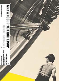
For our second project, I took inspiration from Josef Müller-Brockmann. Müller-Brockmann’s work was influenced by Bauhaus and constructivism where he eventually became known as one of the pioneers of Swiss graphic design. He opened his own graphic design studio in Zurich in 1934 where he worked as a freelancer, soon joined by collaborators in 1936. He then began the communication agency Müller-Brockmann and Co. alongside with being a consultant for IBM.
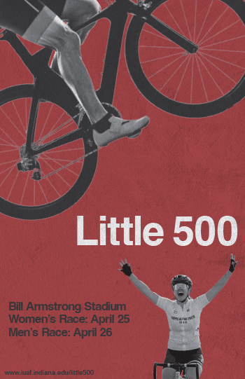
I came to the decision to use Müller-Brockmann as I felt that I could come up with a clear vision for a poster when looking at some of his past work. His work really stood out to me with its minimalist vibe. I really thought that his style would be able to create a poster design that is able to effectively communicate the information related to the Little 500 race.
Some of the key elements from Müller-Brockmann’s design style I tried to include were sans-serif typography, asymmetrical layouts, and use of negative space. These were the features that I saw across most of Müller-Brockmann’s work and felt it was crucial to incorporate them into my design.
The typeface seen on the poster is Helvetica. Most of Müller-Brockmann’s work uses the Akzidenz-Grotesk typeface, but I was unable to find the font for free online, so I thought Helvetica would be a fine substitution. Müller-Brockmann does not really do anything special with his type, he just uses a clean sans-serif typeface. He does usually include lots of text in work, and I tried to include as much as I could without it getting too busy.
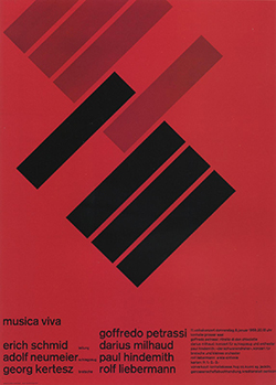
I took inspiration from Müller-Brockmann’s Automobil-Club der Schweiz, Schützt das Kind! for the photographic elements on the poster. While photographic imagery was not a staple of Müller-Brockmann’s style, he does have some artwork that utilizes it and I thought that its inclusion would make for effective design in this case. I also really liked the diagonal directional force from his posters for Musica Viva, especially the one from 1958. I felt that the diagonal direction of the cyclist paired the two inspirations together well. I included the other cyclist in the bottom right to fulfill that element of asymmetrical balance, as well as the inspiration from the Automobil-Club der Schweiz, Schützt das Kind! poster.
Lastly, the use of negative space was a huge feature from Müller-Brockmann’s work. A lot of his designs were very minimalist and left a lot of open space. It seemed like it would be a crucial part of my design to not overcrowd the poster. I again tried to incorporate the use of asymmetrical balance with my negative space by leaving lots of openness to the top-right and bottom-left of the “Little 500.”
Vivid Pineapple Logo Design
The first part that I came up with for the name of my company was pineapple. When thinking of a name I sort of just started thinking of the first words that would come to mind. Pineapple was one of those words and it stuck with me throughout the brainstorming process. The “vivid” part of the name did not come until the process of designing the logo. The original name was going to be “Sweet Pineapple,” but when designing the crown of the pineapple, I noticed a “v” shape within it. I decided that I should include a word that started with a V instead and ultimately settled on vivd\id. I felt with vivid I would be able to create a compelling brand voice for the company.
The process of the logo design began with sketching it out. My original idea was keep design the crown of the pineapple as it normally is, with it being made of leaves. One of the leaves however, would be a feather of a pen. I kept drawing it in different ways, but it never seemed to look right. I then thought about designing the crown in the style of a book. After a few tries I ended up on a design I liked and stuck with it through the whole process. All that was left to do was design the logo in Illustrator.
The final design is meant to portray a pineapple with an open book as the crown. This of course represents the brand’s role as a publishing company. I didn’t want to do anything to the main shape of the pineapple, as it is quite a recognizable figure and something people would notice right away. I made sure to choose bright colors to go along with the “vivid” part of the company name. I also felt that bright colors are good way to make the logo stand out. For typography, I settled on the font “Tarif” for the design. I found the font on Adobe Fonts when looking under the filter “funky” and liked the look of it.
Overall, I enjoyed working on this project. I’ve sketched logos in the past just for the fun of it, but I liked getting the opportunity to experience the full process of logo design. It was interesting to learn more about brand guides, as well as researching examples of other brands to give me a better idea of how to go about creating mine.