This project was definitely a challenge, but I’m happy with how close I was able to get to the idea that I had. The bowl of soup comes in as if pushed across a table to the viewer, and then the letter pops to the top of the soup. By far the hardest part was getting the rocking of the bowl at the end of its movement to look natural, and then finding a sound effect that would fit that movement. The rocking ultimately took quite a bit of trial and error. For the sound of the bowl moving, I ended up with a sound of a glass being pushed across a table followed by a rolling beer can, both of which I found on freesound.org and edited for timing and to remove the room tone. Finding music that felt right took a while, but adding the music and bringing in the type in time with it really pulled the whole thing together for me.
Category Archives: T. Hawkins
Project 3: Conceptual
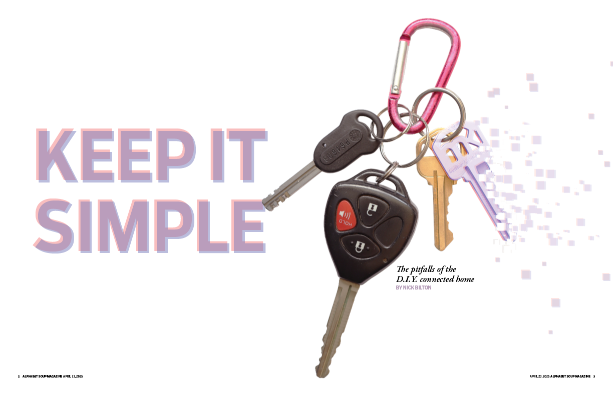
For this project, I designed a conceptual illustration and two spreads for the “DIY Home” story by Nick Bilton that was provided to us. This is a column about the writer’s experiences with “smart home” devices such as security cameras and locks that are connected to the internet and to the user’s smartphone, and his generally frustrating experiences with them.
I decided to use “Keep It Simple” as the headline for this story because something that runs through the story is the sense that it’s much easier not to have to deal with the complication of connecting your phone to things in your house; as he says “rather than making life easier, [the August Smart Lock] took 10 times longer to unlock than if I had taken the key out my pocket and turned the lock.” “Keep It Simple” references the KISS principle of design (“Keep It Simple, Silly”), that cautions against over-complication. According to the Interaction Design Foundation, “simplicity guarantees the greatest levels of user acceptance and interaction.”
Ironically, I initially found myself over-complicating this design at first, with the pixels from the key all over the page. Eventuallly, I realized that the solution to what was becoming a frustrating design was staring me right in the face, and I settled on this layout, which uses white space to emphasize the headline and keys. I also chose this font for the display text because of its simplicity.
The idea behind the illustration is twofold. First, the pixelated key references, on a very surface level, the idea of something physical becoming electronic. Second, the breakdown of the key into disappearing pixels references the intangibility of something that is electronic or controlled electronically. That is, if your phone runs out of battery or the wifi goes out, your key ceases to exist. Bilton closes his story by telling the reader about how he had to re-connect all his gadgets after his router died. This is an additional complication of “smart home” devices, but also speaks to the way in which the “internet of things” can actually make things harder to access because of their ephemerality. This is what the dissolving key references. The other keys on the carabiner provide contrast with the immaterial key. I decided I wanted to do a photo illustration because I felt that would emphasize this contrast between the real and the immaterial.
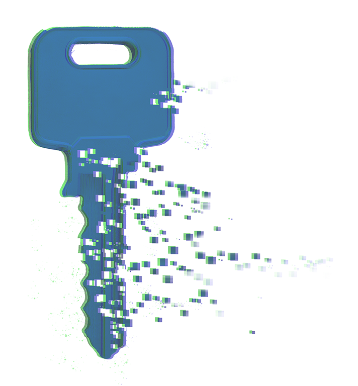
Before making the final photo illustration, I made a mock-up of the key to test both its appearance and the technique. I used a stock photo from Adobe for this. I used scatter brushes with a square pattern to create the pixel effect. The holes in the key are made with the same brush on a masking layer that creates areas of transparency. I then duplicated key and set both layers to different colors and offset them to create the glitch effect.
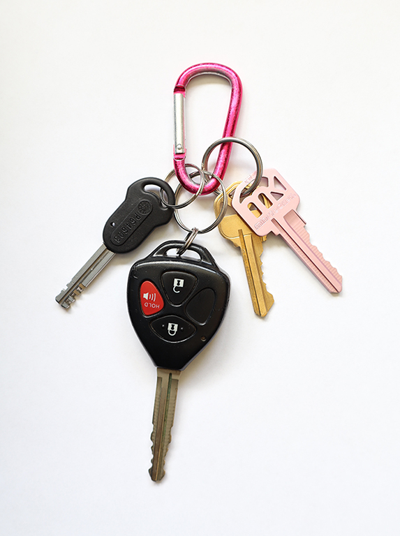
Once I had a sense of how I was going to make the glitched key, I moved on to the final photo illustration. The photo I used was of my own keys (with all the cards and tags removed), arranged in the particular shape that I wanted, and photographed with a digital camera. I used the same technique on the pink key, reduced the opacity of the shape and traced where the outlines of the key ring and the brass key would have been behind it, to create the impression of intangibility when compared to the other keys. Pink, blue, and the resulting purple mixture were chosen to complement the color of the carabiner and match the photo with the graphics.
For the second spread, I continued the pattern of purple pixels from the key, almost as if those pixels had blown in from the first spread, tying the package together. I also used the same colors and effect for the boxes in the sidebar. Because the story was so short, I decided to make the “sidebar” a full-page graphic.
Ultimately, I’m very happy with how the first spread especially turned out. I’m much less familiar with Photoshop and with photo illustrations than I am with Illustrator, and I feel like I learned a lot in the process about the more illustrative tools in Photoshop.
Influenced by Mari White
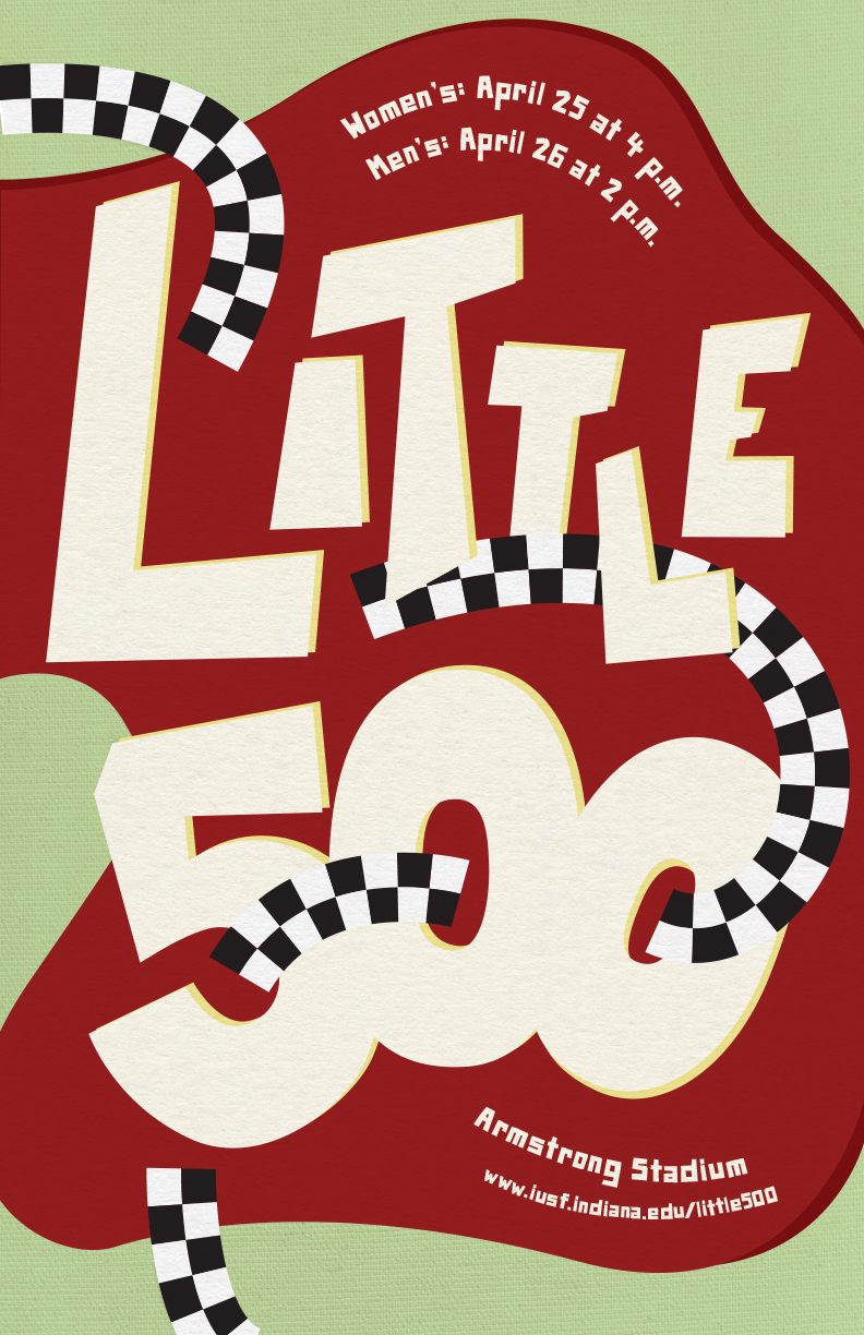
For this project, I took inspiration from the designer Mari White. I really wanted to go off the beaten path with this assignment and looked for inspiration from lesser-known contemporary designers with a distinct styles. I found Mari White by accident on Pinterest and followed the links to their website, Behance site, and Instagram. Their “poster experimentations” series, which was done out of a desire to rekindle their creative spirit, really spoke to me because of their energy and dynamic use of layered elements.
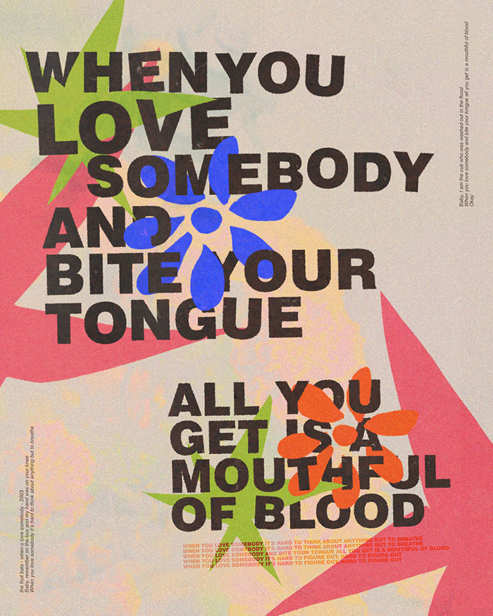
There isn’t much on the internet about Mari White apart from examples of their work. They’re a brand designer based in Tampa who has more recently designed band tour posters and shared a fair bit of personal artwork. I think this poster says a lot to me about them:
Mari is contemporary not only in their designs, but in their experience as a designer in the age of social media. The “poster experiementations” designs deviate significantly from their cleaner brand work and are more reflective of their internal artistic passion. I think this is why I was attracted to these designs in the first place.
The main typography is hand-lettered. Many of Mari’s designs feature uneven lettering that look as though they’ve been cut out of paper and pasted onto the poster. Although I kept my letters a bit cleaner, I wanted to hand-letter to get that spontenaiety. I tried to imagine what it would look like if I were to cut out the letters from a sheet of paper. In some of Mari’s designs, the letters have a darker double behind them, resembling a drop shadow. I also used this technique on the letters and on the red background shape. For the location, dates, and url, I used a royalty-free font called “Paper Johnny” that mimicks this cut-paper look.
Mari’s designs use lines criss-crossing in and around the typography to create a sense of energy and motion. In this spirit, I included lines in my design which are patterned with the checkers associated with racing. As Mari does, I passed these paths over and behind the main lettering.
The colors for this poster came from a couple of different places. The red of the background shape comes from the IU brand guide to link the poster to the Little 500 and to the school. The cream color, however, comes from Mari White’s tendency to use a cream color like a faded paper in their poster designs.
Over everything, I used two different paper textures. Mari White’s posters make generous use of texture, especially paper textures. For the background of my poster, I used a texture that is closer to linen. The main elements are textured with something more similar to contruction paper, like someone would use to cut out letters for a physically assembled poster.
Ultimately, I don’t think my design looks like something that would have come from Mari White. I was greatly inspired by their dynamic lettering and use of lines and abstract shapes, but Mari’s designs tend to be much busier than mine and I use a lot more rounded shapes. Even though I went back and forth between my design and Mari’s as I worked on this project, I think my unfamiliarity with their technique hindered my ability to mimic it, and I got a little carried away with my own ideas as I worked on the poster. I would like to try something similar again, perhaps with a little more focus on colors—especially the way the colors of overlapping elements interact—and using more varied and interesting shapes.