Conceptual Illustration: Old Tech

Click the image to view both full spreads!

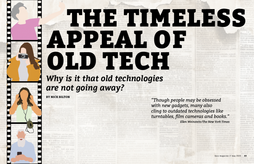
For Project 03, we were tasked with creating a conceptual illustration for a magazine spread based on one of three topics: DIYHOME, OLD TECH, or WEARABLE TECH. Each topic came with an article to base the conceptual illustration on, along with some sidebars and images to include in the spread. I chose the OLD TECH topic, which features an article by Nick Bilton about how old technology continues to be relevant in today’s world despite the introduction of new gadgets and technology.

In my illustration for this article, I wanted to depict how newer generations are continuously reaching for old tech, while some older generations are trying out new gadgets. I illustrated young and old people on a film strip and placed it on the opening spread. To unify the opening spread with the next spread, I continued the film strip along the bottom of the next page. I added a faded old newspaper background to give dimension and texture to the pages, which looked a bit plain and overly white before.

On the opening spread, I included a quote by Ellen Weinstein on the right-side page: “Though people may be obsessed with new gadgets, many also cling to outdated technologies like turntables, film cameras, and books.” I think my conceptual illustration represents this quote well. I found this quote attached to the real article posted on the Seattle Times website and thought it fitting to include in my spread.

After adding the text to the next spread, I realized the article was very short, so I had to get creative to fill the remaining white space. I started by adding a callout within the article with a quote I thought was important. This helped lengthen the article but not nearly enough. I looked for images in the provided materials but was disappointed to find none. I ended up finding my own image, which I feel fits alright, though it’s not my favorite. I wished the article had come with an image to add.

Next, I designed the sidebar from the provided materials. I made it larger than usual to fill the space, given the short article. I like how it turned out, though I wished it didn’t have to be so large. Finally, after adding the sidebar, there was still some room at the bottom. I brainstormed and tried rearranging the page, but it never looked right. Ultimately, I decided to add some of my own copy at the end, summarizing the article’s message in one sentence. I really like this addition as it pulls the spread together nicely.

Overall, I’m decently pleased with the outcome of my conceptual magazine spread. This wasn’t my favorite project, as I struggled with coming up with a conceptual idea. I don’t think conceptual illustrations are my strong suit, but I enjoyed exercising this skill throughout the project!

Logo Animation: Bass Publishing

For Project 04, we were tasked with creating an animation for the logo we designed in Project 01. My logo for BASS PUBLISHING is an outline of a bass fish. For this animation, I opened my original logo design file and inverted the colors. The original logo features a red fish and letters on a white/transparent background, which didn’t suit my idea, so I switched the colors.

Next, I decided to create bubbles for the animation. After searching extensively on YouTube, I found a tutorial that allowed me to create bubbles from scratch in Illustrator. Following the tutorial was actually quite fun, and I think it added a unique touch to my animation. The bubbles look really realistic!

I used the puppet pin tool we learned in After Effects to move the fish’s tail without moving the entire fish. Navigating the fish around the frame was the hardest part. I wanted the fish to move across the frame and then come back from the other direction, so I had to ensure all my keyframes were correct to prevent the fish from turning around on frame. It was a tedious process, but I’m very pleased with the result.

After completing these steps, I felt the plain red background made the animation look somewhat boring and flat, so I added some movement with a gradient. I started the animation in blue to enhance the underwater feel with the fish and bubbles. The part I’m most unsatisfied with is the popping of the bubbles at the end. I tried my best to make them look like they were popping, but I couldn’t get them quite right.

Overall, I’m pleased with my animation and enjoyed using and learning the features of After Effects, as it was a new application to me.

Influence Poster: Seymour Chwast

My Little 500 poster is influenced by Seymour Chwast, a legendary graphic designer, illustrator, and typographer, born in 1931 in the Bronx, and now 93 years old. Chwast is celebrated for his bold, vibrant colors, playful typography, and whimsical tone. His hand-drawn, quirky, cartoonish aesthetic has become his signature style.

Chwast’s work spans a wide variety of mediums, including posters, book covers, advertisements, and children’s books. He often incorporates humor and clever visuals into his designs. Below are examples of Chwast’s work that inspired me for this project.

Bailey Cappella, rider for Kappa Alpha Theta bike team, finishing first in the Little 500 race in 2024.

When I first selected Seymour Chwast as my influence, I didn’t have a clear idea of how to integrate his style into my poster. However, after researching his work, I began to appreciate his illustrative approach. This inspired me to create an illustration of a Little 500 photo. I immediately knew which photo I wanted to recreate: the moment my friend Bailey Cappella crossed the finish line at the end of last spring’s Women’s Race. Bailey and I are both in Kappa Alpha Theta, but unlike me, she’s a member of the bike team.

Click the image to see the full pdf version of my poster.

After tracing the photo of Bailey, I decided what to do next. I knew I wanted to give the poster a border because almost all of Chwast’s pieces include borders lining the edges of the page. For inspiration, I turned to his work of Judy Garland. I was drawn to the way he outlined her shape and decided to do the same with Bailey’s figure. It took a few tries to get the outlines just right. I aimed for a slightly wonky and quirky look, staying true to Chwast’s style.

Next, I selected the colors for the outlines. I debated whether to draw from Chwast’s palette or take inspiration from The Little 500. Ultimately, I decided to use the colors of the flags in the Indiana University Student Foundation (IUSF) logo. Since IUSF organizes the Little 500, I felt it was fitting to incorporate their influence into the design.

Finally, I worked on adding type and the border. I chose letter colors that matched the outlines. For the border, the answer became almost too obvious: checkers, representing the iconic checkered flag waved at the finish line of the race.

Overall, I am very pleased with how my poster turned out and I hope that Seymour Chwast would appreciate it.