The idea behind my animated logo was already planned. It seemed petty obvious to me that I had to animate the ladybug flying into frame and landing and morphing into the final logo.
First, I had to make some adjustments to the actual logo to get separate parts that could be animated. I adjusted the clipping masks and moved each part onto its own layer.
Then, I had to figure out a way to incorporate the middle stylus part into the animation, so it felt like it had a purpose and wasn’t just there. My idea originally was that the stylus also resembled bug antennas, but I had to figure out how to animate those where they would end as one piece. I decided that my best option was to triple that element, animate two of them as antenna, and animate the other one as the middle of the stylus. In-class, we learned how to animated elements to seemed drawn on and that was the perfect way for me to animate the middle part rather than just having the opacity rise from zero in its place.
I found the ability to animate a composition within a composition very useful. First, I animated the logo’s parts in its own composition; this consists of the antennas wiggling and the wings rapidly flapping. Then, I animated the logo’s position, scale, and rotation in the larger composition to make it fly around the composition.
I scrolled through music and sound effects for awhile to find the ones I liked. I wanted the music to be whimsically but not sound like a fairytale, so that left limited options. It only seemed right that the sound effect would be a flying bug, to make the ladybug seem more realistic.
I really enjoyed this project and had fun learning more about using After Effects. This semester was my first time using After Effects, and this was only more second exposure to it ever. I never though I would get into animation, but know I have so many ideas how I can incorporate animation into my advertising composition and portfolio work. I believe this will elevate make my work stand out and i am excited to build even more skills within this application.
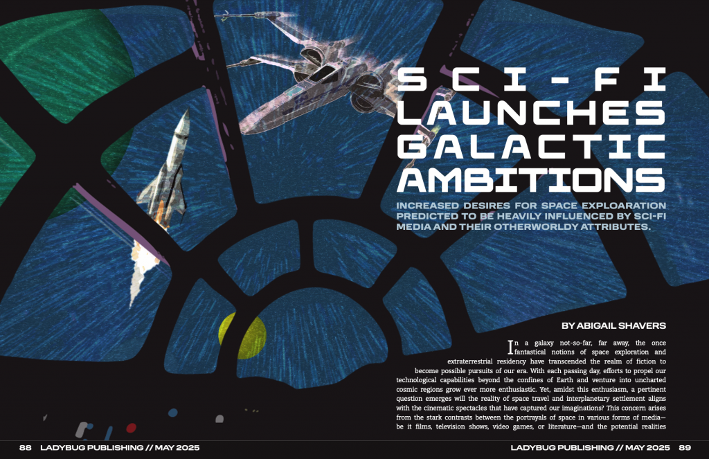
When this project was introduced I was excited about being able to choose an article of my own. I decided to make a cover image and magazine layout for an essay I wrote in Spring 2024. The story is about how media depiction of space and intergalactic travel has warped humanity’s expectations of what space is and could be despite the realities and limitations of space explorations.
During the brainstorming process, I tried a few different designs for the cover image. Similar to the final product, most ideas made use of use photographic and illustrative elements. Instantly, I loved the idea of showing space from inside a fictional cockpit.
When beginning to design the cover image. I felt that it was necessary to combine elements from the fictional Star Wars universe and from the reality of space exploration. I found that the best way to do this was to depict both kinds of spacecraft outside from the perspective of the viewer.
I did have to spend more time creating the spread layouts than expected because I ran into difficulties. I knew I wanted to bring the first part of the story onto the cover image, but this part gave me the most trouble because I had to adjust the two different text spaces to fit their placements while still having the text connect between the two pages. However, I did enjoy finding and/or creating various elements to add character to the second spread. I found it best to use the same typeface for the subheadings as the main title to connect those elements. I also had the idea to add pops of the blue and red hues from the buttons in the cover image to emulate the iconic lightsabers from the Star Wars franchise.
For the bigger elements, I felt that it was important to use these elements to give more context to readers who may not have seen the movie the article references throughout. The chart entitled “Portrayal vs. Reality” makes more general comparisons between the franchise’s sci-fi depiction of space and the real conditions of space. This chart can also serve as a concise summary of some of the points made later in the article. For the photograph, I wanted to use a scene from the movie to show how fictional the world is; while looking for the specific scenes, I kept finding photos from filming on set that featured the director giving directions to different actors and thought this could be an interesting way to show the fakeness of the Star Wars worldbuilding. In the photo I chose for the layout, you see J.J Abrams in his typical work attire instructing his two leads in their first on-screen interaction while wearing their unrealistic galactic costumes.
I loved working on this project because I feel like I had a lot of creative freedom from being able to pick my own story to designing pretty much every detail of the spreads’ layouts. If I were to change one thing about my design it would be to bring the primary color of the inside of the ship in the cover image to the story spread as a background color and make the story text white. Overall, I am happy with my final layout and cover image and feel that I executed my vision for this project.
For my influence project, I took inspiration from Paula Scher’s work. When choosing my influence, I wanted to look for a female graphic designer. Not only did I find one, but I believe I found the ultimate female graphic designer. I came across her work when looking for female graphic designers in general, and I loved how her work stood out amongst others because her style does not fall into conformity; through her use of strong layouts, complex typography, and bold colors, her work breaks norms of typical commercial graphic design and does not scream her gender identity like I commonly find amongst other designers. When starting to research her more, I came across an episode of Abstract: The Art of Design on Netflix that focused on her insights and career; through direct interviews with Scher and her colleagues, I was granted a better look into her personality and thoughts and instantly knew that she would be my influence.
In my work, I aimed to capture styles from her various works to encompass different eras in her career. So, for this reason, I approached my project in sections: design elements, photography, and typography.
Design Elements
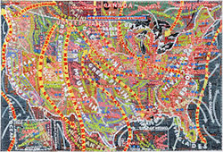
I have to admit the overall layout of the poster changed a few times because I trapped myself within a box by only designing on a vertical canvas. One day in class, Pr. Layton reminded us that we can make our poster horizontal if desired; I changed my design right away and thankfully I did because I love it so much more. I also feel that it better represents Scher’s influence because the inspiration for that illustrated track in the background stems from her work designing maps which are typically always horizontal. Her maps were also painted, as were her early typefaces, so I added the artistic paintbrush strokes to the track to emulate this. She also tends to make use of all available space; therefore, there was no doubt in my mind that filling the middle of the track was necessary and the checkered pattern made the most sense to represent the finish line of the race.
Photography
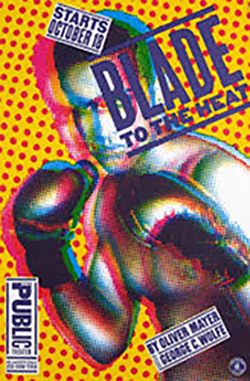
The photography in my project stands out as a main element of the poster but strangely was the easiest part to design. In Scher’s designs, she has a distinct photographic style that includes cut-out, two-toned portraits sometimes with stylized overlays. I knew how to achieve this style because of our previous Pop Art and Constructivist exercises. First, I was drawn to this certain image of cyclists racing down a track, so I brought it into Photoshop, cut it away from its background, adjusted the lighting, and changed its mode to grayscale. Then, I chose the crimson color from Indiana University’s official color pallet and created a halftoned image to showcase it. Finally, I decided that the photographic element should reference a specific piece of her work, Blade to the Heat for The Public Theater, so I created a second version of the image using IU’s official black and added it as a second top layer to bring out more detail and mimic the 3D quality in her work.
Typography
Typography is the most important part of Scher’s influence. In the episode I watched, she says, “Typography is painting with words. That’s my biggest high. It’s my crack.” I knew I had to make creative and atypical design choices with the type to follow her influence correctly. At this point in my design process, I had only a cyclist image over the bland track illustration, so the choice seemed obvious. I would position the type along the track’s curves to make better use of the space. I had seen Scher do this in some of her work and felt that it would make more sense for my layout than trying to position straight blocks of text in an overwhelmingly round layout. Trying to fit lines of information into limited sections where separations between text naturally made sense did pose difficulties at first; however, I just kept making changes to their paths or the text placements and eventually landed on a layout that was readable and showcased all the important information.
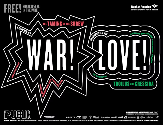
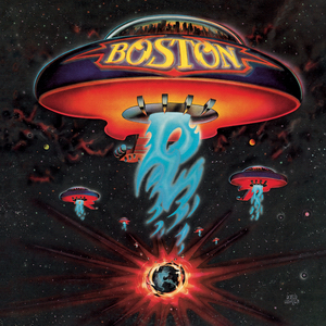
Paula Scher stood out early on, skipping football games in high school to attend art classes. She studied illustration at the Tyler School of Art, where she fell in love with typography, influenced by contemporary culture like underground magazines and record covers. In the 1970s, she landed a job at CBS Records, designing album covers and working closely with artists—though they often dictated the creative direction. Her cover for Boston sold six million copies in a month, a success she finds ironic given her dislike for the design. Over time, she pushed typography to the forefront of her work, developing a bold, urban, and expressive style. Her poster for Bring in ‘da Noise, Bring in ‘da Funk became iconic and widely imitated. Later, she moved into environmental graphics, designing systems that could be used for navigation or a sense of place like the one at Rockaway Beach after Hurricane Sandy. Inspired partly by her mapmaker father, her painted maps are meant to provoke thought rather than provide answers. Though she didn’t initially see herself as a feminist, working in a male-dominated field revealed the challenges she faced. Today, she’s considered one of the most influential female graphic designers.
Prior to researching Scher, I never had a strong design influence. But I believe I have found the prefect influence for me. Aside from her design style, Paula is a top graphic designer with decades of successful work who started out having to prove her worth a young female in a male-dominated profession. I feel very inspired by her journey and hope to have at least an ounce of her success in the future.
The first element I chose for my brand was the brand voice. I knew I wanted to make my brand voice welcoming and inclusive because I feel that those are important qualities for any entity to have in relationships whether personal or business.
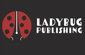
The hardest part for me was choosing a concept for my company. I had a few trial-and-error concepts before I landed on Ladybug Publishing. I tried coming up with names and logo mocks for various ideas, but none felt strong enough until I came up with the visual idea of a ladybug. One that I worked on for a while was an illustration of a peach pit, but it didn’t give the sophistication that a logo should and didn’t have much symbolism or purpose behind it either.
The visual concept started with a small sketch of a ladybug, but it felt too intricate and unmemorable for a solid logo design. Then, I began to sketch just the ladybug’s body and focus on the spotted design element. I started to like this design because the foundational shape of the body is circular and makes for a good circular logo concept. During my sketching, I realized that the shape of the closed wings against the body came to a point in resemblance to a pen stylus. Then, I decided to manipulate the shape of the wings to emphasize the negative space between them, so I could integrate a stylus shape into the ladybug’s body. Finally, I utilized the negative space even further by adding contrasting detail elements to emphasize the stylus illustration more. Both the ladybug and pen stylus stand out while remaining balanced within the illustration because of my use of bold colors which are both iconic and contrasting.
The typography was the second easiest decision for me. To stay true to the brand voice, I felt that a sans serif was more welcoming and less stiff looking; personally, I am also drawn more to the look of sans serif type. When looking through Adobe Fonts, I came across Tomarik, and immediately downloaded the font family and implemented it into my design. I feel that Tomarik perfectly combined the welcoming and inclusive brand voice by having an imperfect line weight while still looking professional.
Overall, I love my logo design, and I am glad I spent a lot of time in the brainstorming process to reach a concept and design that I am proud of.