The Groove We Live In

Click this image to view full pdf!

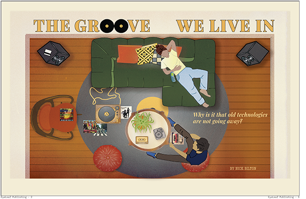
For my Project 3 conceptual magazine, I chose the article OLDTECH by Nick Bilton. I was really drawn to the idea that older technologies like vinyl records, Polaroid cameras, and cassette tapes aren’t just surviving, they’re thriving because of how people still connect emotionally and physically to them. I wanted my illustration to reflect that in a way that felt warm, immersive, and metaphorical. I created a top view living room scene filled with analog tech, showing two people relaxing and engaging with retro formats. Instead of placing the image on a standard magazine page, I framed the entire scene within a rounded, analog-inspired layout that feels like you’re looking into the past through an obsolete interface.

I built the illustration in Illustrator and then used Photoshop to add texture and depth. I layered a soft retro grain over the entire piece, added subtle drop shadows, and applied sprinkled gradients and radial shading to create a warmer, more tactile look, especially around the rug and table. These effects helped the illustration feel more like a printed object rather than something flat or overly digital. I also made sure to include specific visual elements from the story, like vinyl records, a cassette tape, and a vintage camera, which are placed intentionally throughout the space to draw the viewer in.

For the typography, I used a bold retro serif for the headline “The Groove We Live In” and paired it with a softer italic style for the deck and byline. I wanted the typography to support the illustration while still maintaining a clean editorial structure. One of the biggest challenges was making sure the concept felt thoughtful without being too literal. I didn’t want it to just be a room with old objects in it. I wanted it to suggest that these objects still hold meaning and are very much part of the present.

Overall, I’m proud of how this project turned out. I focused not just on aesthetics but on how illustration can carry an idea forward and enhance the message of a story. This was the first time I felt like I was able to combine narrative, design, and visual storytelling in a complete and cohesive way.

Animation Project

This animation for EyeLeaf Publishing logo was created in After Effects, which was a learning experience in itself. I started by using fade-in effects and scaling to gradually reveal the logo, but what really shaped the tone was the dramatic soundtrack, “Reveal” by Francesco D’Andrea. The cinematic and tense quality of the music gave the animation a surprisingly serious mood, which contrasted interestingly with the organic visuals of the brand. I also incorporated a typewriter sound to emphasize the publishing concept, timing it with the appearance of the company name. Learning how to time audio and visuals precisely in After Effects, especially syncing sound effects to movement, was one of the most challenging but rewarding parts of the process.

Logo Animation

In are last project of the semester we had to create an animation for the publishing logo we created in the beginning of the class. this project was definitely changing for me, this was my second time ever using adobe after effects. It was challenging to understand all the mechanics and what dose what with the platform, I tried my hares doing nothing fun but making sure I could actually do what I wanted to. I wanted the shoe to looking like its “walking or hopping” on screen and adding the foot step audio cuddly in the background helps. as for the affect with the word Publishing I just messed around with all the affect available and came up with this almost push domino affect you see. overall I will say this was the most challenge project I’ve done yet but for this being my second time doing nothing like this Im happy with the turn out of it and although it was a bit of a struggle I had fun with it!

Animation

Windmill and text displaying "Windmill Publishing" on a green hill with a cloud passing overhead.
Play animation below

For the animation project, I animated the arms of my windmill and added wind sounds in the background to create the sense that the wind is turning the arms. The word “Publishing” is written out to match the calligraphy of the font. Before “windmill” appears on the screen, I made sure to have the actual windmill logo stand in for the word windmill for a few moments before “Windmill” fades in. As a last minute addition, I added the cloud movement to fill in the background space and add more motion aside from the windmill arms. I chose a Spanish guitar riff to stick with the Spanish roots that inspired the logo design.

Animation Project: Love More Publishing

Creating the animation for my “Love More Publishing” logo proved to be one of the most challenging but fulfilling creative experiences I’ve encountered this semester. Right from the beginning, I had a vivid idea: I aimed to design a brief animation where a butterfly flies into the screen and lands on a flower, leading to a fade to black that showcases my logo text. What appeared to be a straightforward concept, was harder than I thought. One of my primary challenges was making the butterfly’s wings flap in a way that appeared natural. Initially, I attempted to use rotation keyframes on layers imported from Illustrator; however, regardless of how I adjusted the anchor points or expressions, the wings continued to spin awkwardly rather than flap smoothly. I decided to abandon the original wings and recreate them directly within After Effects using solids and simple shapes. This decision allowed me to take control over the animation, and it finally began to resemble my vision. It taught me that at times, the best solution is to start anew with a simpler method.

Timing presented another obstacle. I had to coordinate multiple keyframes for position, scale, opacity, and audio to ensure everything transitioned fluidly over 10 seconds. The landing bounce, fade to black, and text reveal all needed to feel cohesive. I also faced difficulties with audio initially, uncertain about where to find royalty-free music and how to integrate it into After Effects, but once I found the YouTube Audio Library, that finishing touch truly helped tie the piece together.

In spite of the challenges, I’m proud of the progress I made independently from creating layers and utilizing expressions to resolving export settings. I realized how much consideration and technical precision go into what may look like a simple motion. I take pride in the warmth and character I infused into this animation, and I believe it effectively reflects the brand’s essence. In summary, this project illustrated that animation can be challenging, but also incredibly rewarding. I now have a better grasp of how to break down a vision into manageable steps, and I’ve recognized my growth not only as a designer but also as a creative problem-solver.

Conceptual Illustration: Maquiladoras Under NAFTA

Click on this image to view the full PDF!

When I designed my conceptual illustration, my intentions were for the design to embody the deep betrayal that maquiladora workers, particularly women, faced under NAFTA. The narrative extended beyond factories; it showed the illusion of opportunity and the harsh reality of exploitation. I decided upon industrial colors to illustrate erasing workers’ identities, leaving only the bland production machinery. The viewpoint of women employed in these factories was nameless; they were recruited for their ease of control, closely monitored, and ultimately discarded when they became a burden. I aimed for my design to produce a similar feeling of being destroyed by a system that valued them for their labor, not as human beings. I examined actual photographs from maquiladoras to provide a visual foundation for the story. Observing pictures of tightly packed sewing stations, where workers cramped beneath bright lighting, influenced my perception of the physical environment I aimed to show. The infinite lines of machines and individuals highlighted that these factories were not hubs of opportunity; they represented an empire of endless labor. This understanding impacted the repetition and structure of my final work.

Women working in maquiladora factories symbolized how individual identity was erased under NAFTA’s system. The overwhelming scale of maquiladora production lines stretches endlessly without regard for the workers inside them.

Early sketches.

I examined authentic photographs taken within maquiladoras, but the design evolved once I began to sketch. I was determined not to show violence. The genuine heartbreak portrayed was in how the exploitation became almost routine. During my initial sketches, I explored the concept of workers blending into the machines, gradually losing their human characteristics. These sketches influenced how I constructed the final layout, duplicating the human figures with the mechanical structures until they nearly vanished.

As I moved further into the design, I understood the importance of illustrating the emotional and social repercussions and highlighting the physical effects endured by workers. Incorporating health statistics anchored the project even more effectively. Charts depicting the elevated rates of respiratory ailments, gastrointestinal issues, and injuries among maquiladora employees made it clear that the damage was not a hypothetical but a real-life tragedy. The comparative graph illustrating the differences between maquiladora workers and other demographics, such as housewives and those employed outside maquiladoras, emphasized how significantly worse the conditions were within these factories. I strategically placed this evidence toward the conclusion of the design, as it served as a compelling final argument against the notion that NAFTA generated genuine opportunity.

Health data shows maquiladora workers faced major health risks, including respiratory illnesses, injuries, and long-term health problems.

This was a part of my ASF side-spread. I wanted to include real-life data showing the detrimental effects the maquiladora factories caused workers. This graph shows health data maquiladora workers faced major health risks, including respiratory illnesses, injuries, and long-term health problems.

Comparison showing maquiladora workers suffered far worse physical health outcomes than other working groups.

This graph illustrates a comparison of health issues across work groups. Compared to housewives and non-maquiladora workers, maquiladora employees report significantly higher rates of musculoskeletal symptoms, difficulty breathing, and other health issues. These disparities highlight the physical toll of factory work under poor conditions.

Reflecting on the final piece, I believe it encapsulates the complex betrayal central to the maquiladora system. It went beyond merely broken promises; it included lives taken, health compromised, and identities destroyed for profit. Through my choices regarding color, structure, and the elements I decided to include (and exclude), I aimed for the design to prompt viewers to face the human toll frequently obscured by trade agreements that typically present only one perspective.

Anthony Influence Project

My Poster for the Little 500 Influence Project (Theophile Steinlen)

This is the final design that I decided to go with for my poster. My inspiration was Theophile Alexandre Steinlen. He was a French painter who had a very unique painting style. I used my typography to reflect his writing style by tracing his handwritten letters and forming them into the words I wanted them to say. I also attempted to create drawings with brush strokes that were reflective of the ones in his paintings. Below are the paintings that I used for reference.

Influence Poster: Josef Müller-Brockmann

Click on the image to view PDF

Designing the Little 500 poster through the lens of Josef Müller-Brockmann’s work was an exercise in restraint, structure, and purpose. Known as a key figure in the Swiss International Style, Müller-Brockmann emphasized clarity, order, and functionality in graphic design. His iconic Musica Viva posters and his seminal book Grid Systems in Graphic Design guided my process, showing me how structure can elevate visual communication. I wanted to emulate Brockmann’s Beethoven poster in particular. I started by sketching the composition of the wheel and adding elements of Brockmann’s influence as I went. I eventually got a good idea of how I would make it in Illustrator, mapping out where the typography would go.

Initial sketch

As I transitioned to the digital phase, I focused on incorporating Müller-Brockmann’s key principles: clean geometry, typographic hierarchy, and grid-based composition. The biggest challenge of this process was staying true to Brockmann’s minimalist style while simultaneously communicating to the audience that the centerpiece is a bike wheel. The grid design on the right side of the wheel signifies the motion of the spinning wheel. Brockmann’s work does not typically incorporate bright colors, but considering this is an IU event, I felt like the bright red was a must-have.

Josef Müller-Brockmann began his design journey in Zurich, Switzerland, where he studied architecture, design, and art history. He later opened his studio and became a leading figure in Swiss graphic design, known for pioneering the International Typographic Style. His work emphasized grid systems, objective communication, and the use of sans-serif typography to create clarity and order. Over time, Brockmann’s designs evolved from more illustrative compositions to purely abstract, structured visuals that prioritized function over decoration.

Poster for the Zurich Town Hall by Müller-Brockmann
“Swiss Style” poster by Müller-Brockmann

Under the influence of Lucian Bernhard

Click here to see my Poster!

For this project we looked to some of the greats to get inspiration for the Little 500. Little Five is a famous bicycle race held annually at Indiana University Bloomington. It started in 1951 and is modeled after the Indianapolis 500, but with bikes instead of cars. It’s argued as the biggest week here at IU, and with that it’s advertised and talked about the whole Month of April. We were tasked with creating a poster for the event but in the influence of a famous graphic designer.

When looking at some designers to get inspiration from I found myself circling back to Lucian Bernhard and George Olden, two amazing designers with vary different styles. because I was so stuck with who I would pick I decided to sketch some of my ideas down and see what style my vision would look best in, muted black and white photo collages or sketch style colored designs. I the end I went with Lucian Bernhard.

Lucian Bernhard was a German graphic designer, type designer, professor, interior designer, and artist. He is best known for pioneering the Plakatstil or the poster style movement, characterized by bold, simple designs with flat colors and minimal text. ​

With my designer now picked it was time to work on my poster. like I said before I already sketched out two ideas one was a close up on a bicycle seat and the other I wanted to do a race track with a racer on it.

The bicycle seat one was pretty straightforward, the only thing that stumped me was choosing the color way. I know I wanted to stay with the cream, red, and black color palette, I just didn’t know how to format it the way I wanted.

In the end I narrowed it down between these two color ways

next I worked on font and copy placement, I wanted to do a similar fort to one you find in Lucian Bernhard’s designs. I found a font called Attic Antique Italic, I thought it resembles perfectly with fonts Lucian Bernhard uses. but also for fun I went with a simple font called Transat Black just to see. in the end I went with Attic Antique Italic, I just looked better and more cohesive to me with the design.

And these were the final designs I turned in because I couldn’t ick what color way was better.

at this point of the project I was just messing around with more ideas I had so I ended up making another post for this project. this poster shows more of the racers. and combining 500 into the actual drawing of the racer.

I stared making the design as a vertical poster but I looked too smushed so I switched it to horizontal and it was much much better.

click to see the poster better!

this is the final design for the horizontal poster and I think it Turned out perfectly.

overall I have a lot of fun with this project, even though we have to “copy” a creative style I still felt like I had a lot of creative freedom.

In the Spirit of Seymour Chwast for Little 500

Click image to view PDF!

For this poster, I drew inspiration from Seymour Chwast’s signature blend of satire, bold color, and playful visual metaphors. Chwast’s work often turns everyday objects into quirky characters or symbolic icons, and I wanted to bring that same energy to the Little 500.

At the heart of the poster is a bicycle made of cherries, an over easy egg, and a rain cloud. This gives a whimsical nod to Chwast’s love for blending illustration and concept. This unexpected bike functions as both a visual pun and an anchor for the overall composition. The winding green track beneath it adds motion and direction, guiding the eye through the design while echoing Chwast’s use of bold, simple forms to convey depth and story.

I used flat colors from a retro palette containing a mustard yellow, cherry red, olive green, sky blue, and cream peach to reflect Chwast’s printmaking aesthetic, and paired them with checkered patterns in the title to add texture and dimension. The playful gendered stick figures with quirky rear faces are a subtle nod to Chwast’s satirical tone, hinting at the tradition of the race while poking fun at iconography we take for granted. The typography was carefully planned with the title at the top, event dates prominently in the middle, and URL tucked at the bottom, ensuring everything feels cohesive yet spontaneous, just like Chwast’s designs, which are structured but never rigid.

Overall, this poster captures the spirit of Seymour Chwast by combining unexpected visual storytelling with humor, color, and a hand drawn sensibility. It’s fun, strange, and invites the viewer to look closer just the way Chwast would want it.

Seymour Chwast Design

Seymour Chwast is an influential American graphic designer and illustrator well recognized for his humorous and fun style. He co-founded Push Pin Studios in the 1950s, challenging the mainstream modernist design style with more artistic and unconventional approaches. His work includes posters, publications, books, and political art, and it frequently incorporates comedy, hand-drawn illustrations, and typographic experimentation.