Influenced by Mari White

Click to view the full image

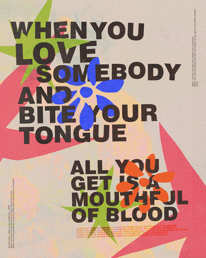
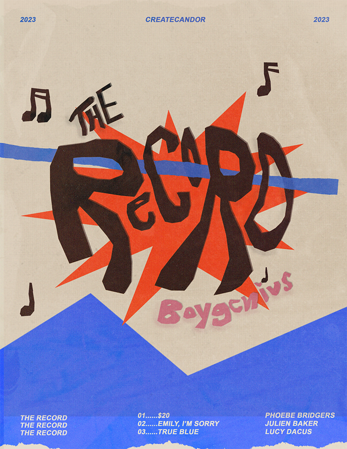
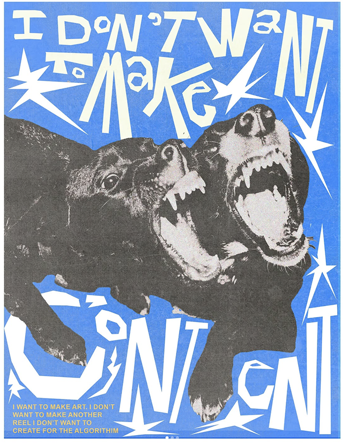
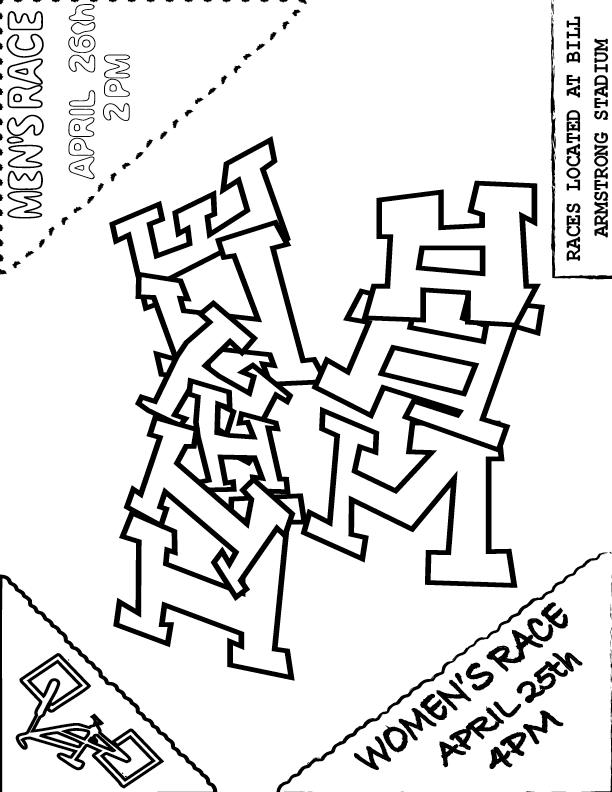
For this project, I took inspiration from the designer Mari White. I really wanted to go off the beaten path with this assignment and looked for inspiration from lesser-known contemporary designers with a distinct styles. I found Mari White by accident on Pinterest and followed the links to their website, Behance site, and Instagram. Their “poster experimentations” series, which was done out of a desire to rekindle their creative spirit, really spoke to me because of their energy and dynamic use of layered elements.

There isn’t much on the internet about Mari White apart from examples of their work. They’re a brand designer based in Tampa who has more recently designed band tour posters and shared a fair bit of personal artwork. I think this poster says a lot to me about them:

Mari is contemporary not only in their designs, but in their experience as a designer in the age of social media. The “poster experiementations” designs deviate significantly from their cleaner brand work and are more reflective of their internal artistic passion. I think this is why I was attracted to these designs in the first place.

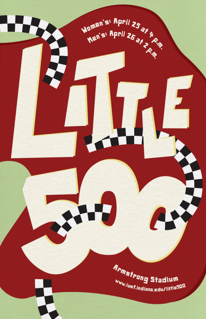
The main typography is hand-lettered. Many of Mari’s designs feature uneven lettering that look as though they’ve been cut out of paper and pasted onto the poster. Although I kept my letters a bit cleaner, I wanted to hand-letter to get that spontenaiety. I tried to imagine what it would look like if I were to cut out the letters from a sheet of paper. In some of Mari’s designs, the letters have a darker double behind them, resembling a drop shadow. I also used this technique on the letters and on the red background shape. For the location, dates, and url, I used a royalty-free font called “Paper Johnny” that mimicks this cut-paper look.

Mari’s designs use lines criss-crossing in and around the typography to create a sense of energy and motion. In this spirit, I included lines in my design which are patterned with the checkers associated with racing. As Mari does, I passed these paths over and behind the main lettering.

The colors for this poster came from a couple of different places. The red of the background shape comes from the IU brand guide to link the poster to the Little 500 and to the school. The cream color, however, comes from Mari White’s tendency to use a cream color like a faded paper in their poster designs.

Over everything, I used two different paper textures. Mari White’s posters make generous use of texture, especially paper textures. For the background of my poster, I used a texture that is closer to linen. The main elements are textured with something more similar to contruction paper, like someone would use to cut out letters for a physically assembled poster.

Ultimately, I don’t think my design looks like something that would have come from Mari White. I was greatly inspired by their dynamic lettering and use of lines and abstract shapes, but Mari’s designs tend to be much busier than mine and I use a lot more rounded shapes. Even though I went back and forth between my design and Mari’s as I worked on this project, I think my unfamiliarity with their technique hindered my ability to mimic it, and I got a little carried away with my own ideas as I worked on the poster. I would like to try something similar again, perhaps with a little more focus on colors—especially the way the colors of overlapping elements interact—and using more varied and interesting shapes.

Influence poster: Otis Shephard

Click on this image to view full PDF!

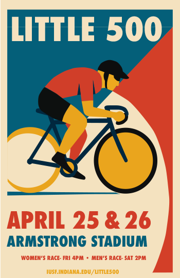
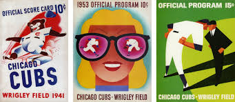
When I began designing the Little 500 poster, I aimed to capture the vibrant energy of the event while honoring Otis Shepard’s design principles. I was fascinated by Shepard’s talent for turning simplicity into something impactful, and it seemed ideal for the Little 500 event, which is a fast-paced, energetic event that requires a design reflecting its intensity. One of the initial aspects that crossed my mind was typography. Shepard had an incredible ability to use fonts that weren’t fundamental to the overall design. His typography consistently featured a clean, bold, and intentional quality, which I aimed to mirror. For the Little 500 poster, I opted for a modern sans-serif typeface (Futura Condensed) that I believed expressed a lot of Otis’s work. I wanted the text to stand out but also blend smoothly with the rest of the design, so it wouldn’t take over the other elements while still grabbing attention. Typography transcends mere legibility; it’s about establishing a tone, and I wanted it to reflect the dynamic energy of the event.
When it comes to color, this is where I really felt Shepard’s influence. I remembered how he used bold, contrasting colors and bright, primary ones that immediately catch your eye. I went with red and blue because they’re both vibrant and timeless. Red brings energy and grabs attention, reflecting the excitement and speed of the race, while blue helps balance things out, making the design feel more grounded. I used some cream and yellow and that helped the poster come together the most, in my opinion. The color contrast wasn’t just for looks; it was meant to make people feel something. I wanted the poster to give off a sense of urgency and excitement, so the colors had to work together to create that feeling, just like the race itself.

Otis Shepard’s Chicago Cubs graphics!

I also took inspiration from Shepard’s minimalist style. His designs were simple and to the point, never overcrowded. I knew my design needed to highlight the most important things: the cyclist, the event details, and the energy of the race. I worked hard to keep the composition clean, letting the cyclist’s image and the text stand on their own and tell their stories. It wasn’t about adding every detail I could think of; it was about focusing on what really captured the spirit of the Little 500.

Working on this poster really made me reflect on my design style and helped me focus more on making intentional choices. It’s easy to overcomplicate things, but this project showed me how powerful simplicity can be when done right. Like Shepard, I realized there’s a certain elegance in keeping things minimal, and that sometimes less really is more.

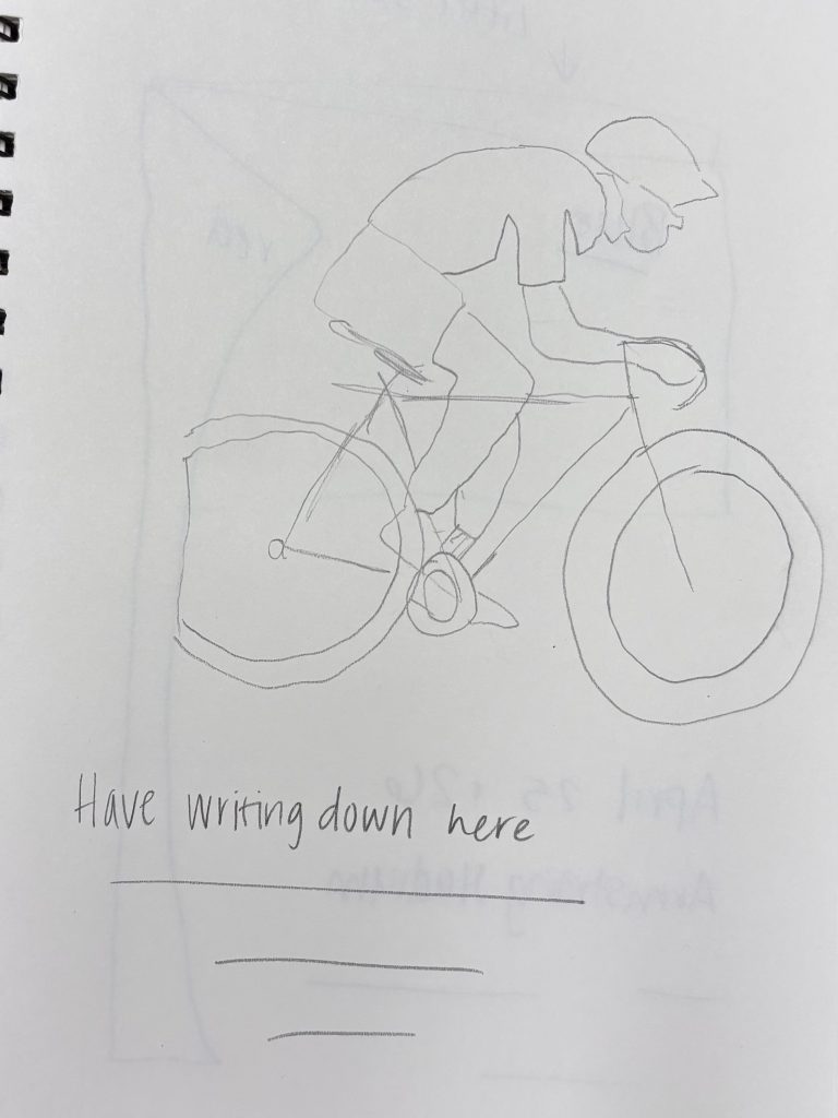
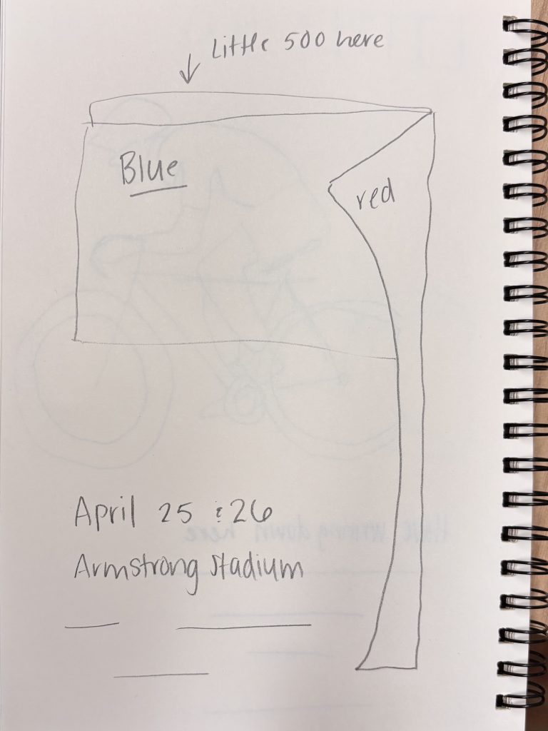
I’ve included two early sketches I worked on. They were a way for me to try out different ideas, like layout, the main image, typography, and color choices. I think they give a peek into how I tried to blend my own ideas with Shepard’s influence.

In the end, this project was more than just making a poster. It gave me a chance to really understand the power of restraint, clarity, and being intentional with my design choices. Shepard’s influence wasn’t just about copying his style; it was about embracing his mindset and applying it in a way that felt true to the event and my own creative process.

sweetheart logo animation

Sweetheart Publishing Logo Animation

For my logo animation, I knew I wanted to make some revisions with my logo. I ended up choosing two completely new fonts. I was scrolling through Adobe to find a cursive font that I could use for the S in Sweetheart (Lindsey Signature) and I also chose a cleaner but also bold font for the rest of the text (TT Ricordi Allegria). I messed around with how I wanted the text to be positioned until i ended up with this final product and added a line separating the two lines of text. I then changed the overall color of my design to fit the overall vibe I wanted, as well as make it more coherent. I also decided to move the quill from the top to the bottom. As for my animation…I knew I wanted it to animate as if it were handwritten. I first began with the actual logo itself and created a stroke shape layer and selected that stroke to be the track matte layer for my logo. I did the same for the line between the text, and the S as well. I then worked with the rest of the text, I precomposed each one and separated every letter, adjusted them to come up one after the other by a separate key frame, and added a motion blur to make it look more dynamic. I I also adjusted everything in the graph editor (speed) to appear and come in onto the screen as I wanted. Finally, I added a transition at the beginning and the end to make it flow better. For my sound, i knew I wanted to rely solely on sound effects. I found a sort of magical whoosh that I used at the beginning and end of my animation and then added a handwriting sound over any part of the animation that was appearing on screen as if it were written. Overall I am very pleased with how my animation turned out. Working with After Effects has become less scary to me with this project as well and I am happy I got to learn some new things!

Project 3 – Conceptual

For this conceptual Illustration Project, we were tasked with designing a magazine layout inspired by one of three article options. These projects allowed us to flex our creative muscles, blending design, typography, and illustration to tell compelling visual stories. From the nostalgic charm of “Old Tech” to the innovative tale of an AI robot wasting telemarketers’ time, these projects pushed our conceptual thinking and illustrative abilities.

 AI’s Tangle with Telemarketers: A Futuristic Metaphor

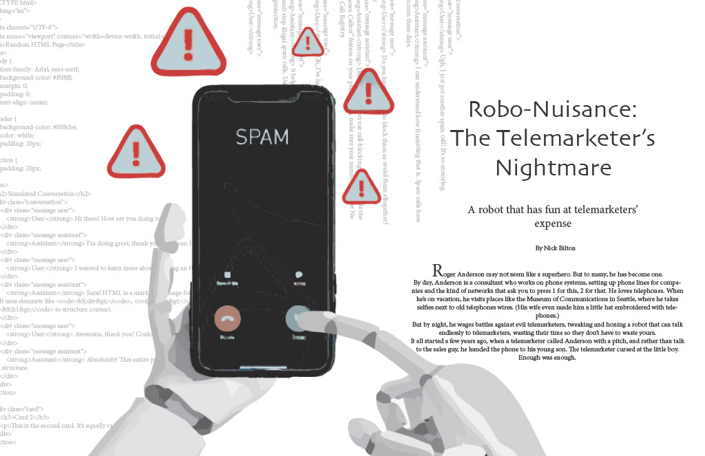
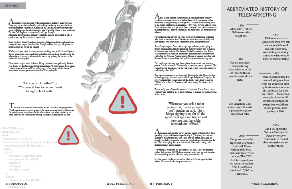
When reading through the different stories, I found the 3rd one the most interesting. It is based on a story about a robot that is designed to waste telemarketers’ time. My challenge was to visually balance some of the humor, but still have it be more serious looking. The design steered clear of overly cartoon depictions, opting instead for sleek, modern aesthetics. Staying strong with the concept, I decided to add a phone that appears with the caller ID being “Spam” and being answered by what looks like a robotic hand. I decided to add a little bit of a texture and more of the context of coding as the background, to simulate the idea of being programmed. 

A robot hand, crafted with smooth, lifelike machinery, became the focal point, holding a blocky, easy to distinguish, modern day iphone. The telemarketer, not shown, but mainly due to the simple idea of us not ever seeing them either. 

The layout incorporated a basic and simple typography, but mainly due to the detail of the illustrations being more important. I added the background code to add texture so it would not stand as a straight white page, but also to add some depth. On the second page, quotes from the article were magnified to draw readers’ attention, complemented by a big hand reaching for a robot hand, similar to the ‘Creation of Adam’ art piece by Michelangelo. Overall, based on my want to keep it simple and detailed, I think that it turned out great.

Conceptual Project

For the Conceptual Illustration Project, we had the choice between three different articles to design out magazine around. I chose to design a magazine based on the “Old Tech” story, which was a story about how old tech is coming back into style. I learned a lot when I was designing this magazine and overall learned how to conceptually show an idea.

For this project, because it is a story about old tech coming back, I thought this was a great opportunity to show comparison through color/pages/ect. I thought that the project being a magazine and having two pages in the opening spread, that this opportunity would show itself very well on the first spread.

Opening Spread
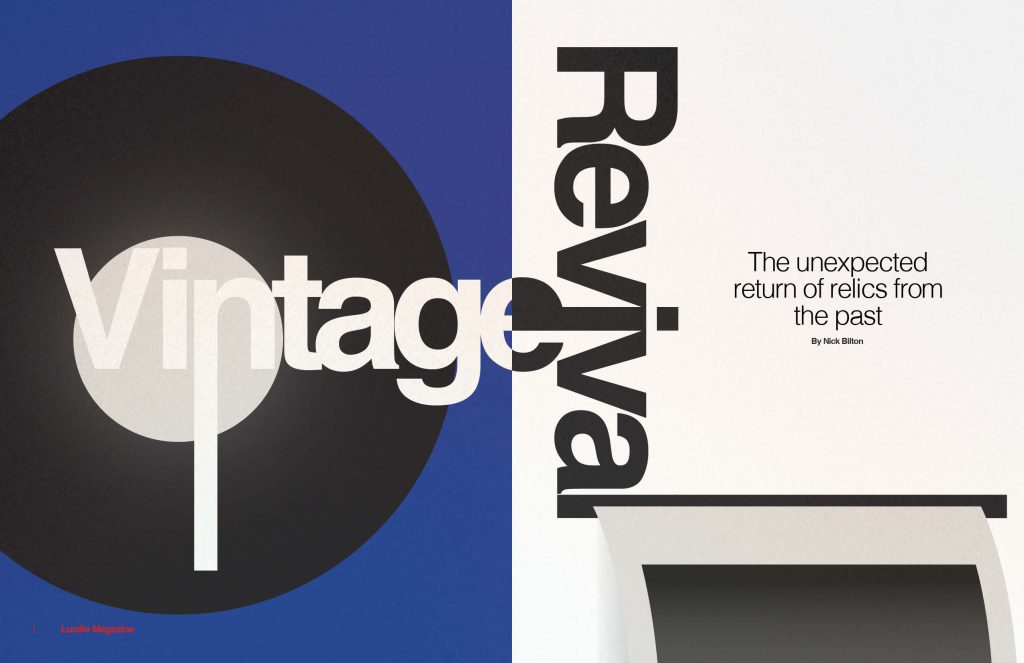
I chose the font “Helvetica” in bold because I think this font looks vintage and modern at the same time. Because the text is on both of the pages on the opening spread, I wanted to choose a font that had these qualities. I thought that Helvetica was perfect. To continue this transcending through time feeling, I wanted to show the “vintage” items on both pages. Within this, I wanted to incorporate the font into the design to make everything feel cohesive. On the left page, the “n” is extended and used as the needle for the vinyl record. On the right page, the “l” from Revival is extended to be the part of the camera where the Polaroid comes out. Along with this, I wanted to continue to emphasize the transcendence of old to new through color. On the left page, the blue background and white text feels vintage to me. On the right page, I chose to do black text on a white background, because that feels more modern.

I chose the name “Vintage Revival” because it felt right with the story. I wanted the word “Vintage” to be in the title because that is such a large part of the story, and the word “Revival” just felt right.

Story
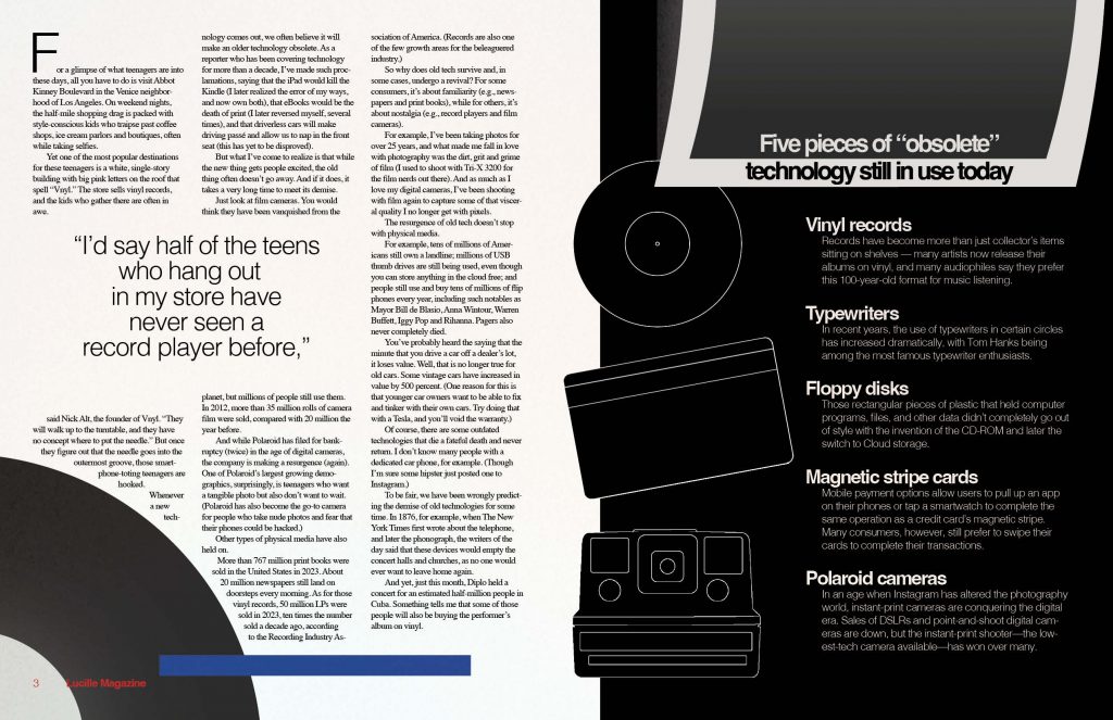
In terms of the next two pages, my biggest goal was to ave the Polaroid continue onto the second page. I really like how this looks. In terms of the story, I chose the font “Times New Roman”, as it is a good classic serif font for magazine body copy. I wanted the quote about how the majority of kids fascinated by record players have never seen one before, which is why I made it such a large emphasis on the left page. At the bottom of the left page, I added another record, similar to the one that is in the opening spread. I made this choice because it felt appropriate if the Polaroid is also on the second spread. I also included the blue strip to pull in the color from the opening spread, but also so there is a needle on the record. In terms of the sidebar, I chose to make the record, credit card, and camera more illustrative to separate them from the other illustrations. I also made it on a black background so it had a similar flow to the opening spread in terms of comparison, but change up the colors.


Overall, I am really proud of how this project came out. I was honestly intimidated by the name of the project “Conceptual Illustration” because I feel my strengths lie in photography and not graphic illustrations. This definitely showed me that I can do both. I learned a lot in terms of how to show a story through illustration.

Project 2 – INFLUENCE

For my influence poster project, I chose to be influenced by American graphic designer Timothy Goodman. Timothy Goodman is an award-winning artist, graphic designer, author and public speaker. Timothy Goodman’s art and words have populated walls, packaging, clothes, products, magazine covers and one sanitation truck for brands including Apple, Nike, Google, Samsung, MoMa, Netflix, YSL, Time, The New Yorker, and the New York Times. His partnerships have included a global collection of clothing with Uniqlo and a Nike b-ball shoe with Kevin Durant. He regularly partners with schools to create art for communities in NYC. His second solo gallery exhibition Every Time I Fall in Love It’s Summer was on view at the Richard Taittinger Gallery in the summer of 2023. He’s the author of three books and the co-creator of several social experiments including the viral blog 40 Days of Dating and 12 Kinds of Kindness. Timothy’s work often discusses topics such as mental health, manhood, politics, heartbreak and love. He teaches at School of Visual Arts in NYC, and speaks around the world at conferences. His graphic memoir I Always Think It’s Forever was published in 2023 by Simon & Schuster.

Times Magazine

When researching and looking more into the pieces that Timothy Goodman created, I noticed that he tended to have different forms of typography included. I liked that it wasn’t all uniform and wanted that also. I started off with a sketch where I hand drew the fonts and everything that I thought would work. While I do believe that I could have added more detail into this piece, I had a level of restraint because I was worried that the more that I added, the more it would become too similar to the ideas of Goodman.

When beginning this project, I went onto Google and begun to research different designers to find who I wanted to represent. I came across a site that include a bunch of options and showed images of the different kinds of styles. I came across the name Timothy Goodman and when I saw the image of his style, I knew that I wanted to choose him right away. It was very much similar to how I used to like to draw and gave that ‘doodle’ style that I liked.

At first, I was starting to wonder how I could execute this styling without making it too similar or too obvious of who I was portraying. I wanted to keep the style of doodling with the random kinds of typography that were included. Although some of his work has included color, I decided to keep my work in black and white. I wanted to stick with the base colors. The main key points that I tried to portray were both the type and color.

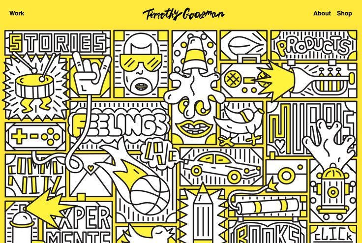
homepage for Timothy Goodman

Overall, I was influenced his piece that he made for Times magazine, but also by his design of his main homepage. I liked a lot how each involved different forms of typography and framing. I decided I wanted to focus on those two main points in his style. I decided to keep the base color as black and white to stay with the idea of sketches.

In the end, I’d say that I think that although I could have come up with a little bit better design, I am happy with how my final design for this Little 500 poster turned out. Being able to find a equal balance between using the reference from another designer and being able to develop a design that visually comes off as an original piece. This process was interesting but fun. I think the typography and free style are still recognizably the main elements in my design. 

Influence Poster Project

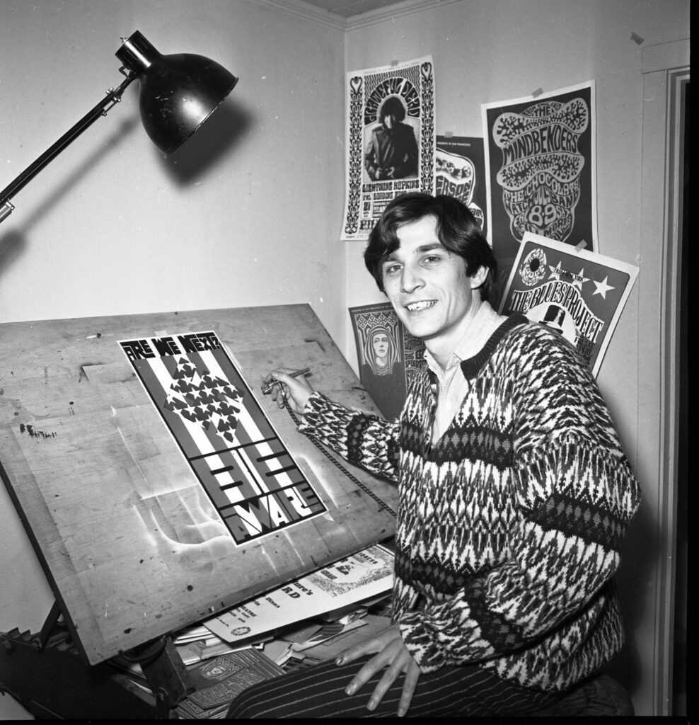
Poster artist Wes Wilson, November 2, 1966

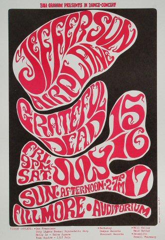
For my Little 500 poster project, I chose Wes Wilson as my inspiration. Wes Wilson was an American designer, most well known for his psychedelic posters that are synonymous with the peace movement in the 1960’s. Some of his most popular works of art were in collaboration with Bill Graham, a popular rock concert promoter in the 1960’s. Wilson created posters for bands like Grateful Dead, Love, 13th Floor Elevators, The Byrds, Jefferson Airplane and more. I chose Wes Wilson as my inspiration because I have a collection of his posters, and ones of similar style hanging in my room. I am a big fan of psychedelic rock in the 1960’s, and I wanted to create something based off of this era.

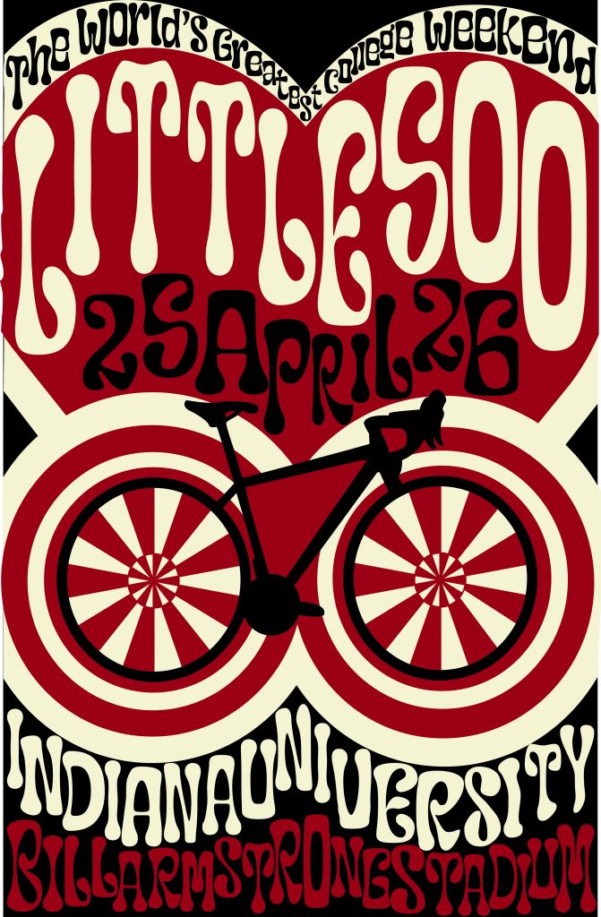
For my colors, I used crimson, cream and black. I chose black as the background because it complemented the black on the bicycle, and I felt in contrast best with the white and the red. I had many phases, where I used a teal, the complement of crimson and a light blue, the complement of cream, but I felt the blues didn’t encapsulate the spirit of Little 500 the way that black did, because a lot of jerseys, and other popular IU merch contains black as a filler color.

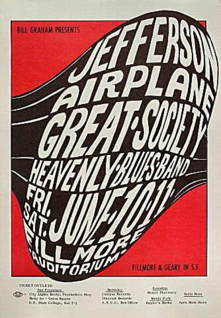
I specifically chose a poster Wilson made for a Jefferson Airplane concert, because I liked the colors and thought they resonated closely with IU’s colors, which I wanted to implement in my design. I used the tip from week 7, Rays and Wraps, to create the wheels of the bicycle. I felt the wheels give the bicycle a psychedelic, playful look rather than realistic. I tried to avoid realistic sketches and images for my poster, because I felt it would contrast with the blown up letters and distorted typography. 

As for my other graphic elements, like the bike and the heart, there are a few reasons as to why I implemented them into my design. The bike may be a dead giveaway, but it is honoring Little 500, where competitors happen to race while riding on bikes. Surrounding the wheels are more circles, and this is to give the bike an amplified effect, because it is the star of the poster. As for the heart, Little 500 is a weekend of IU Pride, and most people who celebrate are not only celebrating the race, but also our love for our University. At the very top of the heart, “The World’s Greatest College Weekend” is written, and this is a well known phrase that is often said about IU. 

Wilson’s style of design is one that has closely resonated with me, for more years than I even considered my favorite graphic designers. On his website, wes-wilson.com, Wes also has a collection of stories about living in the times, including an entry about his time spent with world famous designer, Andy Warhol. Below is my design.

Mira Carlson, 2024. J465

Influence Poster

For my Little 500 Influence Poster, I chose Josef Müller-Brockmann as my influence. Ever since I learned about who Müller-Brockmann was in Graphic Design I, I have been a fan of his work. I have always loved the Swiss design style – I just didn’t know who the pioneers where. Müller-Brockmann’s design style and the Swiss design style are both very similar to my individual style and I really enjoyed understanding Müller-Brockmann ‘s work flow and specifics better.

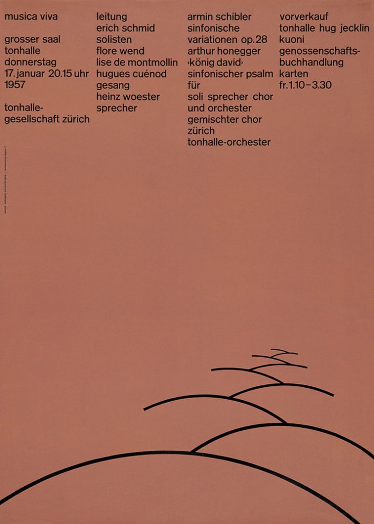
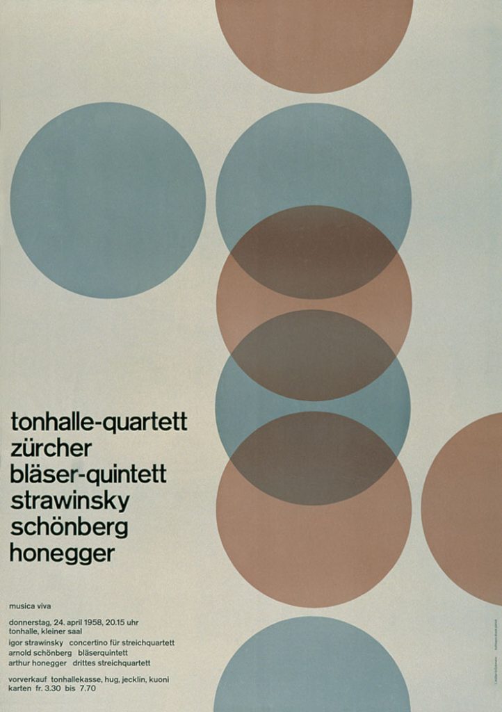
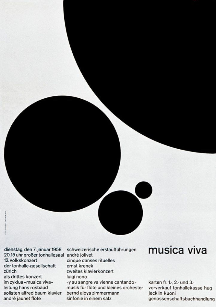
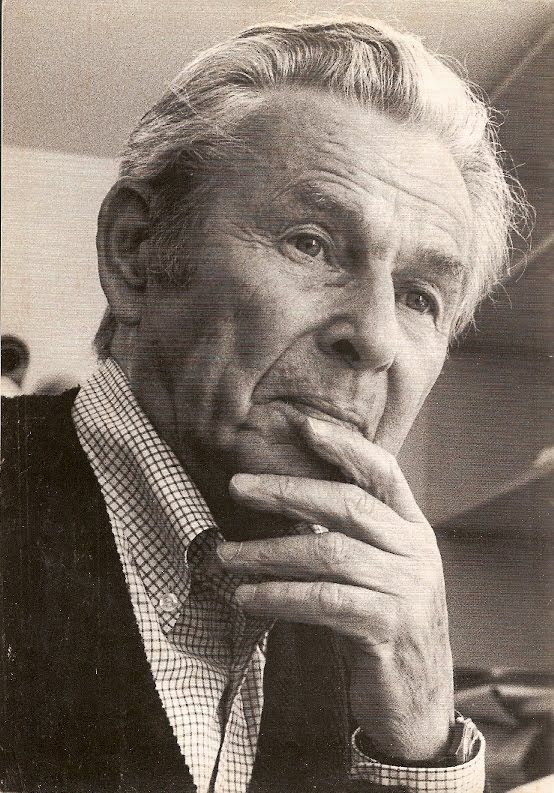
Josef Müller-Brockmann was born in Rapperswil, Switzerland, in 1914. He grew up in a time of influential design, and has mentioned inspiration from the Bauhaus and Constructivist movements. He went on to study graphic design and architecture at Zürich School or Arts and Crafts. He then opened his own design studio in Zürich, and his career took off. He was famously known for his typographic and geometric posters, which generally followed a strict grid system. He went on to design a famous series of posters for Zürich Tonhalle in the 1950s (shown below). He is famously known for his book, Grid Systems in Graphic Design, published in 1961. It emphasizes the importance and visual ease of using the grid system in design, one that he commonly used. Müller-Brockmann was a professor at Kunstgewerbeschule Zürich from 1957 to 1960, and continued to guest lecture at many universities. He died in Zürich in 1966. He has left a major impact on the world of graphic design, and is a major pioneer in Swiss design.

When doing my research on Brockmann, I wanted to also understand how he was as a person. In researching, I found a few first hand accounts of him which were very endearing to me. A student at Arizona State University who was lucky enough to have Brockmann visit his class wrote, “once I was in his calm, yet playful, presence, the impact of his stopover became clearly apparent”. I thought this was important to note because his calm, yet playful presence is clearly echoed in his design. This student was also lucky enough to receive a critique from Brockmann, and with ease mentioned that “reduction of content can make all the difference in the outcome of a design” and I kept this in mind while designing my posters. In this same visit to the classroom at Arizona State University, a student asked Brockmann to show his business card. “As JMB casually pulled the business card out of his coat pocket, there was a frenzy like fish at a pond when the morsels are tossed in. He was taken aback as we scurried around to take a peak at the card revealed; novice typographers eager to see his miniature piece of art. I still remember the card clearly. It was on light gray paper stock printed with a solitary color of cool gray ink. All content was in a singular sans serif face, all lowercase, and no punctuation to speak of other than the umlaut and hyphen in his distinguished name. No commas, no periods, no colons. All the elements on the card were restricted to the purest of necessary elements. In that small space he proved the mastery of minimalism; communication clearly achieved without the use of a period or a comma. The execution of an all lowercase solution, which has influenced my own design solutions to this day, and a restrained use of typographic elements was an awe-inspiring lesson, visually delivered. He didn’t need to speak a word.” In reading this first hand account, I was inspired to keep my design hyper simple, while still conveying what needs to be conveyed.

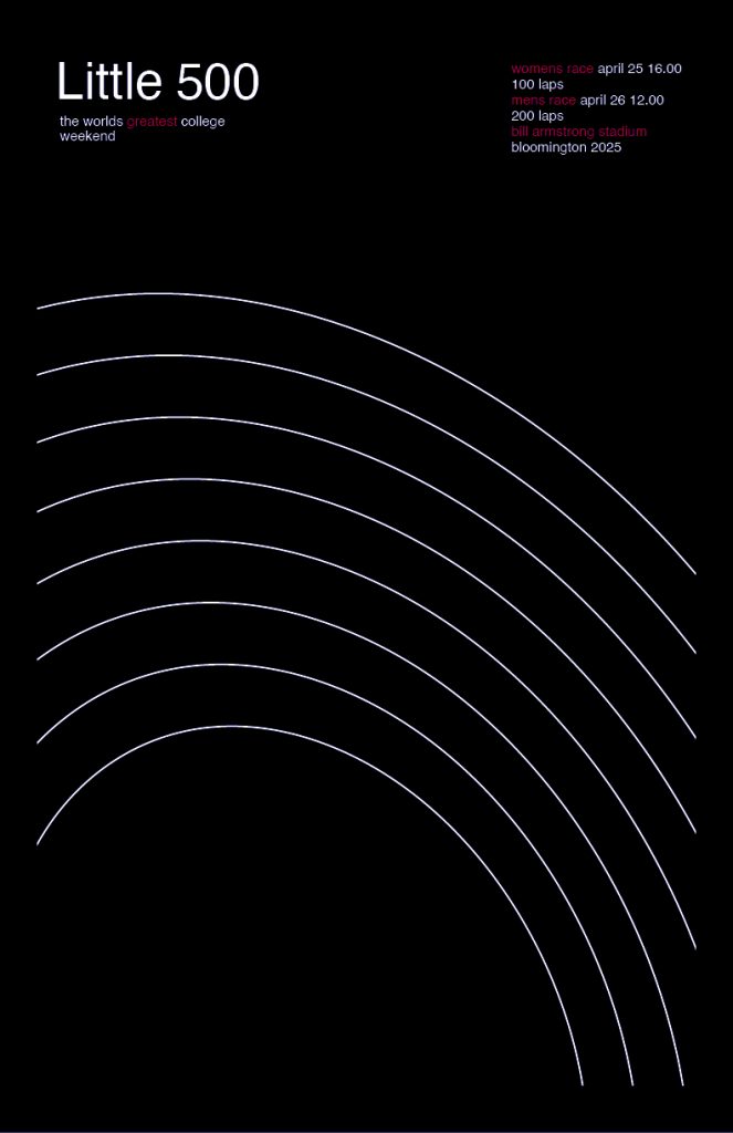
I designed three posters because I had time and because of the simplicity of Brockmann’s designs. For my first poster (below, black) I was inspired by Brockmann’s use of simplistic lines and thought this would be a great opportunity to echo the lines of the track at Bill Armstrong Stadium. I referred to many of Brockmann’s numerous poster designs to understand how he uses type and where he places it on his posters. He tends to highlight important parts of the message in red, which I also chose to echo. And of course, the iconic Helvetica was the font I used, as it was the font Brockmann used his entire design career.

First Poster
Second Poster
Third Poster

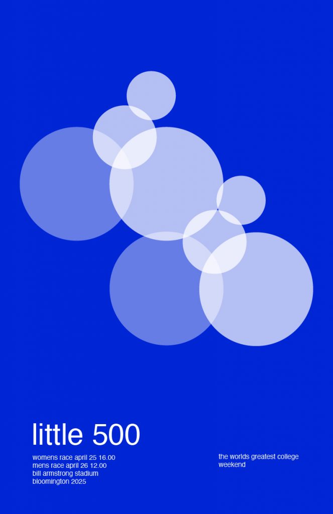
In the second poster (below, blue) I wanted to reference Brockmann’s common use of circles, and different opacities. In designing this poster, I saw the opportunity to place the circles in a way that looked like cyclists. I thought that this was very interesting, and a simplistic way to show that it is a bike race. in terms of type, referencing Brockmann’s business card, I made it as simple as possible, all in lowercase.

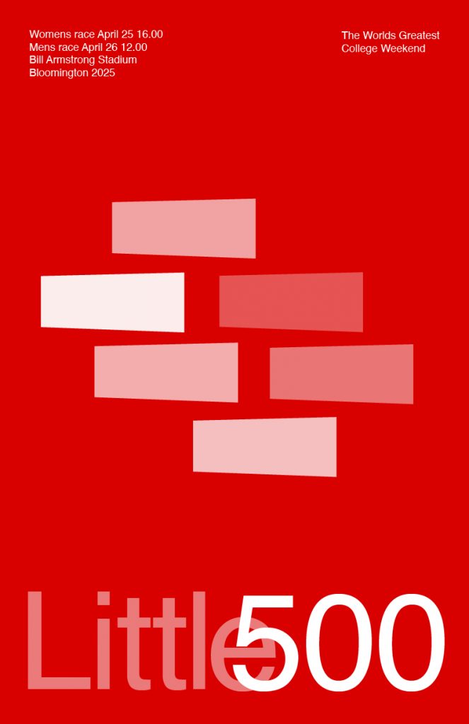
In the third poster (beneath, red) I noticed that Brockmann used a lot of rectangles, which I wanted to echo but with a twist. I made the rectangles larger on one side, to represent looking down at cyclists. I made them in the formation that they are because when you look down at the cyclists on the Little 500 track, this is commonly the pack formation that they are in. I made them different opacities to represent the different teams, something that I noticed Brockmann does in many of his designs. I thought that changing the opacity and not the color would make the poster look cleaner. As for the type, I took a similar look from Brockmann’s poster “Der Film” from 1959. I thought that this type treatment matches well with the visual element of the design.

I really love how these posters turned out. I think that they work well together – they all represent different views of Little 500, and I think they have the potential to be used in a campaign-like setting. I am a big fan of Josef Müller-Brockmann’s designs and really enjoyed researching him and using him as an influence for my Little 500 poster.

WOLF PUBLISHING

When I was coming up with ideas, I knew that I wanted to create the company logo related to an animal. The wolf, an animal often misunderstood and feared, embodies the qualities that I liked and thought would be great as a company representation. Wolves are intelligent, adaptable, and fiercely loyal to their pack. They possess a keen sense of intuition and a deep connection to the environment around them. I believe that the wolf and the hypothetical values of the company are very similar and based off each other. In a company, it is good when it tries to be intuitive in the approach to publishing, understanding the unique needs and goals of each project. Overall, the idea of a wolf is something that holds a strong meaning behind it and can represent the company very well. By choosing a wolf, the publishing company can convey a message of power, creativity, and intelligence, with a strong visual identity that stands out in a competitive market.