Tuxedo Publishing: Publishing One Of A Kind Works Of Art

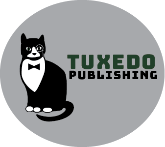
Tuxedo Publishing is a publishing company committed to the one of a kind books out there, similar to how every tuxedo cat is one of a kind. We seek out original and meaningful pieces of work, ranging from coffee table books to novels. Tuxedo is commited to diversity, inclusivity, and we believe that every artist deserves a chance at getting published.  

The idea for Tuxedo Publishing was created when my roommate’s tuxedo cat, Toby, took a nap next to my computer while I was working on sketches. A tuxedo cat is a breed of tabby, and they are known for their black and white fur. Every tuxedo cat has a unique coat, and I thought that this would be a good metaphor for a publishing company that seeks out one of a kind works of art. The dark green color ‘tuxedo’ is written in is pulled from the green eyes of the cat. I chose green because Toby has green eyes, and green is commonly associated with wealth. One would hope that if they are getting a book published, it would lead to some good income. The bowtie is a play on design, making the idea of a tuxedo cat literal. The monocle on his eye was added to symbolize that Tuxedo is a publishing company, because many people used to read using a monocle. 

Sweetheart Publishing

Click the logo to view the full brand guide!

When I first started thinking of ideas for my logo, I knew I wanted to involve my last name sweet. So at first, I began with just the name Sweet Publishing. I knew i wanted it to have a simple and sleek pen stroke look to it to tie into the publishing brand. Right off of the bat, I had the idea of incorporating a wrapped candy within my logo to represent the “sweet”. From here I made a couple of sketches, where I noticed I could make the middle part of the candy be identifiable as the S in sweet.

After a couple of sketches, I realized I was envisioning the candy wrapper ends to emerge into something else as well, which was hearts. So i ultimately decided to have my publishing company be named Sweetheart Publishing.

I once again made several sketches until I was happy with a final product. This took a lot of trial and error. I wanted the hearts to be positioned a certain way…But really creating the circled candy in the middle was the hardest part because I wanted all of my pen strokes to be even and curved WHILE STILL create some sort of an S shape as well. I ended up angling the ends of the hearts to match up together as well so it gave it an idea of continuation. Finally last thing I did in my illustration was draw out a little quill at the end of the pen stroke to make it seem as if it had drawn it out, tying in the publishing title for my company.

I used a cursive handwriting font along with a more formal italic font because I wanted to match the elegance of the design itself but I think in future alterations of this logo I would look into changing the fonts the fit a more simple and elegant look because right now it seems to be a bit whimsical.

I wanted to keep this logo very sleek, elegant, and modern so I came up with a pretty neutral palette although honestly I can see myself changing it now to maybe just being the red color rather than the beige as it adds a little more pop. Overall though, I am very happy with what I was able to create and really enjoyed this process.

Creative Juices

Click for the brand guide

For my logo I really wanted to focus bright colors. Being creative is supposed to be a happy and fun experience. I wanted to portray that. I created my own typeface because I was not satisfied with any typeface. Your creative juices flow when you are in a groove which is what you want for a publication company. For our writers to just write and write and write.

Welcome to J465

Featured

Hello and thank you for being part of J465 this semester. Together, we will undertake a series of projects and assignments that are meant to build your abilities as designers and increase your expertise in the core Adobe programs that are the tools of the trade. You will be designing logos, illustrations, layouts and animations that will showcase your creative vision and your unique personal style.

You will use this site throughout the semester to post your work, as well as descriptions of your creative process and analyses of the finished products. As authors, you may post additional thoughts and reactions any time you see fit. As part of the class, you will also be designing and maintaining your own J465 website, showcasing your project and exercise work. To read the full syllabus for J465, please visit our syllabus site at www.stevelayton.net/j465/s25.

Good luck — and once again, thanks for being here.