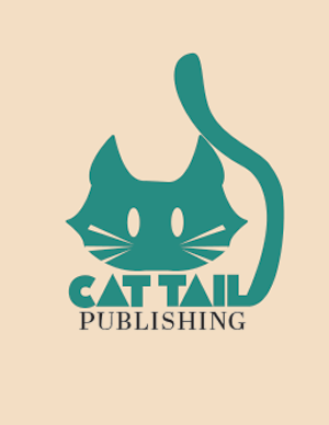
This is my first project for J465, and it was a challenging first project. This was my first experience in logo design and it was a learning curve that I had to navigate.
I knew that I wanted to do a cat-themed logo because I felt like there was a lot of opportunity for color variation, brand story, and an engaging logo design. I went through many variations before my final product. The initial direction was “Cat Paws” but I saw an opportunity to create imagery out of the typography. I converted the typography into outlines and adjusted the L in cat tail to fit the illustration I had in mind for the cat tail.
I chose the font Flecrei because I really enjoyed the abstract look to the font, as well as the letter A reminded me of cat ears which I felt fit the visual. I chose Abril Display for the secondary typography for the sake of readability and an aesthetic match to the abstract primary font.
The color choice was difficult, but I ended up with a green/blue and ivory color scheme because I felt like it communicated the “home” feel that I wanted to evoke with soft colors that are easy on the eye.

