For my influence I chose Yusaku Kamekura. I found him in one of the graphic design books that we looked at in class. The reason I chose him was because I felt he had a blocky color art style that resonated with my art style. In Graphic Design I, I made a poster that was similar to his method of color pieces put together to make one design.
Kamekura was a Japanese graphic designer who studied at the Institute of New Architecture and Industrial Arts located in Tokyo, Japan. The school took inspiration from Bauhaus. After his education he started working at Nippon magazine. In 1960 he became their managing director. Throughout his early life as a graphic designer, Kamekura gained inspiration from Bauhaus as well as Cassandre, and constructivism. He is best known for his work designing the 1964 Summer Olympics Tokyo poster. He would later go on to work at Nikon and design a series of logos for the company.
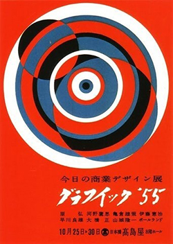
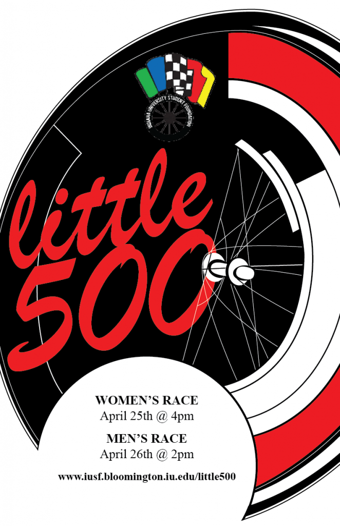
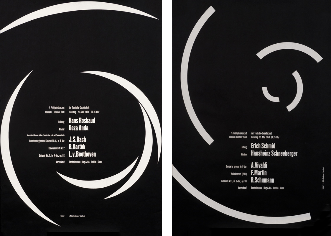
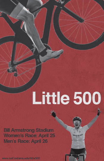
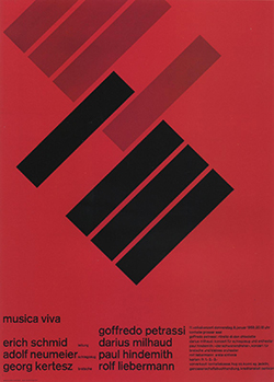
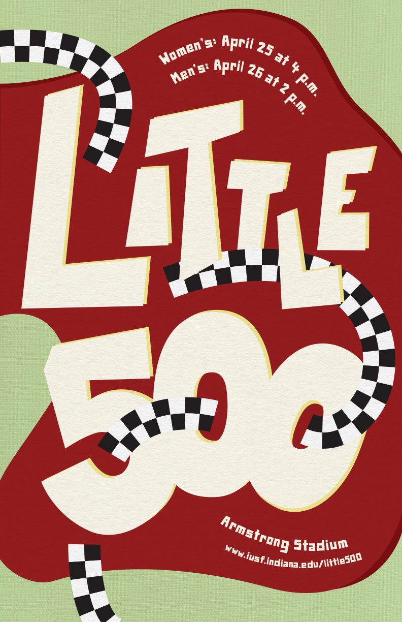
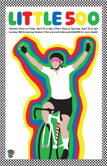
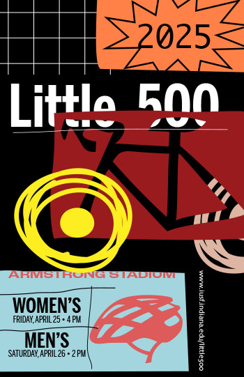
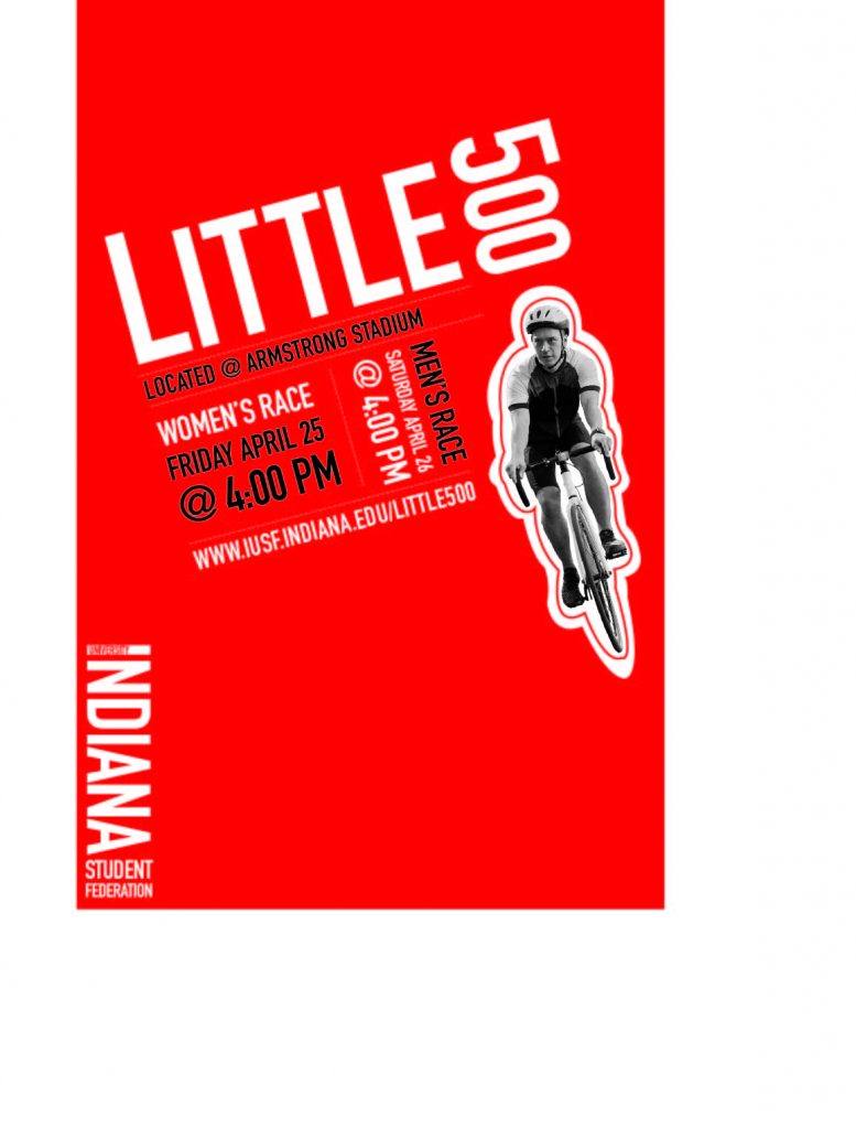
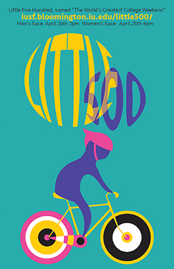
In terms of the influence I took from him. I was deeply drawn to his poster called Graphic ’55 Exhibition, 1955, seen on the left here. I think the circles, colors, and overlapping of both make for a distinct visual and a great artistic choice. This style can be seen in my poster with the wheels of the bike. I felt like they were visually captivating. The bright colors that Kamekura utilizes throughout his posters are an aspect I also wanted to take in with my poster. Through multiple posters of his I took the color dropper tool so I could use the exact vibrant colors that he used from his works. The back wheel on the bike has a little bit of overlap in terms of color where the bike chain is, I also added that style in inspiration from his Graphic ’55 Exhibition poster, as well as the “Little 500” text. In Kamekura’s work he often does a sandwich method in his work where he’ll have one line first, then the second increased in size and a bolder color, then more text below it to emphasize the text in the middle. I tried to do that with my text in my poster.
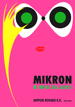
Another work that I took inspiration from was Kamekura’s poster called Nikon Mikron Binoculars, 1955. Upon immediate inspection of this poster, I was inspired to make a bike with the shape that the eyes are made in this poster. Hence why I used the above poster to as well to include the main visual to be a bike in my Little 500 poster. Again, the colors are vibrant and eye catching, The pink here can be seen in my poster too. This poster was the one I used to help me pick out my font, a lot of Kamekura’s posters are in Japanese and so I wanted to find something in English and came across this poster. The main link in my poster in yellow takes inspiration from the fonts used in this poster on the left. The art style of doodle type shapes were another thing I took inspiration from. I tried to draw my cyclist in a similar style as the yellow hand seen in the above poster.
I really enjoyed making this poster. I unfortunately, was crunched for time, but if I could go in and revise my poster I would add more color and a border around the poster that kind of looks like the checkerboard race flag but instead of black and white, I would replace every black square with colors I used in my poster to create a rainbow checkerboard. Overall, I think Kamekura has a minimalist and clean style with vibrant usage of colors, I tried my best to use his influence within my poster.