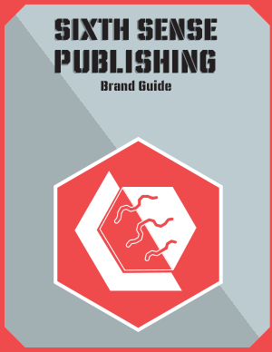
I wish I could say there was some personal tie in with Sixth Sense Publishing, but honestly when I was creating this logo I made it by accident. I was messing around with the pathfinder tool, trying to build a different logo for a different class, when the middle shape appeared and it was just too striking to leave alone. So I switched gears, and started to work on the logo, establishing a brand voice, name, company mission, all off the look of a miss-click with the anchor point deletion tool.
As I kept going with SSP, I realized I needed something more, something that made it stand out. Originally, SSP was going to be Sixth Sense Fitness. I had molded the hexagon shape to fit on a dumbbell, and this super macho tough guy brand was going to be the backbone of the design choices, as I had never made anything like this before. The strong, geometric design was a good start but it needed detail. So, I added the brain-like squiggly lines in the middle. It was actually a bigger undertaking than I originally thought, as I had to cut out that shape while keeping it aligned on the same axis that the rest of the design is based on. But, with a little elbow grease and a lot of CTRL + Z, I think I got it in a place where I like it.
The typography was something I figured out pretty early, as I had already been searching for fitness-esque type beforehand. However, CCUltimatum stood out as being particularly striking and bold. It was very reminiscent of brands I had gotten used to seeing in military and cross fit gyms. The color scheme followed a similar line of reasoning, I needed something simple and striking with good contrast. I wanted the colors, type, and shape design to tell you everything you needed to know about the brand with one look.

