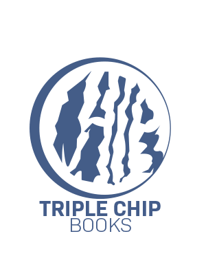
Triple Chip Books combines not only my last name, but a three for “Triple”, and a ravenous creature. All together, it reflects a being ready to find inspiration. It consumes but also encourages imagination as a symbol for growth and creation.
As for the development of this design, it has gone through many iterations. Most of them too complex to be used for the project itself. While I wanted to integrate little cracks and chips in the logo for my name sake, it was better to develop them more simply as it would be a tedious process to appear as a detailed logo. First I had sketched a clean look of the design before tracing over it in Adobe Illustrator. Experimenting with different colors, line weights, and sizes with the pen tool. Although there is one main design, there were many ways to customize it with slight variances and shape. This part of the project was a challenging process, as I had so many options to choose from and had trouble finding my strongest design.
For the font, I choose Bio Sans Bold and Light with cool bluish and turquoise colors for the scheme. The font itself felt clean and simple, which didn’t overshadow the logo and kept a bold appearance for its initiative. As both a creative and fun design, it manages to integrate more than two hidden pieces of imagery.

