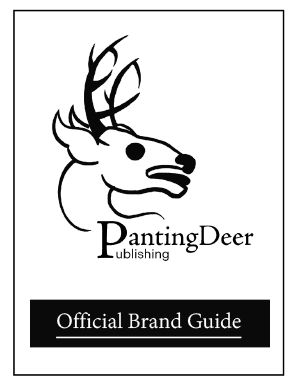
For this project, I really wanted to create a grungey logo that matches the vibe of a small town bookstore located somewhere in the East Coast. So basically a design for a newer Millenial/Gen z targeted company. I got inspired by an actual deer while driving to class on a hot day and I thought it was very offputting. I was hoping to match that energy with my logo. With my sketches, I based the design on an actual image of a panting deer and simplified it. I really wanted to add bits of the name within the antlers so I took some time to incorporate a “P” and a “D” but it unfortunately isn’t that noticeable until you see the other variations which I do love. Despite this, I still chose the logo without the name incorporated in the antlers as my cover logo because it is a lot simpler and easier to understand.
J465
Design 2 | Fall 2025

