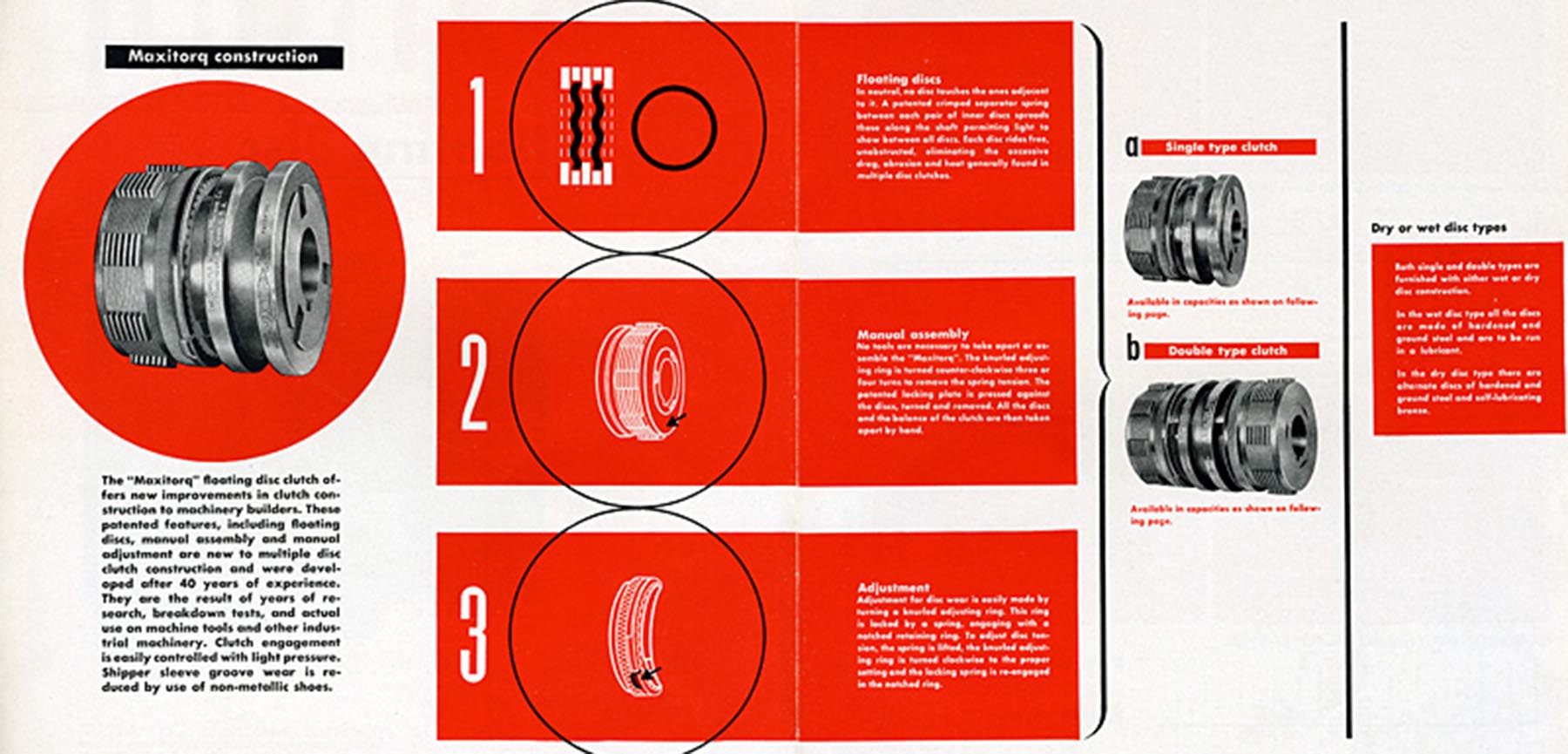
The focus of this project was on going deep into an artist’s design philosophy and understand it. I chose Ladislav Sutnar, a Czech designer who’s work was as practical as it is stylish. He made a multitude of work for McGraw-Hill, IBM, and the United Nations.
This is my design for little 500!
One of his most enduring and practical contributions to modern informatics was the simple idea of putting area codes in parentheses. This small but significant change fundamentally improved the visual layout of phone numbers, making the otherwise long string of digits far easier and quicker for users to comprehend. I wanted to replicate this idea by using shapes to highlight text with color, highlighting the most important text. Sutnar’s work was appreciated as it was practical due to it being published widespread, commonly seen in factories. To capture this, I added a faint crumpled paper texture in the background, with a faded sandy yellow to encapsulate the feeling of being used/worn.

When it came to type, Sutnar loved simple, bold, and to the point type. While I love experimenting with type, this project was a fun challenge on how to use type. A lot of Sutnar’s work presented type angularly, at a fixed direction. He combined this idea with putting a 3D effect on a grid, making a striking image combined with the aforementioned text design.
The grid establishes a sense of space in an otherwise 2D environment. When designing the poster, I wanted to encapsulate that idea of space by combining the feeling of being in a race by adding other racers behind the main biker, but with them all facing the same direction as if they were heading in the same direction. By combining the bikers, the grid, and the angular type, I wanted to give a feeling of direction and movement as if the bikers were in an actual race.
Sutnar’s work used only blacks, whites, and one other color of choice to make his work stand out. The emphasis was on the person, mechanics, or map he was designing. Because we all go to IU, cream and crimson was the obvious choice.
Sutnar combined a simple color scheme, with large, bold shapes to place heavy emphasis on the focus of the design. But I did want to add a little color to the main rider in order to make him pop against the background and grid with a thin white stroke and a red belt.
All in all, I wanted to showcase a sense of direction and movement in my design, while paying homage to the design choices of Sutnar. By adding his commonly-used grids, shapes, and color choice, I believe I encapsulated his design choices.


