Here is my reflection for my first project in J465! We had to create a brand guide for a “publishing” company of our own creation.
I was nervous about this project because I had never designed a logo or written a brand guide so I was really going in blind. I was nervous because of my lack of experience.
I did really enjoy the project once I got into it! It took me a while to come up with an idea and a brand but once I did I really enjoyed making up a brand and their vibe. It was definitely a learning experience but I enjoyed being challenged and I had a lot of fun!
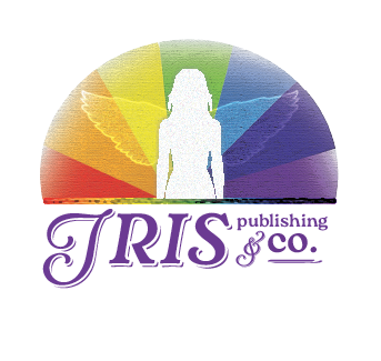
When I was trying to design this logo, I was stuck on coming up with a concept to go off of. I’m currently taking a class on Classical Mythology, so the idea to incorporate mythology into this logo eventually popped into my head.
Iris is the goddess of the rainbow and she is a messenger for the gods. She is specifically the messenger between the gods and humans on earth. She is typically depicted with a rainbow, wings, and just as a “beautiful woman.” Since she is a messenger that is almost a bring between worlds, I thought it would be cool to reference her in my logo.
After this idea popped in my head, I started writing out associations with the word “Iris” and sketching out designs that could incorporate a rainbow. I landed on this design above eventually, and I focused on expanding it with textures and typography. I experimented with placing text, different typefaces, and even how the text was placed around the image. I also experimented a lot with text color and background color. The process of depicting the woman’s figure without getting stuck in details took more time, but I eventually landed on this. The most important thing was to find a way to incorporate her wings, because that is part of what makes her a messenger goddess.
This logo incorporates Iris’s wings and rainbow to encapsulate the mission of Iris Publishing & Co.
For the first project, I wanted to create a logo that was simple and could be recognizable for what I was trying to accomplish. I knew from the start I wanted to marry two icons together, and after much trial and error, I decided on combining an open book with a sandbox. Stylistically, the two elements paired well together as they both were composed of similar geometric shapes, and brand-wise a sandbox would represent all the limitless creative potential that I wanted by publishing company to be known for. I decided to include two well-known objects to help convey that my image was a sandbox: a shovel and a pail.
I first tried creating the book from a birds-eye perspective, looking straight down on it with sand covering the entire surface. But this did not create an interesting design that really popped out at me, so I did another attempt from a sideview, and this become my final image. I knew from the onset I only wanted to use a few colors, so I experimented with different sand colors until I found one that felt natural, and only used black and white for the remainder.
For typography, I knew I wanted something light and inviting that would translate the hardworking, but creative outlook my brand would be known for. I chose one called “Pinecone” on Adobe Fonts that felt simple but fun and utilized the same sand color as my image for consistency.
I am happy with how my design ultimately turned out and I feel I made a logo that can translate well to any size and be recognizable. I do think I could have added more details in the sandbox itself- maybe pebbles or just texture to further convey the sand- but I am still confident that most people will be able to immediately understand what I am going for.
Click the image to view the Modern Love Productions brand guide.
I identify Modern Love Productions as energetic and retro – fun-loving, but with a touch of class. The logo, in all its elements, reflects that personality.
The name for Modern Love is a tribute to a personal and creative inspiration of mine, David Bowie. The song “Modern Love” is one of my favorites for its playful sweetness and lively energy, and I wanted to reflect that in the brand personality without sacrificing professionalism. I wanted to make a design that felt retro and classic but could still prove itself as cutting-edge and creative. I also wanted to make it clear that the brand isn’t just about what’s on the surface – that it’s grounded in care and passion. To me, Modern Love as a phrase represents all of that.
The pink and blue shapes form the distorted shape of an ‘M,’ for Modern, while inside that, the outline of a heart represents Love. The ‘M’ also looks like the hands of a timepiece (this is most obvious when placed against a circular background) which signals the brand’s connection not only to what’s currently thought of as modern, but also to the past and future of design. Furthermore, the line that separates the two rows of typography repeats the sharpness of the outside of the design, but its rounded ends are similar to the softened corners and edges of the logo’s shape.
The high contrast of the pink and blue/purple colors is inspired by the bright, shape-based pattern design of the 1980s. But the muted scheme is also lush and romantic in a tribute to the impressionist artwork of painters like Claude Monet. The dark gray in the typography is softer than a harsh black, and conversely, the creamy off-white softens the design against an inverted background. That softness is meant to be comfortable and friendly – more ‘love’ than ‘modern.’
The alteration of Playfair Display Black in the logo provides an air of sophistication that keeps the logo’s classic sense. The use of a Serif typeface adds a traditional sentiment, but Playfair is anything but outdated. The adjustment to the text – making the letters more vertical and closer together – is meant to reflect and balance the sharp, vertical nature of the logo itself.
On the whole, this project presented a new type of challenge for me. I’ve done some logo work before, but usually, I’ve had a starting point – a personality and some other elements that the client wants represented in the final design. For Modern Love, I challenged myself to create something personal to me, drawing on the kinds of design and typography that I love most, but still keeping the design professional and cohesive. I went through pages of sketches of a previous idea I was sold on before I realized it just wasn’t working how I wanted, but after I let go of my first idea I was able to explore a lot of different possibilities. I’m especially proud of the blend of positive and negative space I brought into this logo – I have always found it challenging to invoke that kind of visual play, and figuring out how to do so effectively was a goal that I set and met for this project. I’m quite proud of the finished design, and I think it’s a good reflection of who I am right now as a designer and what I’m capable of creating.
For my logo, I wanted my company name to inspire the design in order to establish a clear connection between the art and the brand ethos. I associate books with learning, knowledge, and wisdom. These traits made me think of the Greek goddess of wisdom, Athena.
I was initially inspired to make a graphic illustration of Athena’s face for the logo, but after our lectures, I realized that scalability would be an issue. Instead, I modeled my logo after the Parthenon, which happens to be dedicated to Athena herself.
The Parthenon does not look exactly like my logo, but this was intentional. I think that the term Athenian should refer to all things masterful about Greek culture, and the Parthenon is just one achievement among many. A graphic meant to convey a wide message should not limit itself to one specific interpretation. I wanted the design to feel Athenian without being too overt.
Overall, I am pleasantly surprised with how this turned out. I made some sketches, but once I had the basic outline for the logo, I went ahead and dove into Illustrator. I knew that a lot of the nuance and aesthetic value of the logo would really only show itself once I started to create it digitally. The 3D look of the columns was the biggest hurdle I faced when making the design. Creating this effect only occurred to me once I started working in Illustrator. I think it is one of my design’s more eye catching elements.
This project taught me a lot about what makes logos great. In particular, I am walking away from this with a better understanding of scalability and simplicity in logo design. I will carry this knowledge with me going forward.