This project was definitely a challenge, but I’m happy with how close I was able to get to the idea that I had. The bowl of soup comes in as if pushed across a table to the viewer, and then the letter pops to the top of the soup. By far the hardest part was getting the rocking of the bowl at the end of its movement to look natural, and then finding a sound effect that would fit that movement. The rocking ultimately took quite a bit of trial and error. For the sound of the bowl moving, I ended up with a sound of a glass being pushed across a table followed by a rolling beer can, both of which I found on freesound.org and edited for timing and to remove the room tone. Finding music that felt right took a while, but adding the music and bringing in the type in time with it really pulled the whole thing together for me.
I enjoyed the animation project, it was a lot of fun learning the basics of After Effects. For this assignment, I took the fish from my Gemini Publishing logo and made them swim around, accompanied by water drops.
To begin, I used the pin tool to create a puppet effect on the tail and fin of the first fish. Then I changed its opacity on the timeline to make it appear like it’s coming up to the surface. I made a copy of this fish layer and reflected it to make the second fish. I changed the opacity of this fish to make it come up later in the animation. Combining these two layers made it easy to make the fish swim in a perfect circle because all I had to do was rotate the object 360°.
For the text layer, I wanted it to have the same effect like it were coming to the surface, so I put a mask on it and changed the feather to do this. The “water drops” are created using the radio wave effect. I messed around with a lot of the settings to manipulate the shape of the waves, notably the expansion and frequency. I changed the life span of the wave so that it would fade out like the ripples in water. I added a distortion effect to this layer to make the fish look like they were underwater, with how their shape was being contorted by the water drops.
The audio was pretty easy to do. I faded the background music in and out in Audition, and I cut up the original audio of the water drops and placed them in the timeline to match up with the ripples. This was my favorite project this semester.
Logo Animation
The idea behind my animated logo was already planned. It seemed petty obvious to me that I had to animate the ladybug flying into frame and landing and morphing into the final logo.
First, I had to make some adjustments to the actual logo to get separate parts that could be animated. I adjusted the clipping masks and moved each part onto its own layer.
Then, I had to figure out a way to incorporate the middle stylus part into the animation, so it felt like it had a purpose and wasn’t just there. My idea originally was that the stylus also resembled bug antennas, but I had to figure out how to animate those where they would end as one piece. I decided that my best option was to triple that element, animate two of them as antenna, and animate the other one as the middle of the stylus. In-class, we learned how to animated elements to seemed drawn on and that was the perfect way for me to animate the middle part rather than just having the opacity rise from zero in its place.
I found the ability to animate a composition within a composition very useful. First, I animated the logo’s parts in its own composition; this consists of the antennas wiggling and the wings rapidly flapping. Then, I animated the logo’s position, scale, and rotation in the larger composition to make it fly around the composition.
I scrolled through music and sound effects for awhile to find the ones I liked. I wanted the music to be whimsically but not sound like a fairytale, so that left limited options. It only seemed right that the sound effect would be a flying bug, to make the ladybug seem more realistic.
I really enjoyed this project and had fun learning more about using After Effects. This semester was my first time using After Effects, and this was only more second exposure to it ever. I never though I would get into animation, but know I have so many ideas how I can incorporate animation into my advertising composition and portfolio work. I believe this will elevate make my work stand out and i am excited to build even more skills within this application.
Logo Animation
The animation begins with air bubbles flying upwards to represent that it is taking place underwater. The background begins with a light blue gradient, and slowly fades into a darker blue gradient to resemble that the anchor sunk deeper in the ocean, setting the environment of the brand. An anchor falls on screen, causing the rest of the letters for the logo to fall into place, creating the completed logo.
Sound effect also plays a role. I utilized a heavy collision sound when the anchor hits the bottom to represent the sturdiness of the anchor. In contrast, the letters are a lighter, pop sound to resemble the other brand’s tone of friendliness.
Some details I focused on were the subtle knock-back effect of the letters. After the initial impact, it jumps up and rotates slightly, and falls into its place to make the objects more lively. The bubbles also move separately, each moving on its own pace and path to make it feel realistic.
The biggest struggle I had was the transition of the first anchor when it was sinking into the stretched-out anchor for the final logo. To cover this, I created them to be two different anchors, with each part in a separate layer. If you look closely, you can notice the initial arrow starts to fade out as the new arrow appears. I attempted to cover this with the fast tempo transition, but in future projects, I would like to know a different solution to better execute this.
Animation Project Reflection
For this assignment I had a solid Idea of what I wanted to do from the start. Since my logo depicts two books facing one-another to create a “portal” , I wanted to play with that idea more.
So I animated two books flipping through pages than forming a shape that resembles my logo. I had a very hard time trying to get the bend on them right so the transition is not seamless.
I added a quick animation of a night sky using the colors i used in my original logo. Then the sky fades to reveal my new logo. I updated it so it is more versitale. I also updated my logo type to emphasize portal over publishing. I still could not get rid of that line down the middle, its fine as an illustrator file and is only visible when blown up.
Honestly I think my idea was a little too much for 10 seconds. I also learned that sometimes less is better with the audio, I tried to add a bunch of sound effects at first. I ended up just using a “magical” sound effect I found on youtube as the music and the sound of flipping through a book.
Conceptual Magazine Spread
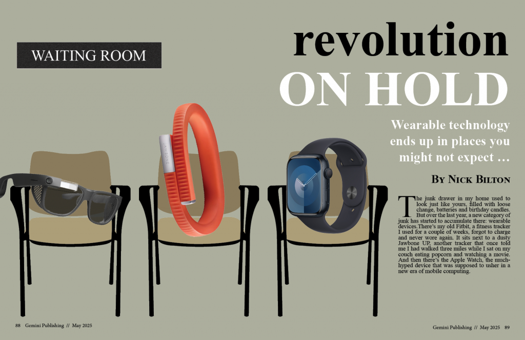
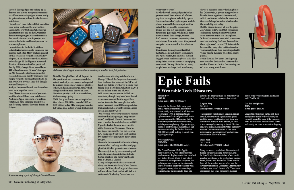
The entire conceptual design unit was a challenge for me. I found it difficult to come up with powerful concepts relating to the stories we were given. For this magazine cover I chose to work with a story that explained how wearable technology, once thought of as something that would change how we live on a day to day basis, was underwhelming compared to it’s expectations.
The design for the cover depicts a waiting room, with several wearable devices sitting in chairs to convey the message that these products are not exactly ready to change the world quite yet. I chose to use Times New Roman typography to reflect the vibe of a bland waiting room. I used some images I found online for the story section and repeated the design of the jawbone to make the cover cohesive with the second spread.
It was challenging to find a way to fit the sidebar story onto the second page, considering how long it was. I am satisfied with how the main story fits in horizontally at the top, I felt like the “Epic Fails” story looks clean, having an entire block to itself. This has been my favorite project so far, I enjoyed making the magazine spread for the London Underground story in Graphic Design I, so I was excited to see that we would be getting a chance to do it again.
Conceptual Illustration: Maquiladoras Under NAFTA
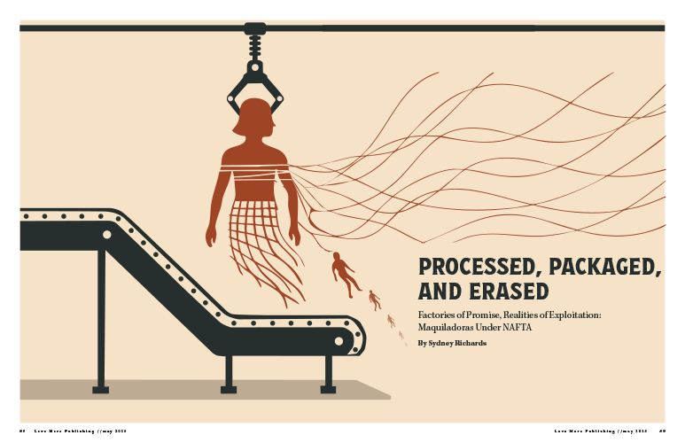
When I designed my conceptual illustration, my intentions were for the design to embody the deep betrayal that maquiladora workers, particularly women, faced under NAFTA. The narrative extended beyond factories; it showed the illusion of opportunity and the harsh reality of exploitation. I decided upon industrial colors to illustrate erasing workers’ identities, leaving only the bland production machinery. The viewpoint of women employed in these factories was nameless; they were recruited for their ease of control, closely monitored, and ultimately discarded when they became a burden. I aimed for my design to produce a similar feeling of being destroyed by a system that valued them for their labor, not as human beings. I examined actual photographs from maquiladoras to provide a visual foundation for the story. Observing pictures of tightly packed sewing stations, where workers cramped beneath bright lighting, influenced my perception of the physical environment I aimed to show. The infinite lines of machines and individuals highlighted that these factories were not hubs of opportunity; they represented an empire of endless labor. This understanding impacted the repetition and structure of my final work.

I examined authentic photographs taken within maquiladoras, but the design evolved once I began to sketch. I was determined not to show violence. The genuine heartbreak portrayed was in how the exploitation became almost routine. During my initial sketches, I explored the concept of workers blending into the machines, gradually losing their human characteristics. These sketches influenced how I constructed the final layout, duplicating the human figures with the mechanical structures until they nearly vanished.
As I moved further into the design, I understood the importance of illustrating the emotional and social repercussions and highlighting the physical effects endured by workers. Incorporating health statistics anchored the project even more effectively. Charts depicting the elevated rates of respiratory ailments, gastrointestinal issues, and injuries among maquiladora employees made it clear that the damage was not a hypothetical but a real-life tragedy. The comparative graph illustrating the differences between maquiladora workers and other demographics, such as housewives and those employed outside maquiladoras, emphasized how significantly worse the conditions were within these factories. I strategically placed this evidence toward the conclusion of the design, as it served as a compelling final argument against the notion that NAFTA generated genuine opportunity.
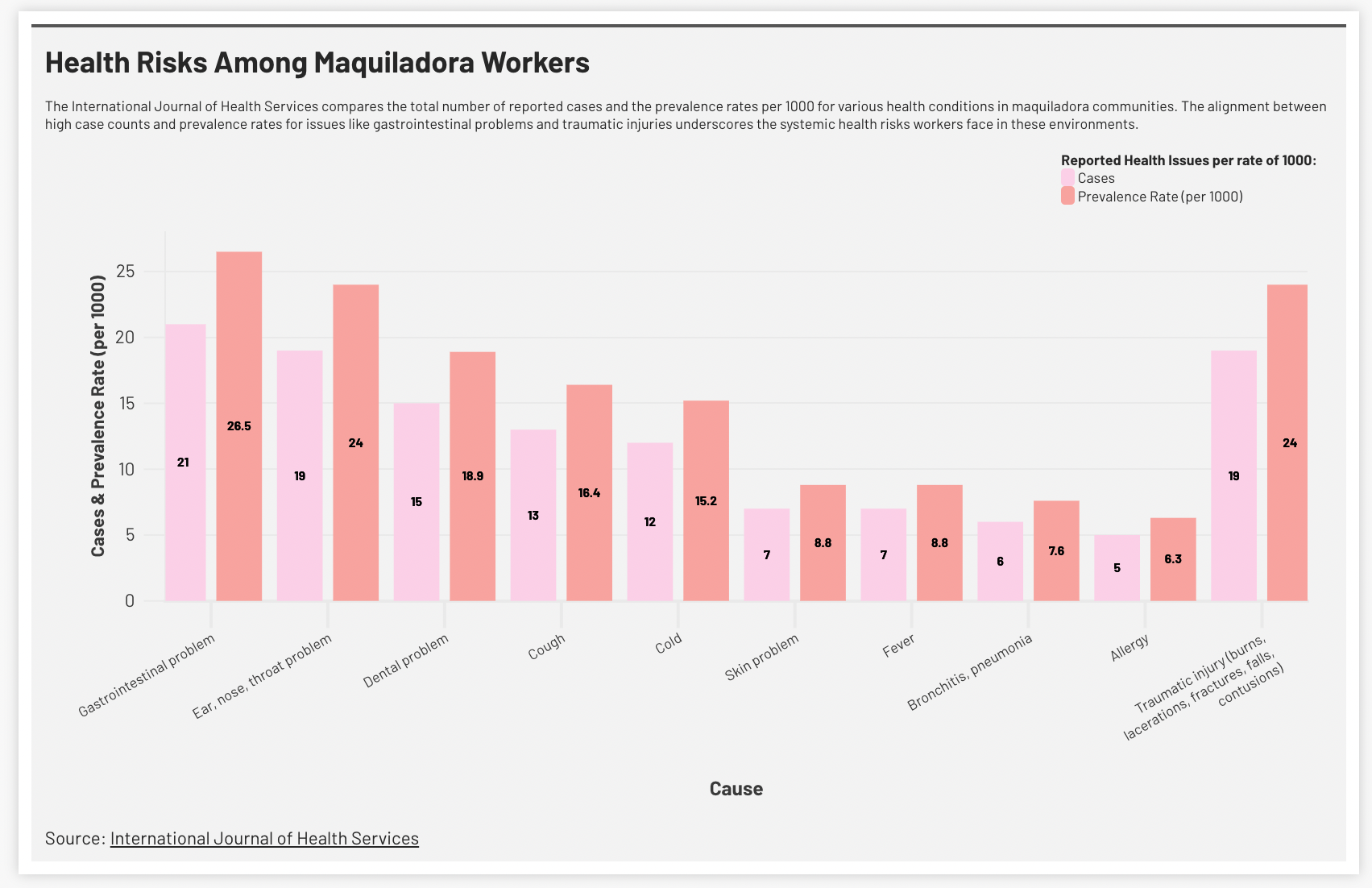
This was a part of my ASF side-spread. I wanted to include real-life data showing the detrimental effects the maquiladora factories caused workers. This graph shows health data maquiladora workers faced major health risks, including respiratory illnesses, injuries, and long-term health problems.
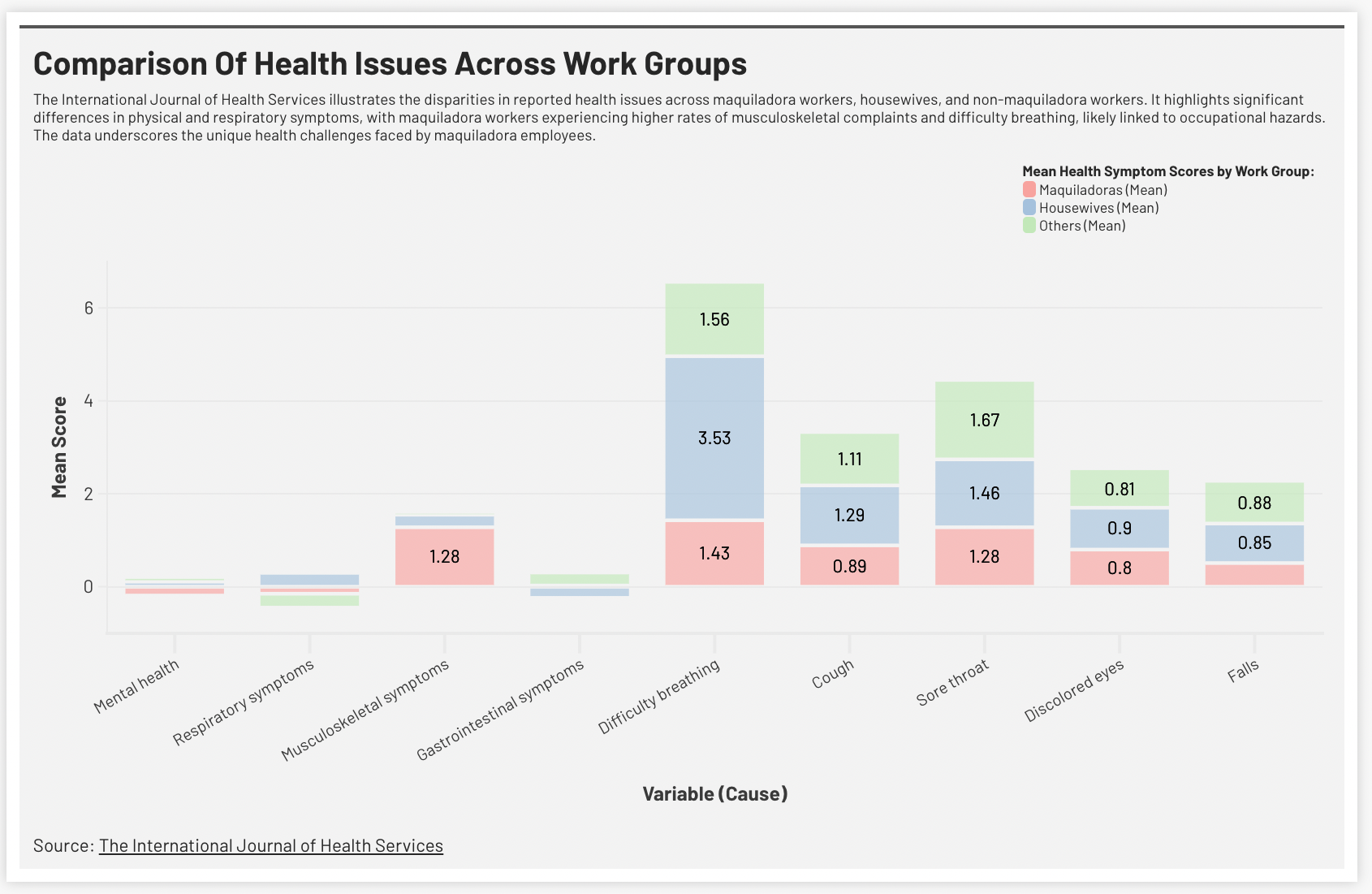
This graph illustrates a comparison of health issues across work groups. Compared to housewives and non-maquiladora workers, maquiladora employees report significantly higher rates of musculoskeletal symptoms, difficulty breathing, and other health issues. These disparities highlight the physical toll of factory work under poor conditions.
Reflecting on the final piece, I believe it encapsulates the complex betrayal central to the maquiladora system. It went beyond merely broken promises; it included lives taken, health compromised, and identities destroyed for profit. Through my choices regarding color, structure, and the elements I decided to include (and exclude), I aimed for the design to prompt viewers to face the human toll frequently obscured by trade agreements that typically present only one perspective.
Project 3- Conceptual
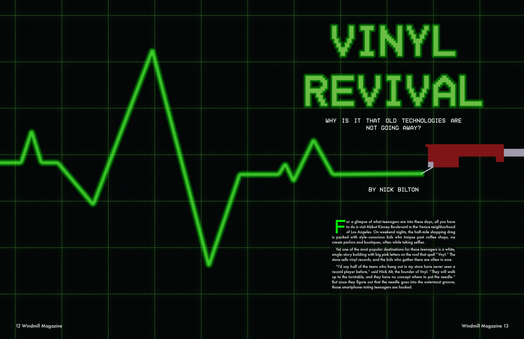
For project 3, I chose the story on old technology. The main idea of the story is about the increasing demand for older technologies, such as, vinyl records and Polaroid cameras. Vinyl records are the main focus of the story, which is why I chose “Vinyl Revival” as the headline, since there has been a rise in demand for vinyl records after years of slowing dwindling sales. To conceptually convey the idea of v records making a come back, I looked for inspiration in heart monitors to show that vinyl is not yet dead. I subtly used the rising and falling pulses to convey the diminishing demand of vinyl and then a sudden jump up to show that there is still a want of vinyl, by consumers. I also added a recorded needle to make it clear that the pulse is being created by vinyl records. For the headline font, I used a 16-bit font face to convey a sense a downgrade to draw upon the old technology concept. The green color I used was from the color palette of the film The Matrix (1999), I felt that the bright green is not only eye catching, but also provides a retro feel, drawing on the old computer screens with bright green code on a black background. Finally, for pages 3 &4, I took the grid background on the spread and used it in the side bar. I also added the pulse and record needle to the bottom the page to further connect the opening spread image with the remainder of the story.
Tech. Conceptual Illustration
For our second to last creative project in this class we were tasked to create a four page magazine article (two spreads) choosing one of the three stories we were given, our main priority was to crate a conceptual illustration for the article of our choosing and display the story text in a creative way. the three stories we could choose form were:
DIY HOME: A story about the perils of making your own home a “smart” home.
OLD TECH: A story about why obsolete technologies — like vinyl records and film cameras — are still with us.
WEARABLE: A story about the inevitable junking of wearable tech.
out of the 3 I decided to go with Old Tech (seen in my spread below)

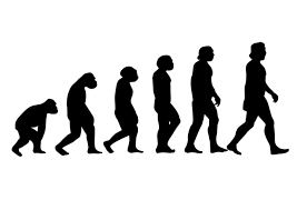
When thinking of concept ideas I first thought of an image like the one show below, the evaluation of man walk thingie, but that idea died quickly because of how dumb I think things are when people just put legs and arms on inanimate objects and personify them.
After that idea I then thought the irony of buying old tech on new tech, I know I’ve done it to buy an old camera thats most likely worst quality them my iPhone Im buying it off of, its a funny concept to me. This was I the idea I then decided to base my main illustration off of, I thought it would get the point across of what the story is about. I also thought the tea line I chose for the illustration went perfectly with it all. Past being the old cameras and vinyls we still hold on to after years of new and “better” tech, Pixel being the new and improved tech we have available now.
when it came to displaying the story and imagery around it I thought about a cool way to show past tech right next to new tech, a side by side.

I think it’s an interesting and different way of showing both Past and present, while also framing the story text.
As for the side bar info. I wanted to think of another interesting way to frame this information inside of having a colored rectangle indicating to the reader that this is different info form the story around it. I began to think of things on theme of this tech story thats also a rectangle… a phone screen!

To show some different/ to better block the information in the side bar I decided to show it as a text thread so it’s easier to fallow.
I had fun with this project, I don’t get to work with text/ magazine layouts that often so getting to do a project like this is always fun to me. it helps me better my thought process when it comes to layouts, visual elements, and overall flow of a project. if I was able to do anything thing different I would try and push myself with the visual a little more, I like the final version I have I would of just liked seeing it maybe a little more cleaned up. But overall I’m happy with I created in the end.
Conceptual Illustration
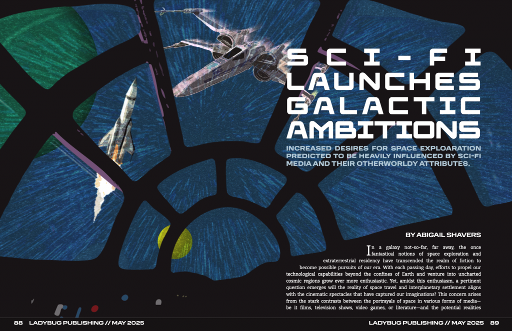
When this project was introduced I was excited about being able to choose an article of my own. I decided to make a cover image and magazine layout for an essay I wrote in Spring 2024. The story is about how media depiction of space and intergalactic travel has warped humanity’s expectations of what space is and could be despite the realities and limitations of space explorations.
During the brainstorming process, I tried a few different designs for the cover image. Similar to the final product, most ideas made use of use photographic and illustrative elements. Instantly, I loved the idea of showing space from inside a fictional cockpit.
When beginning to design the cover image. I felt that it was necessary to combine elements from the fictional Star Wars universe and from the reality of space exploration. I found that the best way to do this was to depict both kinds of spacecraft outside from the perspective of the viewer.
I did have to spend more time creating the spread layouts than expected because I ran into difficulties. I knew I wanted to bring the first part of the story onto the cover image, but this part gave me the most trouble because I had to adjust the two different text spaces to fit their placements while still having the text connect between the two pages. However, I did enjoy finding and/or creating various elements to add character to the second spread. I found it best to use the same typeface for the subheadings as the main title to connect those elements. I also had the idea to add pops of the blue and red hues from the buttons in the cover image to emulate the iconic lightsabers from the Star Wars franchise.
For the bigger elements, I felt that it was important to use these elements to give more context to readers who may not have seen the movie the article references throughout. The chart entitled “Portrayal vs. Reality” makes more general comparisons between the franchise’s sci-fi depiction of space and the real conditions of space. This chart can also serve as a concise summary of some of the points made later in the article. For the photograph, I wanted to use a scene from the movie to show how fictional the world is; while looking for the specific scenes, I kept finding photos from filming on set that featured the director giving directions to different actors and thought this could be an interesting way to show the fakeness of the Star Wars worldbuilding. In the photo I chose for the layout, you see J.J Abrams in his typical work attire instructing his two leads in their first on-screen interaction while wearing their unrealistic galactic costumes.
I loved working on this project because I feel like I had a lot of creative freedom from being able to pick my own story to designing pretty much every detail of the spreads’ layouts. If I were to change one thing about my design it would be to bring the primary color of the inside of the ship in the cover image to the story spread as a background color and make the story text white. Overall, I am happy with my final layout and cover image and feel that I executed my vision for this project.