For this project I wanted to encapsulate the aesthetic and vision I have of reading books into a publishing company. Right from the beginning I wanted to play on using a luna moth but I didn’t know what my company’s name would be or how I would add my logo into the design. It seemed challenging. At first I played with the name of “Ephemera Publishing” but I didn’t know how to have the wing represent the P in a symmetrical way. That’s when I thought of “Ephemera Books” since this is a publishing company, it’s most likely publishing books. For color choice, I used two distinct colors found in a luna moth which is this green color and a dark purple/maroon color. From the logos we had seen in class, I wanted to strive to make a logo that had both the design and logo name hidden in the design to get the synergy seen from example logos. I think it made for a really strong design. I’m really proud with my design and I think I conveyed my aesthetic vision how I wanted to. I wanted to be a publishing company that targeted people who read books on a “Pinterest” aesthetic level (i.e. mood boards, dark academia, cottagecore, etc.). I think if I were to rework the design at all, it would be to make the ‘E’ and ‘B’ in the design more prominent, I struggled with that a lot initially but where I came to an end felt pretty good.
Vivid Pineapple Logo Design
The first part that I came up with for the name of my company was pineapple. When thinking of a name I sort of just started thinking of the first words that would come to mind. Pineapple was one of those words and it stuck with me throughout the brainstorming process. The “vivid” part of the name did not come until the process of designing the logo. The original name was going to be “Sweet Pineapple,” but when designing the crown of the pineapple, I noticed a “v” shape within it. I decided that I should include a word that started with a V instead and ultimately settled on vivd\id. I felt with vivid I would be able to create a compelling brand voice for the company.
The process of the logo design began with sketching it out. My original idea was keep design the crown of the pineapple as it normally is, with it being made of leaves. One of the leaves however, would be a feather of a pen. I kept drawing it in different ways, but it never seemed to look right. I then thought about designing the crown in the style of a book. After a few tries I ended up on a design I liked and stuck with it through the whole process. All that was left to do was design the logo in Illustrator.
The final design is meant to portray a pineapple with an open book as the crown. This of course represents the brand’s role as a publishing company. I didn’t want to do anything to the main shape of the pineapple, as it is quite a recognizable figure and something people would notice right away. I made sure to choose bright colors to go along with the “vivid” part of the company name. I also felt that bright colors are good way to make the logo stand out. For typography, I settled on the font “Tarif” for the design. I found the font on Adobe Fonts when looking under the filter “funky” and liked the look of it.
Overall, I enjoyed working on this project. I’ve sketched logos in the past just for the fun of it, but I liked getting the opportunity to experience the full process of logo design. It was interesting to learn more about brand guides, as well as researching examples of other brands to give me a better idea of how to go about creating mine.
Ladybug Publishing Logo Design
The first element I chose for my brand was the brand voice. I knew I wanted to make my brand voice welcoming and inclusive because I feel that those are important qualities for any entity to have in relationships whether personal or business.
The hardest part for me was choosing a concept for my company. I had a few trial-and-error concepts before I landed on Ladybug Publishing. I tried coming up with names and logo mocks for various ideas, but none felt strong enough until I came up with the visual idea of a ladybug. One that I worked on for a while was an illustration of a peach pit, but it didn’t give the sophistication that a logo should and didn’t have much symbolism or purpose behind it either.
The visual concept started with a small sketch of a ladybug, but it felt too intricate and unmemorable for a solid logo design. Then, I began to sketch just the ladybug’s body and focus on the spotted design element. I started to like this design because the foundational shape of the body is circular and makes for a good circular logo concept. During my sketching, I realized that the shape of the closed wings against the body came to a point in resemblance to a pen stylus. Then, I decided to manipulate the shape of the wings to emphasize the negative space between them, so I could integrate a stylus shape into the ladybug’s body. Finally, I utilized the negative space even further by adding contrasting detail elements to emphasize the stylus illustration more. Both the ladybug and pen stylus stand out while remaining balanced within the illustration because of my use of bold colors which are both iconic and contrasting.
The typography was the second easiest decision for me. To stay true to the brand voice, I felt that a sans serif was more welcoming and less stiff looking; personally, I am also drawn more to the look of sans serif type. When looking through Adobe Fonts, I came across Tomarik, and immediately downloaded the font family and implemented it into my design. I feel that Tomarik perfectly combined the welcoming and inclusive brand voice by having an imperfect line weight while still looking professional.
Overall, I love my logo design, and I am glad I spent a lot of time in the brainstorming process to reach a concept and design that I am proud of.
Portal Publishing Logo Design
I
When I was brainstorming for this project, I kept coming back to the word portal. It was the word that encapsulated a great read. When reading an excellent book it’s hard not to feel like you have stepped through a portal. The word also has a lot of creative energy, so there were plenty of references.
I enjoyed this simple star shape I kept coming across and was constantly playing with its shape in my head to try and incorporate a book-like image. A couple of days later I was reading and laid my book on the bed. When I saw it I recognised it looked like the exact half of the shape I wanted to use.
I created this logo with the idea that it would be two open books facing one another with a shape that resembles an abstraction of a portal between them. I chose these colors because I wanted them to feel reagal, or adjacent to vintage fantasy books. I also chose them to be very inviting, since we want to invite people to read our books, and step through a ‘portal’.
I had a lot of fun with this project; its creative freedom made it enjoyable. I did face challenges though. I had a hard time making things symmetrical. There are imperfections in the logo that if I had put a little more work into wouldn’t be there.
Introducing: Love More Publishing
Creating the Love More Publishing brand was more than just a design project for me. Right from the start, I saw the brand as a symbol of something important: a space dedicated to sharing meaningful narratives while raising awareness for mental health. Each design choice, from the butterfly to the semicolon and the colors chosen, was made to inspire emotions of healing, hope, and strength.
The semicolon played a central role in this project, representing the idea that an individual’s story continues. By incorporating a butterfly, I aimed to add to this concept, emphasizing ideas of change and rebirth. Finding the perfect balance between these two symbols required sketches to combine their ideas. Color played a role in defining the brand’s identity. Choosing shades of purple felt natural, as this color is frequently linked with mental health awareness, healing, and courage.
Overall, it became clear that this project went beyond just creating a logo; it was focused on building a visual identity that tells a story. The completed design incorporates the spirit of Love More Publishing: a commitment to hope, resilience, and the life-changing nature of storytelling in guiding individuals on their journeys. This reflective process has reinforced my belief in the power of design and its ability to convey emotions, inspire change, and develop significant connections.
Hi, welcome to Anchor!
Anchor is a publishing company that nurtures young minds and inspires their creativity. To convey the tone of support and stability, the brand features an anchor symbol drawn with a bold stroke.
The color palette of bright orange provides a sense of warmth and welcomeness, along with the contemporary color of blue brings emphasis to the boldness. The use of font Chaloops gives a sense of childlike and playfulness, which illustrates the tone the brand conveys.
Overall, the design of Anchor communicates our goal of providing children with the support to spark their imagination and explore their creativity.
Animation
At first my idea was to make the whole logo turn around and and have swirling sparkles- the swirling sparkles to represent his magic in the movie. But after doing trials and error, I wasn’t able to get it how I wanted it to. My second idea for the animation was to have the animation pop up and hide in one corner and do the same thing on the other side. The reason is to create curiosity to what it could be. I also used the spiraling zoom effect to bring in the rest of the design of my design together. For the audio choice i chose a fun upbeat jazz instrumental because I felt it goes well with the character’s personality. The second audio I used was his voice from a Youtube video. I specifically chose an audio where he says his name. I wanted it to match up towards the end where everything is put together. Finally what I changed was my logo design itself. My previous logo had the white outline on the design and on the letters but after taking my professor’s advice, i also changed the color theme of the design from shades of brown, white and black to grey, light blue, and white.
sweetheart logo animation
For my logo animation, I knew I wanted to make some revisions with my logo. I ended up choosing two completely new fonts. I was scrolling through Adobe to find a cursive font that I could use for the S in Sweetheart (Lindsey Signature) and I also chose a cleaner but also bold font for the rest of the text (TT Ricordi Allegria). I messed around with how I wanted the text to be positioned until i ended up with this final product and added a line separating the two lines of text. I then changed the overall color of my design to fit the overall vibe I wanted, as well as make it more coherent. I also decided to move the quill from the top to the bottom. As for my animation…I knew I wanted it to animate as if it were handwritten. I first began with the actual logo itself and created a stroke shape layer and selected that stroke to be the track matte layer for my logo. I did the same for the line between the text, and the S as well. I then worked with the rest of the text, I precomposed each one and separated every letter, adjusted them to come up one after the other by a separate key frame, and added a motion blur to make it look more dynamic. I I also adjusted everything in the graph editor (speed) to appear and come in onto the screen as I wanted. Finally, I added a transition at the beginning and the end to make it flow better. For my sound, i knew I wanted to rely solely on sound effects. I found a sort of magical whoosh that I used at the beginning and end of my animation and then added a handwriting sound over any part of the animation that was appearing on screen as if it were written. Overall I am very pleased with how my animation turned out. Working with After Effects has become less scary to me with this project as well and I am happy I got to learn some new things!
RoboBlast Magazine
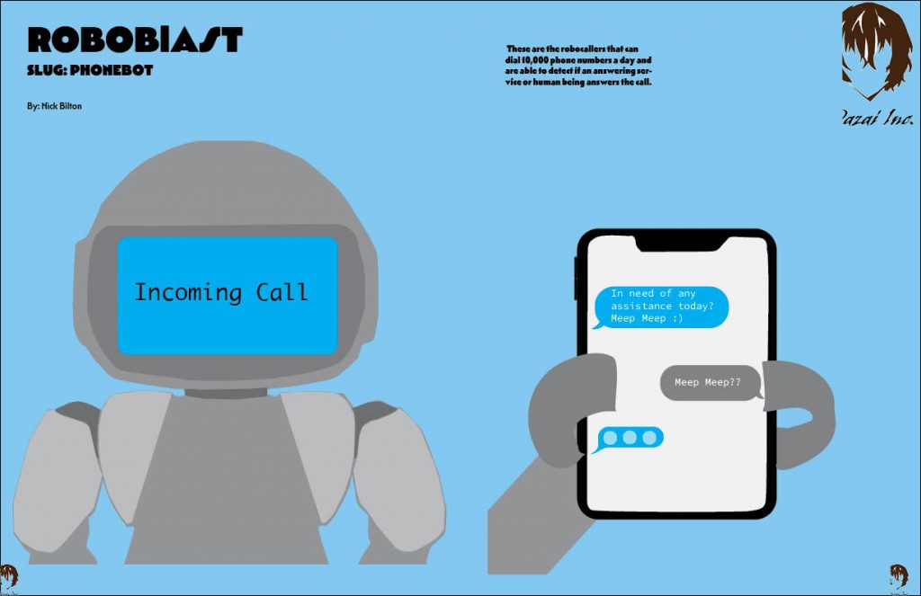
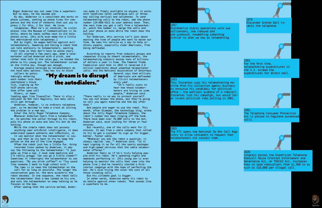
For this project we created a magazine layout for 1 out of the 3 topics. I chose the topic about Phonebots, which is about robots who sole purpose is to waste the time of telemarketers. I took inspiration with the title being called Phonebots. The best way was to illustrate a robot on one side and with the robot holding the phone on the other hand. For the other page on the right hand side, I had the bright idea to draw the robot hand holding the facts to bring more illustration to the spread and not be just words.
Project 04: Nabi Animation
Creating this animation for my publishing company, NABI, was both a challenging and rewarding experience. My logo consists of a simple butterfly that is half red and half blue. This served as the foundation for the animation, and I aimed to bring it to life in a way that reflects the company’s identity and connection to Korean culture. The animation begins with the butterfly gracefully flying into the frame, accompanied by a subtle fluttering sound. This movement not only introduces the logo but also symbolizes the idea of growth and transformation, core values I envision for NABI as a brand.
The highlight of this project is the butterfly’s transition into the Taeguk shape, which mirrors the same red and blue symbol of the Korean flag. The spinning motion and gentle fade between the two forms emphasize harmony and continuity, themes central to the company’s mission of bridging languages and cultures through publishing. As the Taeguk spins and reforms into the butterfly logo, the simplicity and elegance of the design become clear, showcasing the logo’s versatility while maintaining its visual impact.
To conclude the animation, I incorporated the word “NABI” appearing beneath the butterfly, accompanied by three black lines on the left upper wing that represent the Geon trigram from the Korean flag. The soft gong sound that plays as each line appears adds a calming, rhythmic element that ties into the traditional East Asian background music. Together, I feel that the sounds and visuals complement the logo’s simplicity while paying homage to Korean cultural symbolism in a subtle yet meaningful way.
Overall, I am proud of how this animation turned out. The sleek white background, the calming music, and the well-timed sound effects all work together to represent the NABI brand’s core identity: simplicity, balance, and a deep respect for Korean culture. This project allowed me to not only enhance my technical skills in After Effects but also thoughtfully connect my design work to the cultural and conceptual themes that inspire me. If I were to change anything, I may have tried to make the flying butterfly animation more realistic or added more to the Taeguk symbol itself. However, I feel that the final result I have is cohesive, intentional, and reflective of my brand’s vision.