Retro Technology – Conceptual Illustration

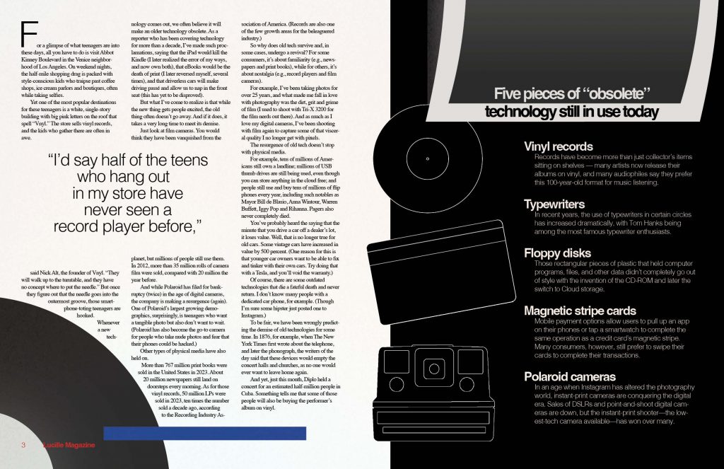
For this project, I chose to illustrate the “Old Tech” story. The article explained how technology is always advancing, and yet some older pieces stick around long after they’ve become obsolete.

The most difficult part of this process was deciding how to represent the technology best. The concept of revival or resurgence was challenging to design without feeling too cliche or overly illustrated. After lots of trial and error, I landed on the idea regrowth, shown through plant imagery. This seemed like a simple but effective way to illustrate old objects finding new life. I also decided to focus the deck on Generation Z as I felt it was the most important part of the article. Yes, these pieces of tech have stuck around with the generations that used to use them, but it’s the new generation who are causing the resurgence, thus making them most important to the story.

This is the first spread, click the image to see both in full.

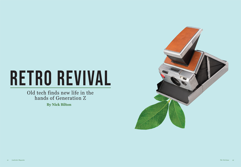
When working on this spread, I was so grateful for the large amount of good quality photographs of the technology. This lead me to focus on photos as opposed to full illustrations for my concept. I wanted to highlight the technology existing in a modern space, and high quality photographs felt like the best way to do so.

Once I had all the images together, I had to tackle fitting them together with the story. The story was shorter than I had expected, leaving me with more room for the side bar and quotes. After lots of rearranging, I found a balance between the sidebar information and the copy that felt even.

The minimal style of this spread felt like the best way to keep the technology as the focus. There was an iteration of this project that had leaves crawling all around and through the story and sidebar, but in the end it was too busy, and I felt that it took away from the intricacies of the old technology.

This is the second spread, click the image to see both in full.

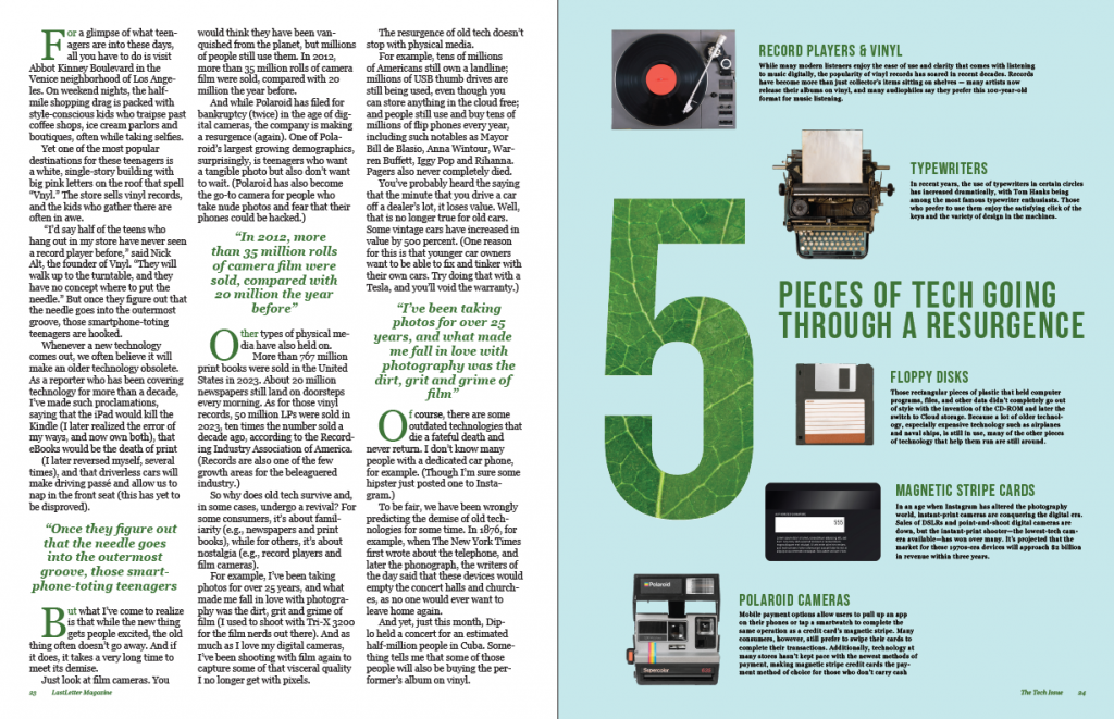
The color scheme lent itself to the spread easily. Although the light blue and green may not seem like an obvious choice for a technology spread, it worked perfectly with idea of regrowth and resurgence, and was easy to weave through both spreads.

Overall, I truly enjoyed this project. I have spent time working with layouts in past magazine and yearbook work and I was excited to work with it again. A lot of the design work I do now is purely social media based, so it was refreshing to get so much space to work with.

Personal Touch

Click the image to see a full PDF version.

For this project, I wanted to create a visually compelling conceptual image that had never been done before. I thought of drawing a hand touching a phone from a bird’s eye angle, I thought of creating a collage of social media icons on top of an iPhone, but eventually I concluded I needed to incorporate a fingerprint into my image. This is why I chose to do my final idea, the icons masked into a drawn fingerprint.

Out of all the projects completed this semester, this was definitely the most difficult. I created clipping masks for each icon, and then had to piece them together on top of the fingerprint illustration. Every illustration was hand draw by me using the pen tool. It was frustrating at first to figure out why my clipping masks weren’t working, but eventually, after much trial and error, I succeeded.

Due to the contents of the article, plus the illustration, I decided to title this article “Personal Touch” as a callback to the fingerprint being the mark you leave after touching something, and after touching a mobile phone, your screen has visible fingerprints on it. I rewrote the deck to something I found more intriguing than the one we were given. The new deck I came up with was “Despite its flaws, social media’s ability to connect personally holds greater value” which I think does a great job of introducing the article’s topic and relates to the image.

The main color I chose to incorporate was blue. I did this because when I think of a color that is trusting and represents stability. Blue is commonly linked to trust, security, and reliability, making it an ideal color to highlight the value of authentic and personal connections on social media. Another idea with blue is that a lot of social media icons incorporate the color blue in some way, showcasing a subtle recall of popular brands such as Facebook, Twitter, and LinkedIn. By only using the color blue, the colorful social media icons in the fingerprint stand out.

Overall, I am incredibly proud of my work for project 3. I think my conceptual visual was innovative, clever, and intriguing. I am very proud to be able to showcase this on my portfolio site and show others.

Conceptual

For this project, I designed a magazine spread for an article about the personal connectedness that we feel due to social media. For the core idea, I created the social media heart icon but used an illustration of “heart hands” instead of an actual heart. I used similar text and social media-related iconography throughout the composition to create a sense of interconnectedness and relation.

Opening Spread
Spread

Project 3 – Conceptual

For this conceptual Illustration Project, we were tasked with designing a magazine layout inspired by one of three article options. These projects allowed us to flex our creative muscles, blending design, typography, and illustration to tell compelling visual stories. From the nostalgic charm of “Old Tech” to the innovative tale of an AI robot wasting telemarketers’ time, these projects pushed our conceptual thinking and illustrative abilities.

 AI’s Tangle with Telemarketers: A Futuristic Metaphor

When reading through the different stories, I found the 3rd one the most interesting. It is based on a story about a robot that is designed to waste telemarketers’ time. My challenge was to visually balance some of the humor, but still have it be more serious looking. The design steered clear of overly cartoon depictions, opting instead for sleek, modern aesthetics. Staying strong with the concept, I decided to add a phone that appears with the caller ID being “Spam” and being answered by what looks like a robotic hand. I decided to add a little bit of a texture and more of the context of coding as the background, to simulate the idea of being programmed. 

A robot hand, crafted with smooth, lifelike machinery, became the focal point, holding a blocky, easy to distinguish, modern day iphone. The telemarketer, not shown, but mainly due to the simple idea of us not ever seeing them either. 

The layout incorporated a basic and simple typography, but mainly due to the detail of the illustrations being more important. I added the background code to add texture so it would not stand as a straight white page, but also to add some depth. On the second page, quotes from the article were magnified to draw readers’ attention, complemented by a big hand reaching for a robot hand, similar to the ‘Creation of Adam’ art piece by Michelangelo. Overall, based on my want to keep it simple and detailed, I think that it turned out great.

Animation

Click on image to download and view animation

Completing this project was both frustrating and rewarding at the same time. At first, I was struggling with how i wanted my animation, and how to achieve it. I was overcomplicating it. Once i took a step back and simplified it, I was bale to see success and progress. After every frame that properly animated I would celebrate and smile. Seeing the end result was so rewarding to know all my hard work had paid off.

Concept Project

Click for full PDF of the spread

I chose the personal article for this assignment because I felt more connected to it when reading it. I loved how I was immediately able to visualize a cover page concept. I went with this design because our emotions are complex just like technology is. We have a love hate relationship with our machines and they are the heart of our world.

Influence Poster

Ava Schneider Influence Poster
Click the image to be able to view it!

My Influence was Cipe Pineless who was a graphic designer for magazines such as Seventeen, Glamour, Vanity and many more. I love her work and how she creates a cover that is both enticing but realistic. I took her cover that was a reflection of a beach picture and used that to create this poster. I loved the simplicity of it while also being able to have the picture speak for you.

Conceptual Project

For the Conceptual Illustration Project, we had the choice between three different articles to design out magazine around. I chose to design a magazine based on the “Old Tech” story, which was a story about how old tech is coming back into style. I learned a lot when I was designing this magazine and overall learned how to conceptually show an idea.

For this project, because it is a story about old tech coming back, I thought this was a great opportunity to show comparison through color/pages/ect. I thought that the project being a magazine and having two pages in the opening spread, that this opportunity would show itself very well on the first spread.

Opening Spread
I chose the font “Helvetica” in bold because I think this font looks vintage and modern at the same time. Because the text is on both of the pages on the opening spread, I wanted to choose a font that had these qualities. I thought that Helvetica was perfect. To continue this transcending through time feeling, I wanted to show the “vintage” items on both pages. Within this, I wanted to incorporate the font into the design to make everything feel cohesive. On the left page, the “n” is extended and used as the needle for the vinyl record. On the right page, the “l” from Revival is extended to be the part of the camera where the Polaroid comes out. Along with this, I wanted to continue to emphasize the transcendence of old to new through color. On the left page, the blue background and white text feels vintage to me. On the right page, I chose to do black text on a white background, because that feels more modern.

I chose the name “Vintage Revival” because it felt right with the story. I wanted the word “Vintage” to be in the title because that is such a large part of the story, and the word “Revival” just felt right.

Story
In terms of the next two pages, my biggest goal was to ave the Polaroid continue onto the second page. I really like how this looks. In terms of the story, I chose the font “Times New Roman”, as it is a good classic serif font for magazine body copy. I wanted the quote about how the majority of kids fascinated by record players have never seen one before, which is why I made it such a large emphasis on the left page. At the bottom of the left page, I added another record, similar to the one that is in the opening spread. I made this choice because it felt appropriate if the Polaroid is also on the second spread. I also included the blue strip to pull in the color from the opening spread, but also so there is a needle on the record. In terms of the sidebar, I chose to make the record, credit card, and camera more illustrative to separate them from the other illustrations. I also made it on a black background so it had a similar flow to the opening spread in terms of comparison, but change up the colors.


Overall, I am really proud of how this project came out. I was honestly intimidated by the name of the project “Conceptual Illustration” because I feel my strengths lie in photography and not graphic illustrations. This definitely showed me that I can do both. I learned a lot in terms of how to show a story through illustration.

Conceptual Illustration

Click here to view my full PDF design.

For this project, I carefully considered the three story options given to us before deciding on the article about a robot that was created to purposefully waste the time of telemarketers. I thought this was the most engaging, original story of the three and I could see my illustration going any number of ways.

I knew that I did not want to create a full illustration of a robot in my design, wanting to stay away from an image that was too cartoony or silly, but instead lean into one that is fun and eye catching. I wanted to highlight my illustrative skills by drawing every image on the page, but wanted to walk the line between having it come off as too realistic or too childish. I looked to other examples of illustrated conceptual designs in newspapers and magazines, getting some inspirations in the type of drawings I saw as well as aspects of color-usage, typography and layout. In thinking about the best way to capture the heart of the story, I thought about different keywords regarding the players in my story. Tech. Business. Trapped. Phones. I finally settled on the idea of a phone cord, and literally having someone be trapped within the tangles of the line and unable to move; a metaphor for what this robot was doing to the telemarketers’ time.

I began with the robot, using the imagery of a more modern version of a physical robot, with smooth, clean machinery that appeared lifelike. I believed this was the best way to avoid creating a caricature of a robot, while still having an image that is recognize-able to people. I chose just to draw the hand to create this sense of power the robot holds, dangling the humans they call by their fingertips. The phone was simple; I used real images of landline phones and chose a blockier, straightforward phone layout that would look good in the robot’s hand. The telemarketer was my biggest decision. I knew I wanted a good blend of realistic, sophisticated rendering with the fun, more zany element of the story. Thus, I settled on a faceless, basically colorless drawing of a man in a suit that I think pairs well with the rest of the elements. To create the cords of the phone, I originally used the preset phone cord brush available in Illustrator. But after some trial and error, and especially after learning the fact that I could not adjust the color of the black cord preset they gave me, I decided just to use the brush as a guide, creating a path of the general direction I wanted my own cord to go, and then drawing the actual phone cord by hand to make it the color and size I desired.

Once all the elements were complete, I went for a light blue backdrop for my image, keeping in mind the aesthetics that come from picturing the words “tech” and “business,” and found a more futuristic, blocky typography for my headline that felt similar to something you would see in coding, without being too obvious. On the second page, I laid out my text, retained the light blue coloring for my sidebar element, and then carried over parts of the images from the first page, namely the phone and the cord. I felt I was still missing something, specifically a brand new drawn element, and so I went back to Illustrator and drew the robot’s hand again, this time completely open.

Finally, with such an interesting story with crazy quotes about the thought process of the AI, I chose to select three of my favorite quotes from the reading and magnify them to draw the reader’s eye. Overall, I am quite pleased with how my design came together, proud of my abilities in illustrating and happy with the overall look of my design because of the various elements I chose. If I could do one thing differently, I think I would have created another original illustration element for the second page instead of just carrying the entire phone over. Something fresh and new that maybe fits a little better with the layout of the page.

Project 03: Conceptual

First spread of magazine design
Click here to view the full PDF of both magazine spreads!

For this project, I took a look at all three potential stories for my magazine design and sketched a few ideas. However, I felt more drawn to and eventually chose the story by Nick Bilton. He writes about the idea that social media and technology bring people together in a way that outweighs the many negative consequences of technology. I first thought about ways to conceptualize the concept of social media having a personal touch or a way of conceptualizing the connection between two people due to technology. I did not want to simply personify a piece of technology, like an iPhone into a human-like figure, but I also did want to draw a connection between technology and humans. Therefore, I ended up coming up with this idea of two abstract human figures hugging each other but made up of popular social media icons. In this way, it is as if humans are fostering this connection with each other via the social media or technology they use.

When creating my imagery, I knew I wanted to stick with a pretty simple, almost monochromatic color scheme. I stuck with shades of blue to give the overall magazine design a techy feel. For the background, I used a blue and white center gradient and added a screen-like texture. I also tried to create human figures for my hand-drawn image in a way that reflects early 2000s tech design. I took inspiration from the Frutiger Aero design style that was popular in the 2000s. The name comes from Adrian Frutiger, a Swiss typeface designer, and Windows Aero, a visual style used in Microsoft’s Windows Vista software. This is where I got the inspiration to keep the human figures more rounded and have varying shades of blue with highlights of white.

Once I had designed my conceptual image, I worked on the headline. I chose “BEYOND THE SCREEN: THE UNEXPECTED DIGITAL HUG OF TECH” since my imagery reflects two figures filled with media hugging each other. I aimed to convey the message within the story about how technology goes beyond just being technology or media to creating positive benefits for users. After I created the headline, I had the idea of formatting the headline and deck into Apple iPhone text messages. I think this element of my design fits into the overall technology and social media theme of the story and imagery, as well as fits into the color scheme I chose. To match the text message idea, I selected the default Apple iPhone text message font family “San Francisco.” I wanted the font to be as close of a match to what a real text message might look like. I carried over this font into some of the other elements in my design such as the sidebar and pull quote. For my body text, I chose Roboto because I think it is easy to read and matches well with the theme. I also ended up creating and adding a scroll bar to both spreads on the farmost right side. I think this adds another tie-in to the overarching technology theme and works with the formatting of the headline and the deck.

For my second spread, I wanted to continue the tech, Frutiger Aero media theme. I first carried over the exact same background and color scheme. I also added some more hand-drawn technology-based imagery such as a mouse cursor and forms of modern technology like computers, a tablet, and a smartphone. I also carried over some of the social media icons that make up the hugging humans on the first spread into the tops of the last two pages creating another tie between the two spreads. The scroll bar is featured on the second spread as well but moved further down as if the reader has scrolled through the story.

For my additional elements, I included a sidebar designed in a way that is meant to reflect what a notification panel might look like on a user’s phone. Each section of the sidebar featuring fun facts about social media is designed to look like its own notification with hand-drawn icons. I aimed to create a sidebar in a way that does not break the overall theme of the design and instead adds to it. I also pulled out a quote from the story that I thought encompasses the overall message of not only the story but the conceptual imagery on the first spread as well.

Overall, I am pretty proud of my design work. I think I did a nice job at consistency and connecting both of the spreads. I think I also added a lot of technology and media-based design elements to craft a cohesive theme that matches the content of the story. I did struggle a little with making sure the pages did not end up with too much empty space due to the story not completely filling up both spreads. However, I think I worked out an effective solution. Although I like my conceptual imagery and think it gives off a Frutiger Aero vibe, if I re-did the project, I think I could push myself further to design something even more creative while still reflecting the content of the story.