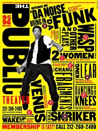
For my influence poster project, I chose to be influenced by American graphic designer Timothy Goodman. Timothy Goodman is an award-winning artist, graphic designer, author and public speaker. Timothy Goodman’s art and words have populated walls, packaging, clothes, products, magazine covers and one sanitation truck for brands including Apple, Nike, Google, Samsung, MoMa, Netflix, YSL, Time, The New Yorker, and the New York Times. His partnerships have included a global collection of clothing with Uniqlo and a Nike b-ball shoe with Kevin Durant. He regularly partners with schools to create art for communities in NYC. His second solo gallery exhibition Every Time I Fall in Love It’s Summer was on view at the Richard Taittinger Gallery in the summer of 2023. He’s the author of three books and the co-creator of several social experiments including the viral blog 40 Days of Dating and 12 Kinds of Kindness. Timothy’s work often discusses topics such as mental health, manhood, politics, heartbreak and love. He teaches at School of Visual Arts in NYC, and speaks around the world at conferences. His graphic memoir I Always Think It’s Forever was published in 2023 by Simon & Schuster.

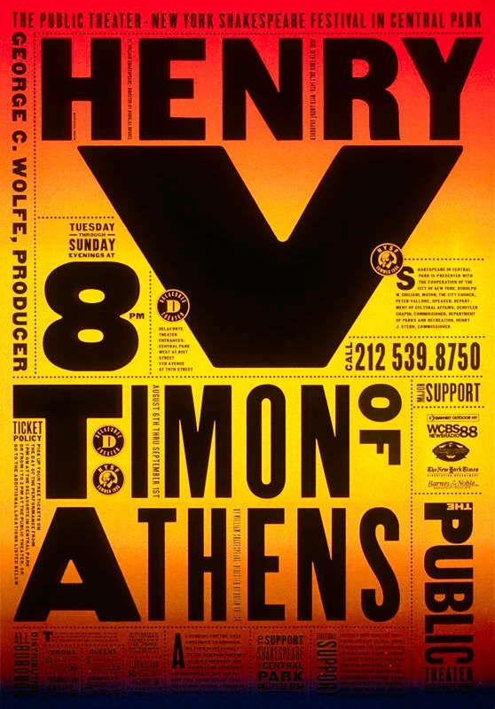
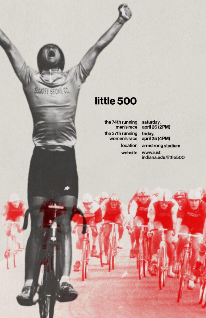
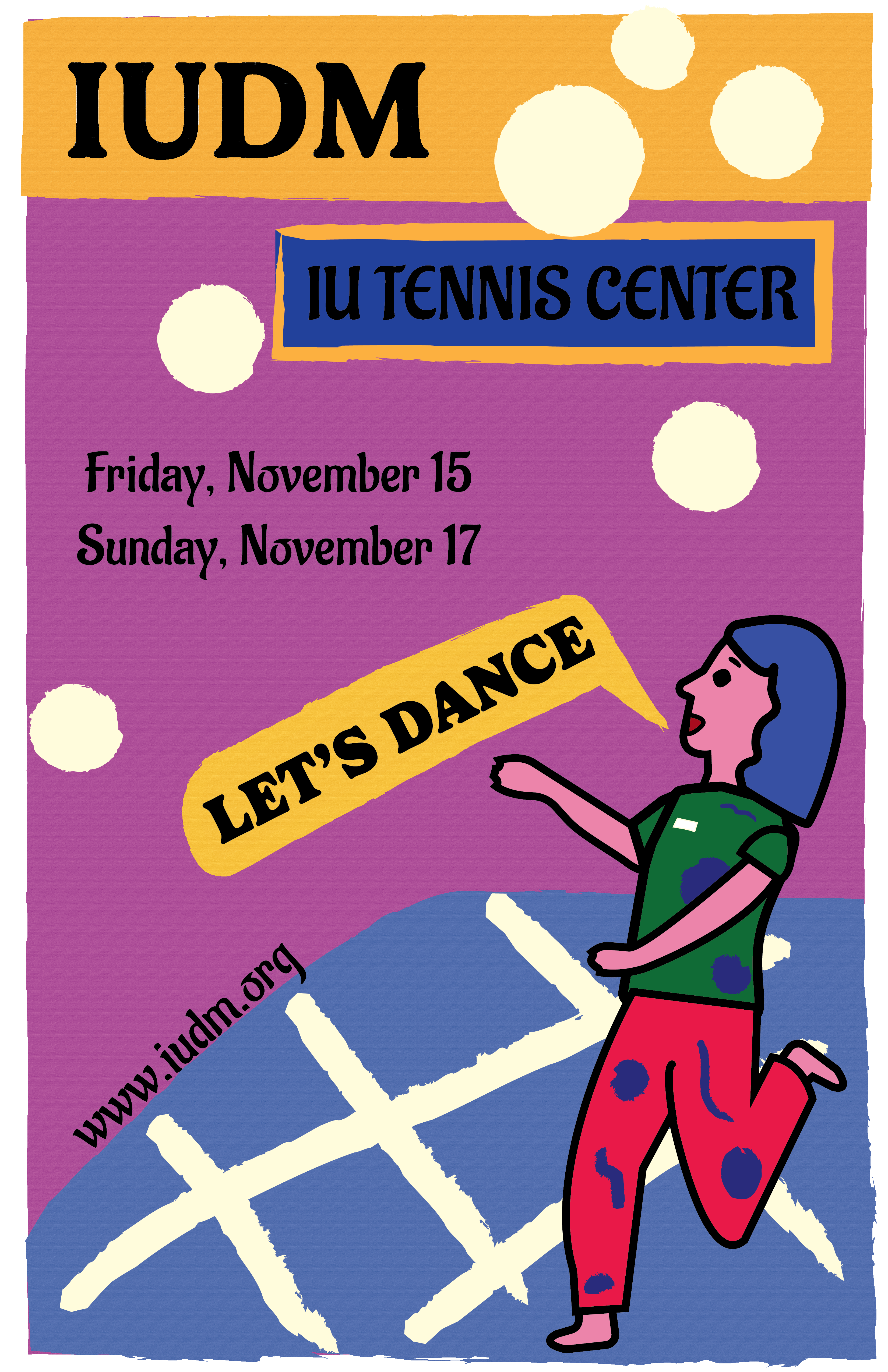
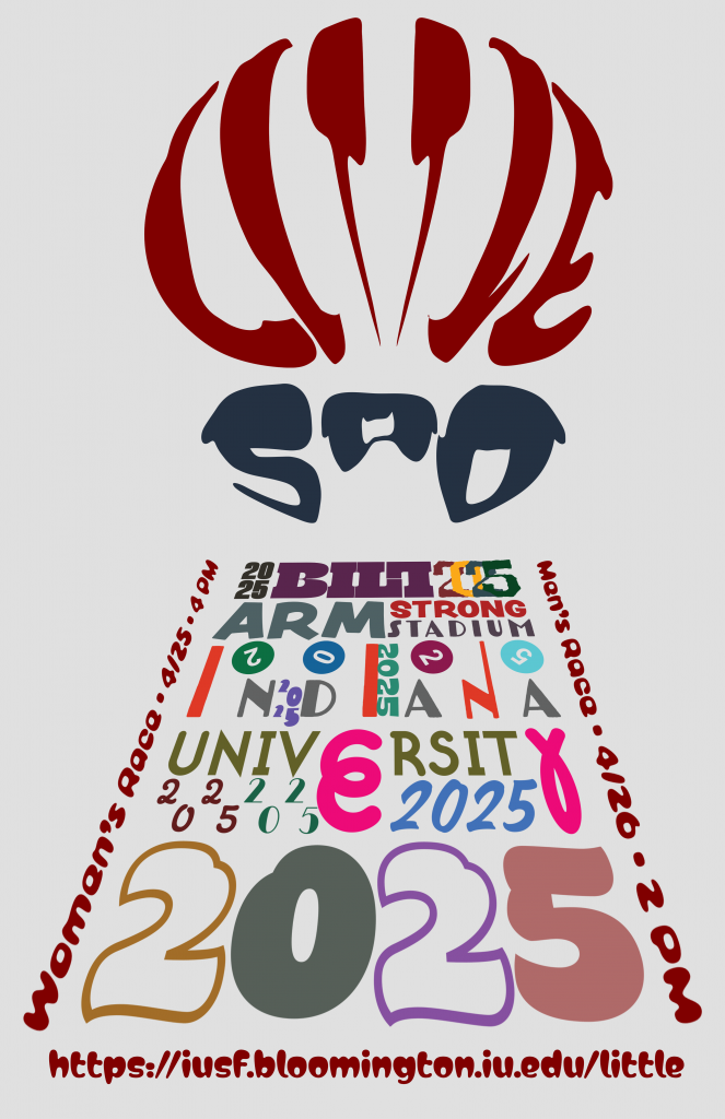
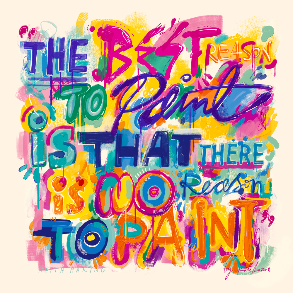
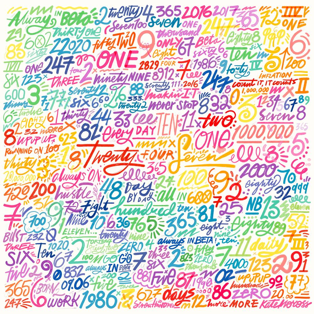
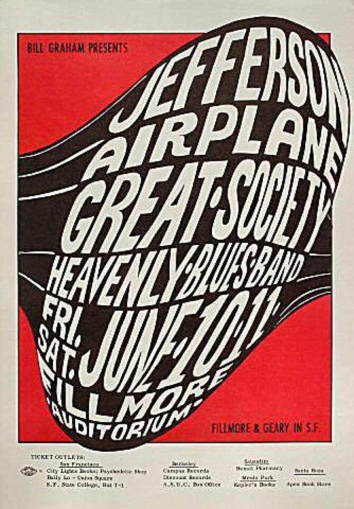
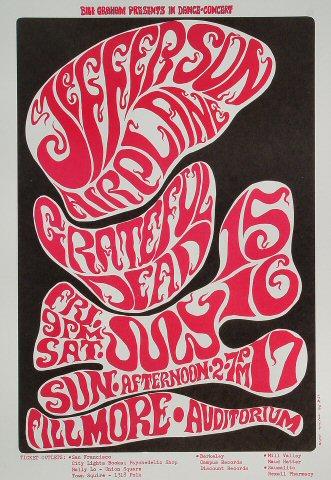
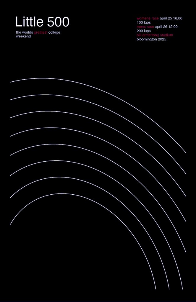
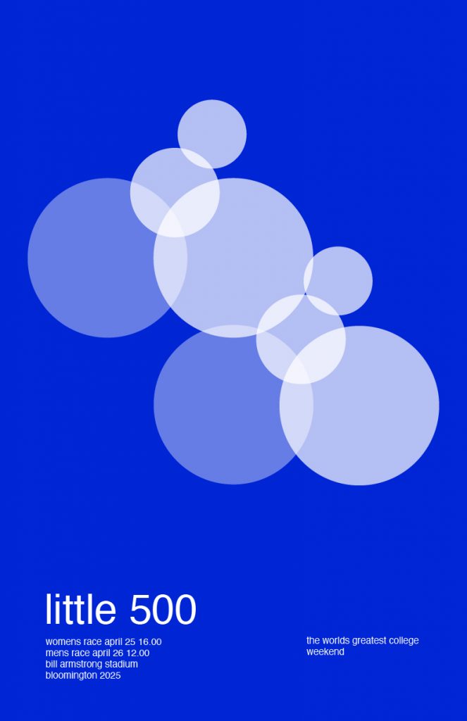
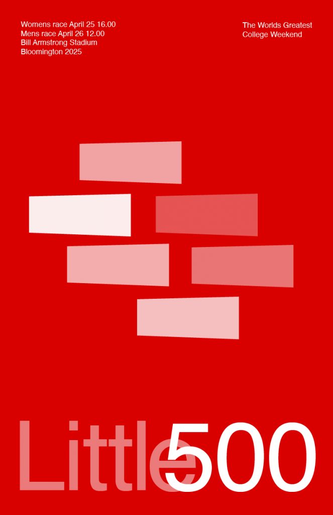
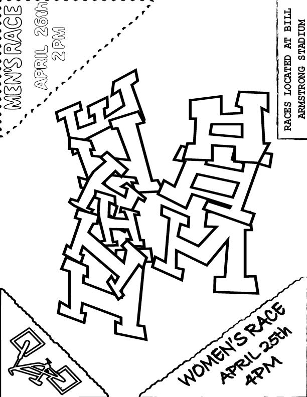
When researching and looking more into the pieces that Timothy Goodman created, I noticed that he tended to have different forms of typography included. I liked that it wasn’t all uniform and wanted that also. I started off with a sketch where I hand drew the fonts and everything that I thought would work. While I do believe that I could have added more detail into this piece, I had a level of restraint because I was worried that the more that I added, the more it would become too similar to the ideas of Goodman.
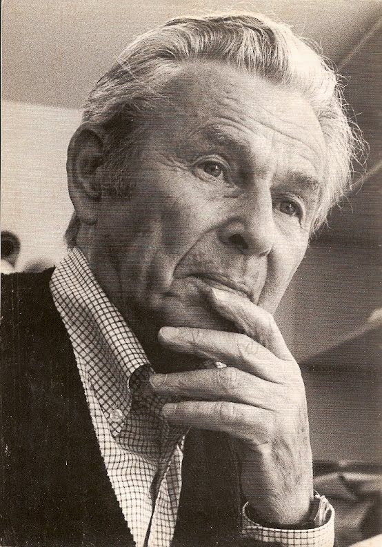
When beginning this project, I went onto Google and begun to research different designers to find who I wanted to represent. I came across a site that include a bunch of options and showed images of the different kinds of styles. I came across the name Timothy Goodman and when I saw the image of his style, I knew that I wanted to choose him right away. It was very much similar to how I used to like to draw and gave that ‘doodle’ style that I liked.
At first, I was starting to wonder how I could execute this styling without making it too similar or too obvious of who I was portraying. I wanted to keep the style of doodling with the random kinds of typography that were included. Although some of his work has included color, I decided to keep my work in black and white. I wanted to stick with the base colors. The main key points that I tried to portray were both the type and color.
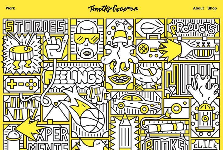
Overall, I was influenced his piece that he made for Times magazine, but also by his design of his main homepage. I liked a lot how each involved different forms of typography and framing. I decided I wanted to focus on those two main points in his style. I decided to keep the base color as black and white to stay with the idea of sketches.
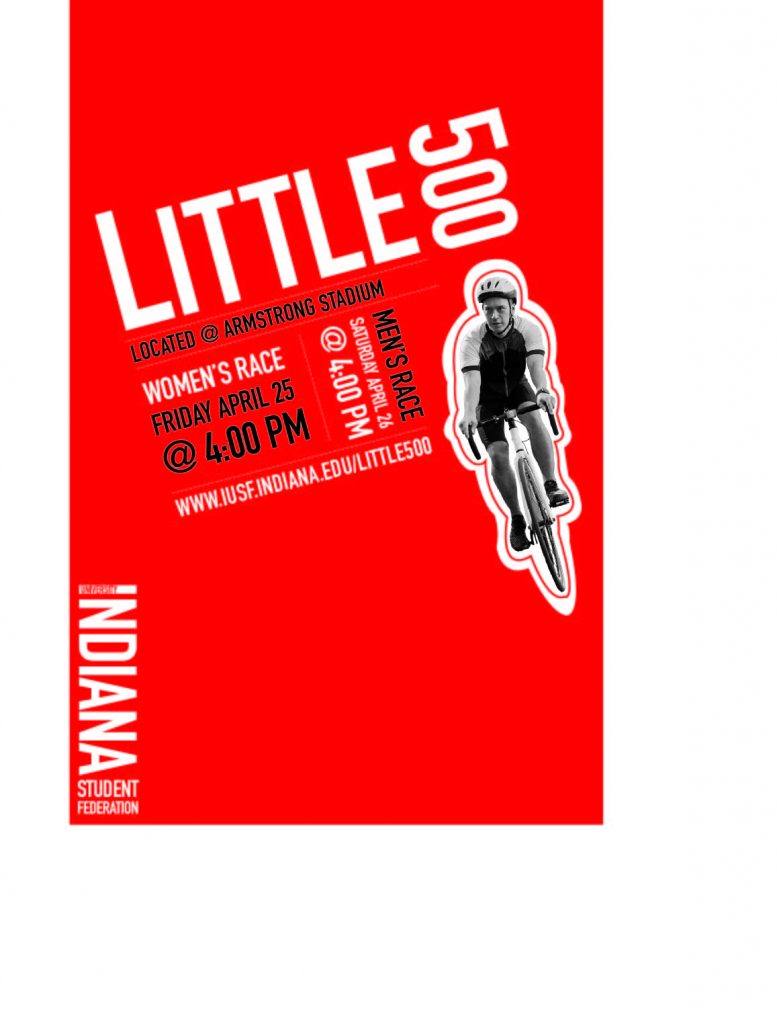
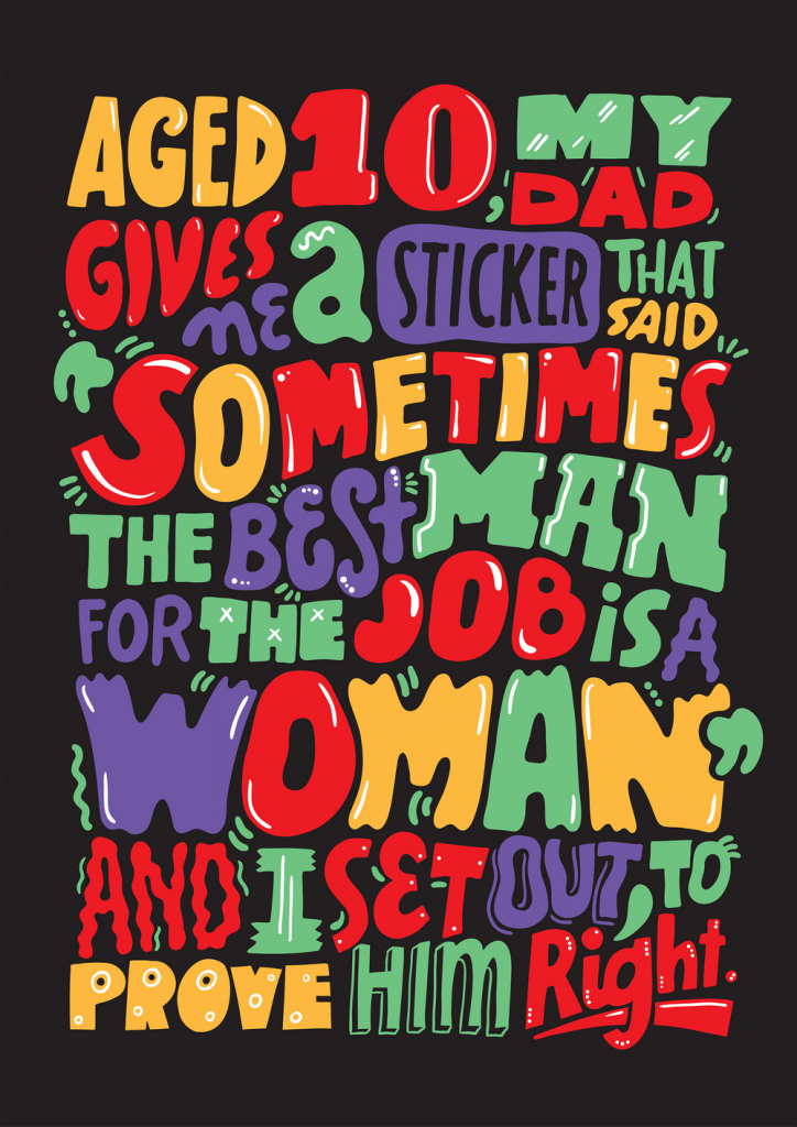
In the end, I’d say that I think that although I could have come up with a little bit better design, I am happy with how my final design for this Little 500 poster turned out. Being able to find a equal balance between using the reference from another designer and being able to develop a design that visually comes off as an original piece. This process was interesting but fun. I think the typography and free style are still recognizably the main elements in my design.