For this project, we were prompted to design a logo for an imaginary media production company that we create. For my project, I was inspired by all of the group projects I have worked on in the media school and the upcoming spring season.
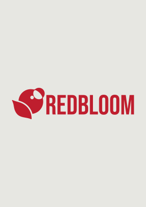
This company is based in Bloomington at Indiana University, so I named the company “Redbloom”. Bloom representing all the blooming flowers we get when it’s beautiful in the spring, and red to represent the crimson of Indiana University’s colors. I also liked the idea using camera blooms in my concept. The summers get so sunny here , and if you were to take a picture outside there might be a sun bloom in your image. That is where I took off with designing my logo.
I wanted there to be a graphic that could be used on its own, so I decided not to incorporate typography into the logo. This way there can be a logo mark which would look great up in the corner of the website search bar in a browser, as well as there being horizontal and more vertical variations which maximizes the opportunities of where the logo can be used.
For the graphic itself, I created a camera bloom/shine/reflection that is supposed to mimic a budding flower. It is accompanied with a leaf to tie together the idea of budding flowers. For the typography I found it appropriate to keep it simple, bold, and sleek. I find that it looks professional and ties in well with the simple graphic.
If there would be any thing I would improve I would like to stylize the brand guide more. I struggled with taking the professional and sleek aesthetic and making it into a stylized brand guide because this aesthetic is out of my comfort zone and not what I am normally designing like. However my favorite part of my brand guide was including a section that explains the design choices by pointing to specific parts of the logo. I feel like that would be a great way to communicate my intentions and decisions as a designer to a potential client.