Conceptual Magazine Spread

Click on the image to view a full pdf

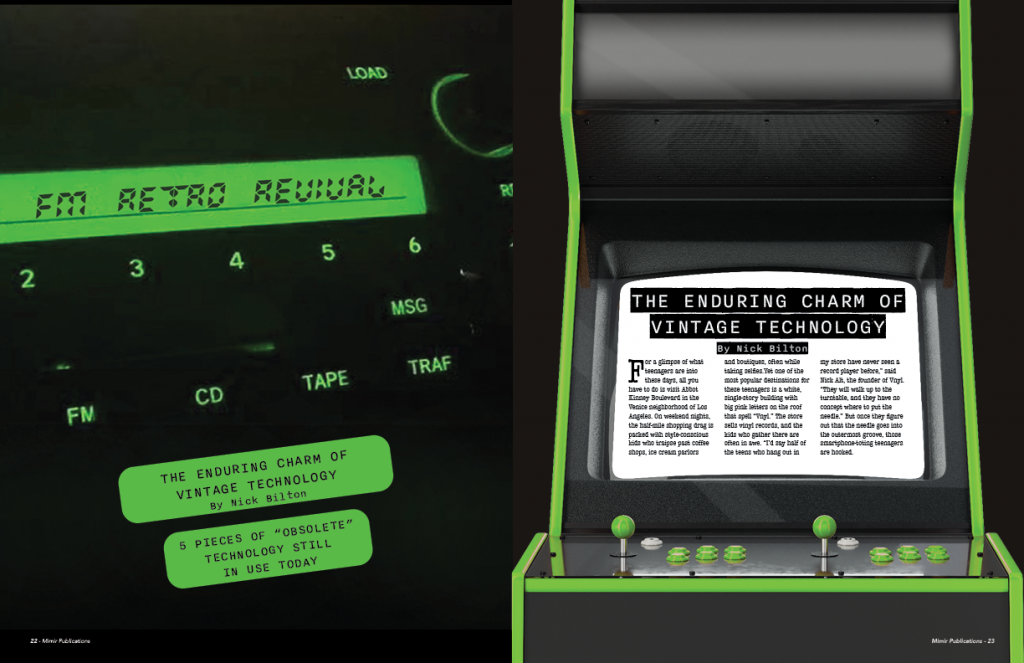
I have always enjoyed doing magazine projects. Although, I struggle in the beginning, I tend to find my stride and come up with some of my favorite designs. For this design, I wanted to make sure I stuck to a theme for the entirety of the spreads. I chose my theme to coincide with my story and everything is a reference to vintage technology. I originally had the main spread covering the entire front two pages, but I did not like the idea of someone opening a magazine and seeing 2 full pages as if they were a title page.

With this idea, I decided to reduce my title page to the left and to have a teaser story on the right. I was attempting to find ideas on how to format the idea on the right and so I decided to encase the story in an arcade machine. For the rest of my story I went with more of a minimal design with some artistic elements in difference spaces. I did not want to overload my 4 pages with a bunch of visual elements. I figured this would take away from the story itself so that is where I came up with the plain text element.

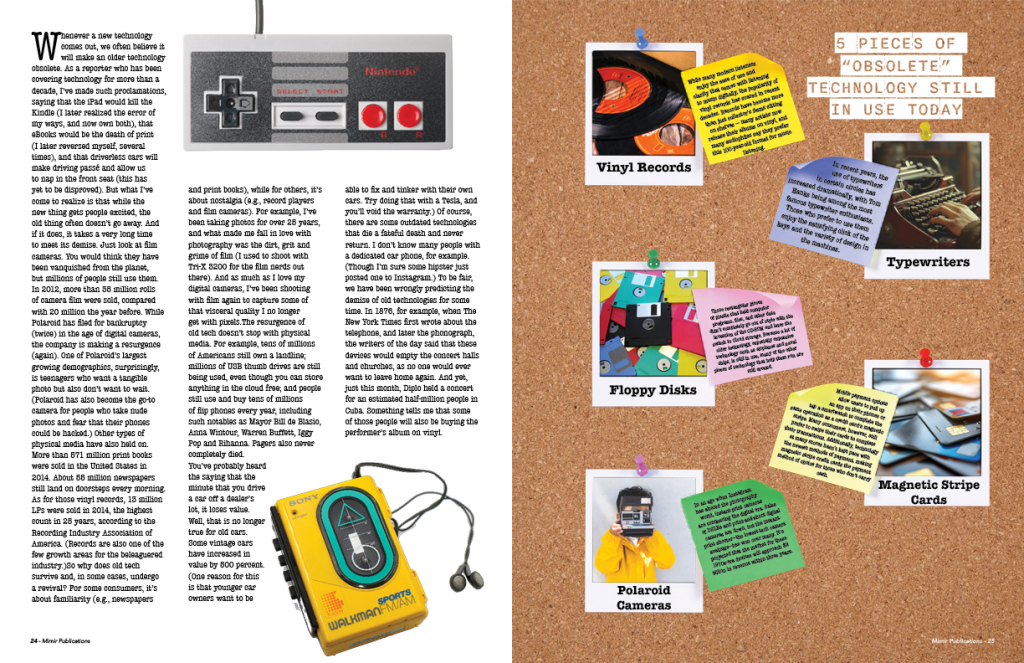
For the alternative story form / sidebar I decided to format the small story into the visual element itself. I wanted to take the “5 pieces of “obsolete” technology” and place them onto polaroids in some form or another. I ended up taking the design and covering it over an entire page because I did not want to compress the text further to where it was almost unreadable if I had it as just a sidebar. This creates a sidebar effect but in a proportion that is still legible to the reader.

This project was fun because I created/altered every graphic composition except for the NES and Walkman. It was fun to take elements of nostalgic tech and implement them into a story format. I think my title page could be done better to be more cohesive to the page next to it, but the deadline approached faster than I expected.

Otl Aicher Influenced Little 500 Poster

Click to view the full design

For this poster, I struggled with finding a designer. I was attempting to discover artists that I knew I would be able to take influence from as well as be within my skill as a designer. As my graphic design career was blooming, I had watched a design video about thresholds and working with layering them. I had worked on a personal project a few months prior where I worked on thresholds. As I was deciding who to design, I found Otl Aichers 1972 Olympic designs. This solidified my influence of choice due to the fact that I knew I would be able to take influence and create a design in my own style that was similar to his work. At the time I was designing a lot of musical posters and I had designed the poster below.

Click to view full image

With designing the poster on the right, and utilizing layering of thresholds, I knew that I would be able to recreate an Aicher style design. The process for my Aicher Influence went smoothly and the only thing I really struggled with was my ability to determine color scheme. I researched Aicher’s full designs and I did not notice any that were dominantly purple. This gave me the idea to chose this color. With my background color in choice I moved onto my layers for thresholds. I began with selecting the lowlights with appear as the forest green on the riders. I moved onto the highlights which are represented in the slime-like green on the riders. I struggled with finding colors that worked together so I opened Illustrator and utilized their color palette and the recommendations that they offer.

Click to view the full design

After I finished the layering of my hero image, I had the bikers and their respective colors on a plain purple background. I was lost on what to do as I had used the selection tool to grab each rider and placed them on an empty image. I went back to my main image and decided to remove the riders from the image and take another shot at thresholding the track itself similar to the design to the left. I got the design placed behind the riders and it made a major difference. I played around with color and it did not make any sense to add color because it washed away the riders and did not blend well due to it not being a compliment of purple. If my background color was similar to the design on the left I think I would have been able to do something similar but I wanted to do something that was my style rather than taking his design and recreating it. Lastly I decided to take my main text at the top and I chose to do a dark style similar to the design on the left. I originally had all of the text white, but I asked my roommate and a few friends which one they preferred and they all said the darker purple made the most sense. I am extremely pleased with my final design as I think I did a wonderful job of taking influence from Aicher yet making it still my own work.