After Effects has been quiet a doozy, but I made it through! In revamping my logo, I took some of your feedback and implemented the comments back into the effort of reinventing it as a purposeful creative idea.
One of the first things I did was to take the minimalistic approach. I stripped the complexity of the existing icon and implemented a geometric redesign. By doing this, the actual “room” becomes cohesive with the monochromatic color scheme of the text, thus unifying it entirely.
The decision to animate my text as if it were a sketched asset may give further context to it being a “publishing” company, because of course a viewer wouldn’t be able to gather that from the initial construction of the room.
Finally, I made the decision to not include music because it felt overstimulating and the simple noises I decisively went with were able to capture the amateur tone of the company as an originating business from my personal room.
When I looked at his prompt specially, I knew it was a need for me to choose, because of my love for old technology and its personal touch to what we consume today.
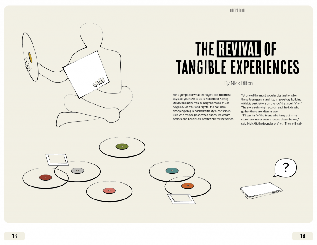
In brainstorming the concept for the conceptual magazine, I thought to envelop the majority of illustration in the subject of polaroids and LPs. In the opening spread of my magazine, I wanted a direct comparison to the then vs now technology through the re-interest in old tech within the contemporary world. With that being said, I took a different approach on the “forgotten technology” in my front illustration. Like vinyl record popularity taking a downturn of popular through the 90’s and early 2000’s, I instead placed the modern phone in its same position, as a left-behind form of technology. Even though I don’t believe the Iphone (Apple as a company) will ever go out of style because of polar capitalism, I do still thinks its a interesting topic, especially because polaroid and vinyl consumers and company owners probably never believed they would go out of style to almost extinction.
Shiny Object Syndrome: “Concept where people focus on a new and fashionable idea, regardless of how valuable or helpful it may ultimately be.”
For the art direction, I gravitated towards the colors of the 40’s and 50’s. The time period choice was in major part to polaroid and vinyl products catching traction in the general public during this time. Thinking about the print of the magazine, I immediately thought of “1989 (Taylor’s Version)” as the overarching inspiration for the outer edge of the magazine spread(s); the outer border has the appearance of a polaroid.
For my logo animation, it took me a while to figure out how I could animate something that went with my theme before I got what I wanted. First, the words come in as if they are a roller coaster climbing up the first hill with sound effects. After that, the actual logo comes in with different pieces like the roller coaster doing a loop, at first close then moving back into position. I thought this made sense because the actual logo is a roller coast so the sound association and movement helps people identify it if they did not know what it was at first. I also didn’t want it to just end so like a lot of other companies have done in the past, I put a little shine effect going across the logo to make it pop along with a sound effect to match it.
This project was a lot of fun once I got the hang of using After Effects. Upon initially starting the project I was very lost and overwhelmed because I had never used this program before and we had a very short lecture on its tools in class. However, once I brainstormed what type of animation I wanted for my logo and how I wanted it to all play out it was easier from there. I wanted my 99 to come into the frame first and come smoothly so I played around with a couple different versions of this trying to figure out what would look the best. I started by first trying the drawing tool that we learned in class however this didn’t look right and neither did creating a mask for it to fade into the frame. What I decided on was a smooth combination where the numbers slide into one another from opposite sides. I thought this gave it a classic look while also bringing on some emphasis towards the numbers being linked together. The next thing I wanted to do was have the sheep bouncing in from the top right of the page. I had an idea in my head of a sheep bouncing in a field and wanted to replicate this somehow. It was difficult for me to achieve this exact effect I had in my mind because all the tutorial videos I found were of a basketball bouncing into frame and that was too dynamic for what I had in my mind. I tried to play around with the levels of the position for the sheep to achieve what I wanted based on what I was finding online for a similar effect. I think I did a good job for the most part, there are some details, if I had more time and skill in the program, that I would like to smooth out but I was not sure what I was doing and liked what I came up with in the end. The final piece that I wanted to add was a typewriter effect to the publishing words. This was actually really hard for me in the beginning because I did not understand that the word actually had to be typed in the program to use this effect and then once I got the word looking the way I liked it I had to figure out how to slow down the typing motion and make it fit in with the already established animation. Once I figured it out this was definitely one of my favorite added pieces to my final animation. Final details included making the animation look cohesive, so I added a little rocking into the final conclusion, and making sure the music and sounds went together. Finding music was hard because I was not originally sure what tone I wanted to use and how I wanted my animation to come across, which the music has a large impact on this, so it took me a while to find a piece I liked. Then, I wanted to add some extra sound effects. I started by trying to add a bouncing sound to the sheep, however once I got the sound in place and fully edited I did not like how it looked all together so I ended up scrapping this and just adding a typewriter sound which I ended up really liking the element it added to my overall animation. Overall, this was one of the more difficult projects because I was having to learn a whole new program however, I also found it really fun once I knew what I was doing and started learning my way around After Effects and it feels really rewarding to see the final version of my logo animation!
When I first read the personal story I knew that was the one that I wanted to choose. I had a lot of different versions of the same design that came to mind. I wanted to make sure that the image was conceptual enough but was easy to get the message of the article. I wanted to symbolize how technology helps keep people in touch with those that they would have a hard time doing without it. Color played a major role in my design, especially the blues. I wanted the phone and the hand coming in from the top to be the same color to represent that the hand was the technology. The spark-like glow in the center is there tp help show the power that the connection gives to the people that use it. How it is a positive thing like the article talked about. The hardest part for me was making the story fit and work well with the design. I had trouble trying to make the design work in the magazine spread-type design. I wanted there to be limited text on the first page because the main point is the conceptual illustration. For the second page of the spread I also had trouble thinking of how to fill the space. I ended up using the spark like shape on the side of the second spread to bring some of the images to the second page. I added the sidebar to add more and help connect the first two pages to the next two. Making sure that everything was easy to read was harder on the first pages since I wanted there to be fewer hyphenated words when using the text wrap. I think the sidebar on the second spread helped to make the whole spread come together as a whole. Overall, I think the project does a great job of showing the main point of the article.
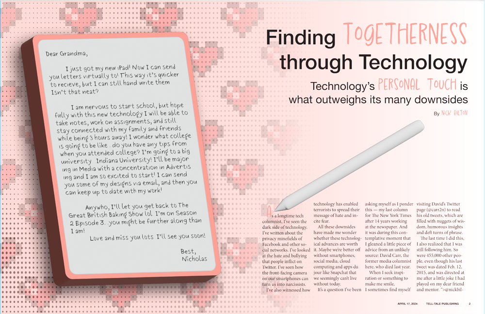
The personal touch story really spoke to me as a college student who lives three hours away from home. I wanted to incorporate the idea of staying together and connected. To do this, I used the stereotypical idea of letters, as a means of staying in touch, with new technology. The illustration I made is an iPad with matching pen to depict a faux letter to someone’s grandma about their college experience and how they can stay instantly in touch. The colors are soft and pink, to resemble to the feeling of home and being with your loved ones. The pen is tilted to try and give the illusion that it wrote the first letter of the article. For the second spread, I wanted to keep a visual consistency, so I made two iPhones to depict the side bar text.
This project was rather difficult for me as I do not have much experience with magazine or newspaper layouts, but I feel like it helped me understand the ideas a bit more. InDesign is a program I know how use but not how to utilize, and I feel that through this project I got a little bit closer to that.
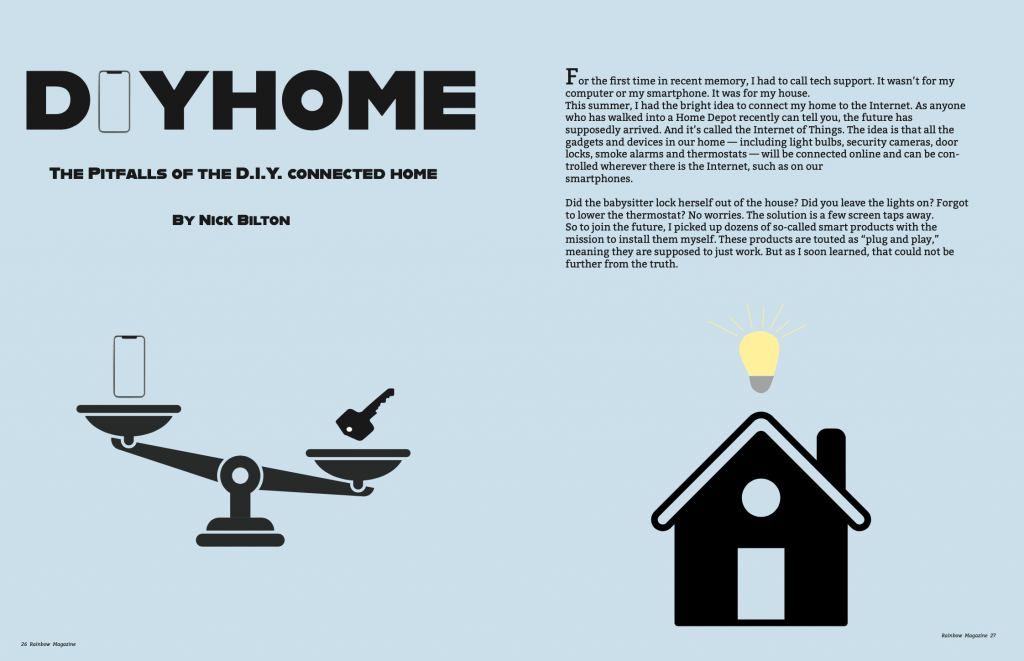
For this project, I chose the story about smart houses. I have always been curious about smart houses and if they are really worth it, so this article stuck out to me. After reading through this article and hearing about this persons debate about the pros and cons of a smart home, I was inspired. I instantly knew I wanted to do a scale showing the traditional key and the “smart key” of a phone. I wanted to show the weight of the two. Taking the term “smart home,” I wanted to show a home with a light bulb because the image of a light bulb means smart and sparks an idea. The font choice I went with reminds me of the fonts they use on HGTV. That was the first thing I thought about because they have done shows that have dealt with smart homes. I think the big, bold font is the type of font used to describe DIYs. I wanted to put an iPhone instead of the “i” to show that this is an article about technology and houses. I went with blue because I wanted a light color to contrast with the black colors. I wanted this to look simple, so I went with simple black outlines of all the artwork. One of the biggest challenges, was just getting started, which always is a problem for me. Getting in the mindset to create an idea is always difficult. Overall, I enjoyed this project. I enjoyed taking a story and turning it into a magazine spread. I think my skills have improved since I did the magazine project in graphic design 1. I am pleased with the way this turned out. I believe I executed the simplistic magazine spread pretty well. There are some ways I can improve. I think I could’ve taken the design a little farther but I am happy with the overall design.
Click this thumbnail to view a full size version of the file.
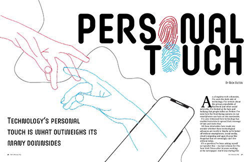
For this project, I chose the Personal Touch story because initially I had the most conceptual sketch ideas for that concept compared to the other two story options. I chose to make my design two hands reaching for each other, with one hand coming in from the left (off the screen), and one hand from the right coming out of the phone. I positioned them this way and made them two different colors to make the differentiation that one hand (red) is a person in real space, reaching for a friend/loved one on an online space (blue). I thought this concept especially worked with the story because the author talks about connecting with his friend who has passed away by looking at his social media often to keep his memory alive. I also included the finger prints in my design because I thought that besides being a literal manifestation of the word “touch”, they also represent two people being connected by touching/holding hands. I also thought that they fit the element of technology throughout the story because many people associate finger prints with unlocking/locking of technology (like a password for your phone, computer, etc). In my second spread page, I included these finger prints in a heart-overlapping shape in the bottom left corner because I thought it was a sweet way to display a connection between two people in an online space, by forming a heart, a shape associated with connection and love. I also included some black lines that curved around my pages as an element to resemble a “string”. For me, this was relevant to my design because in my head I thought of a string connecting two people, no matter how far away they may be, as a non-physical or physical representation of connection and love. I also thought that it was a nice touch to add some dynamic movement to my pages when I had lots of negative white space and I wanted to add some movement as the readers eyes moved across the pages when they were reading. For my headline font, I chose this font because I thought the curviness of the letters mimicked that of the finger prints which were included repeatedly in my design. I also chose red and blue for my colors of the hands/some text in my design because I associated those colors with 3D glasses, which while not explicitly related to the story/concept, I thought was another way to connect to a technological aspect when it came to my color palette.
I enjoyed creating this design because InDesign is one of my favorite Adobe applications to work in and it reminded me of the magazine assignment from Graphic Design I which I had a fun time with. I like messing around with the copy, font, margins and columns to arrange the spreads and doing this assignment makes me want to make more mockups for magazine spreads in the future on my own time.
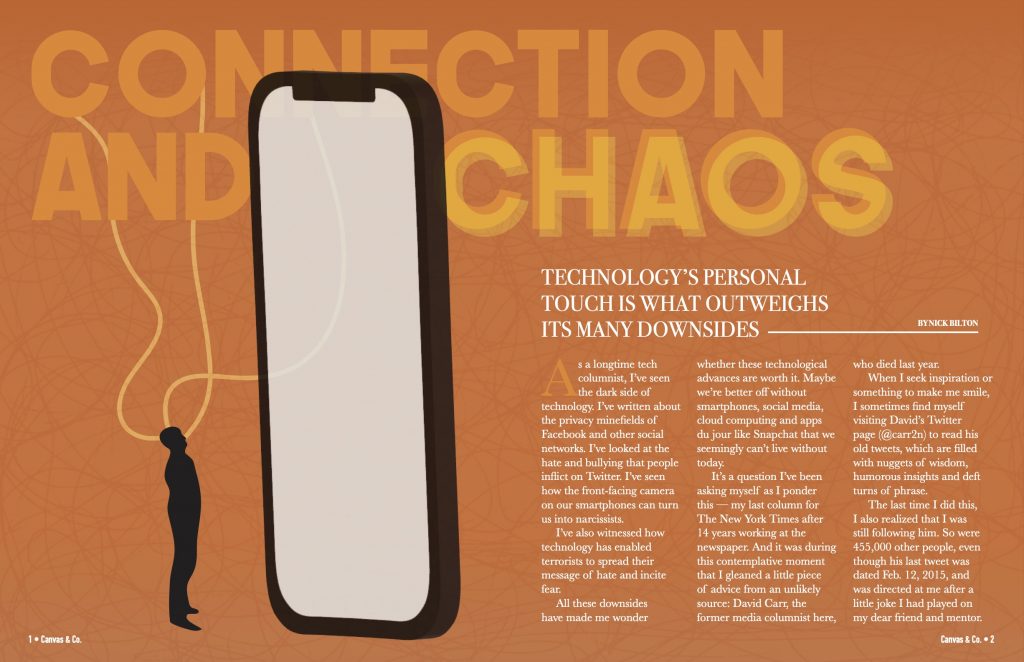
For my conceptual illustration poster, I decided to represent the story of how personal technology shapes our lives, often resulting in both beneficial and damaging influences in our lives. Therefore, for the main headline of this article, I decided to use the phrase “Connection and Chaos”. I felt that this title expressed how our mobile devices, while connecting us to the world, also have the power to overwhelm and consume us.
In terms of design choices, I first chose the orange color scheme to symbolize a balance between the red hue of frustration and the yellow hue of contentment. My goal was to connect this orange color to the state many of us find ourselves in when it comes to our relationships with our phones. Furthermore, the main imagery of my design depicts a small human figure gazing up at a large phone. I represented the imagery in this way to emphasize how our lives can become engulfed by our devices, symbolizing their overpowering presence.
In terms of typography, this played a crucial role in conveying the message I was trying to express. I utilized a blurred version of chaos in the text to emphasize something that is unstable, as well as a more stable font with connecting lines for the word connection. Overall, my choice for this was to reiterate the coexistence of these two forces felt when it comes to our personal technology.
In addition, for the sidebar, I used text message bubbles to add a unique element to the layout while also reiterating the theme. The separation of the sidebar from the main text, in my opinion, helped create a good visual distinction.
Overall, I am pleased with my execution of this project. I believe that I conveyed the message of the story in a minimalistic way, allowing the readers to grasp the main idea without being too overwhelmed. With my consideration of the color, typography, and layout, I believe that I achieved my goal of creating a visually engaging spread for readers. This was one of my favorite projects that we have done so far.
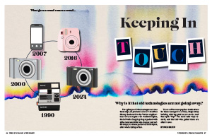
This was the third project I completed in J465. I picked the story old tech because it resonated most with me and it was an opportunity to illustrate something I was interested in. I started my creative process by looking at pictures of old tech and finding out which route I wanted to go.
After doing some sketches to brainstorm, I landed on the idea of illustrating old cameras that have came back around. Although the entire story is about all old tech, I wanted to focus on the camera aspect. To do this, I began with putting letters into Polaroid pictures and made them look like they were scattered like they would be on a floor. I picked up colors for these letters from the background I chose, which reminds me of a film camera. For the main illustrative element, I really wanted to express in some way how old tech came back around. At first, I started with a line across the page to represent a timeline, but eventually I decided that a circle would best show how things “came back around.” I kept the circle in other parts of my design on the second spread to make everything more cohesive throughout. I illustrated each type of camera based on an image of a real one. Although there are far too many types of cameras to include on my page, I ended up picking the ones that seemed most popular and in-use to me. For example, in 2016 Instax Mini cameras were the coolest thing, which are comparable to a Polaroid camera from the 90s. Same thing with digital cameras. I remember as a child, my mom had one, and now they are “cool” again in 2024. The iPhone is on there to represent the break in physical cameras and the transition to phones being the preferred type of camera. However, we know now that it is used in addition to old tech even though it can do a lot of things the old tech can.
The headline I chose was to tie in the idea of “keeping in touch” with old technology even though we have improved technology now. I also thought it would be clever to put the word touch inside of the Polaroid pictures since they are something you can physically pick up.
On the following spread, I really wanted to tie in my colors and background, so I found another photo that gave vibes of a film camera for the side bar and I pulled colors from the initial spread into my text. I wanted the photos I used in this second part to have a little more edge and not look like a stock photo. So, I found an image of a record player to highlight before the article, since that’s what it talks about in the first parts. The image definitely adds something to the sea of text. This is also why I chose to highlight certain sentences by changing the font, color, and size so that the reader was not bored with the endless amount of black text. On the right page, I also made my text align to the circle for more visual interest and to bring more attention to the recurring “timeline” idea.
Something I’ve never done before, but I ended up liking, was putting my sidebar on the left side of the right page. I felt like this once again broke up the text nicely and was a main focal point for that page. If I had placed it on the right side, I think it would’ve been too heavy. For the sidebar, I used an image similar to the one on the opening spread. Like I said, I didn’t want my images to look too much like a stock photo, so I carefully chose the ones that went with the vibe of my story for the sidebar and I think they blended nicely. Overall, I was happy with my sidebar, but the biggest challenge was including enough description for each piece of old tech without being too much.
Overall, I’m extremely happy with how my project turned out. It was a challenge at first to land on a final idea, but I liked the one I chose because it resonated heavily with me. My favorite part of this design is the background I picked and I’ve been wanting to design something with it for a while! This project took a lot of critical thinking in ways that I could conceptually represent the resurgence of old tech, but I think I did a great job of representing it with the circular timeline.