Personal Touch Conceptual Illustration – Alyse Franklin

Thumbnail image of my Personal Touch story design.
Click this thumbnail to view a full size version of the file.

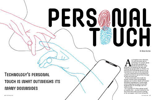
For this project, I chose the Personal Touch story because initially I had the most conceptual sketch ideas for that concept compared to the other two story options. I chose to make my design two hands reaching for each other, with one hand coming in from the left (off the screen), and one hand from the right coming out of the phone. I positioned them this way and made them two different colors to make the differentiation that one hand (red) is a person in real space, reaching for a friend/loved one on an online space (blue). I thought this concept especially worked with the story because the author talks about connecting with his friend who has passed away by looking at his social media often to keep his memory alive. I also included the finger prints in my design because I thought that besides being a literal manifestation of the word “touch”, they also represent two people being connected by touching/holding hands. I also thought that they fit the element of technology throughout the story because many people associate finger prints with unlocking/locking of technology (like a password for your phone, computer, etc). In my second spread page, I included these finger prints in a heart-overlapping shape in the bottom left corner because I thought it was a sweet way to display a connection between two people in an online space, by forming a heart, a shape associated with connection and love. I also included some black lines that curved around my pages as an element to resemble a “string”. For me, this was relevant to my design because in my head I thought of a string connecting two people, no matter how far away they may be, as a non-physical or physical representation of connection and love. I also thought that it was a nice touch to add some dynamic movement to my pages when I had lots of negative white space and I wanted to add some movement as the readers eyes moved across the pages when they were reading. For my headline font, I chose this font because I thought the curviness of the letters mimicked that of the finger prints which were included repeatedly in my design. I also chose red and blue for my colors of the hands/some text in my design because I associated those colors with 3D glasses, which while not explicitly related to the story/concept, I thought was another way to connect to a technological aspect when it came to my color palette.

I enjoyed creating this design because InDesign is one of my favorite Adobe applications to work in and it reminded me of the magazine assignment from Graphic Design I which I had a fun time with. I like messing around with the copy, font, margins and columns to arrange the spreads and doing this assignment makes me want to make more mockups for magazine spreads in the future on my own time.

Erik Nitsche Influenced Little 500 Poster

Alyse Franklin's Little 500 poster that was designed with influence from Erik Nitsche's work.
Click this image to view the full size PDF.

For my influence project, I chose the Swiss graphic designer Erik Nitsche as my influence. I chose Nitsche because I noticed multiple of his designs were in a book that got handed around in class, so I looked at his work online afterwards and really enjoyed his General Dynamics posters and thought they would be fun to use as inspiration for my own project. I felt like a lot of the themes within his work related to what we have been discussing in class, such as the Bauhaus style of design that utilizes many bright colors and geometric shapes. As seen in the thumbnail of Nitsche’s General Dynamics posters below, Nitsche uses these elements in his work along with many others.

Some other elements that commonly appeared in Nitsche’s work are similar background colors, being white, tan, pale blue, and beige as the most common. He also used many transparent shapes overlaid on designs/other shapes, as well as using many circles, ovals, and radial stripes. The color choices for his designs also held many common themes, with many posters from the General Dynamics group having either predominantly blue and green colors or red and orange and yellow. He did also enjoy including broad spectrums of colors, like the rainbow, on shapes in his designs.

Within my own design, I felt drawn to the simplicity of Nitsche’s posters so I tried to accomplish that by only having the necessary text needed to convey the race’s information, smaller text, and non-dominating shapes in my composition. I also felt like I did a good job choosing color for my design based off what Nitsche’s design choices were within his own work, because I stuck to the blue/pale blue color scheme pretty tightly with my background and bike wheels, but also included a rainbow/adjacent pattern on the bike-body stripe pattern to bring some excitement to the poster. I also used asymmetrical balance which was common in Nitsche’s work, and included transparent versions of all my shapes. I also felt that the design composition as a whole, an abstract construction of a bike with two tires and then a curved line for the frame of the bike/its rider, was very Nitsche-esque because much of his work used abstract compositions to represent literal and specific ideas/themes.

Overall I really enjoyed this project, and my favorite part was getting to research my influence designer and find themes within his work. Because his designs aren’t as compositionally complicated as some other designer’s works are, it inspired me to think that maybe I can create work like this someday once I develop my own personal design style.

Erik Nitsche's posters that he designed while working as Art Director for General Dynamics between 1955 and 1960.
Above are some of Erik Nitsche’s posters that he designed while working as Art Director for General Dynamics between 1955 and 1960.