Zane Sanders- Conceptual Project

Click to view the entire magazine article

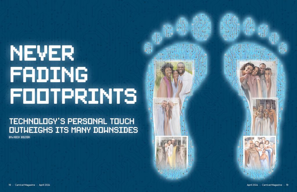
To start my creative process, I first picked the story that I could resonate with the most which was the personal one after reading it. In the article, the idea of a digital footprint was mentioned so I knew that I wanted my conceptual drawing to have something to do with a digital footprint. To make the print look digital, I used a circuit board type texture inside of the feet as well as made them pixelated. I also gave them an outer glow like a phone screen has. I finally chose the color blue to represent the “blue light” that comes off of our phone screens. Lastly, inside the feet are family photos that are melting away but, they persist on inside of the digital footprint. This goes with the theme of the story: being able to remember moments of people from their social media even after they are gone. I did most of the feet in Photoshop except for the texture and actual drawing of the feet which were done in Illustrator.

The font is also pixelated on the opening spread to match the pixelated feet. I also gave the text here an outer glow like the feet have. In the background I also used the same circuit board texture from the feet to give a little more depth to the spread and not just have it be a solid color.

The headline itself came from the fact that as it was told to me, people may not pick up immediately the digital footprint idea so I had to put it in the headline. “Never fading footprints” was chosen because people always tell us to be careful what we put online because it stays there forever hence, “never fading.”

Even though the article was more about the personal touch of social media, I chose to lean more into the digitalization of memories for my theme as can be seen in the opening spread. I continue this idea by making a very organized and almos computer like layout for the article. It is a three column page but, text only takes up two of the columns where a more literal image of social media takes up the two innermost columns and has the “screen glow” like the feet from the opening spread. I also use the same texture that is on the opening spread as well as inside the feet as a background for the page but I lowered the opacity so it wasn’t as hard to read the article. Coming from the central image, I made the same circuit like lines that are in the texture but I connected them to the words on the article to keep up with the digitalization theme. After the article was over, I put the social media by the numbers side bar to take up the remaining space. There was still a little bit of awkward white space after this so I put the feet from the opening spread along the bottom to fill it and make the design even more cohesive with the opening spread.

To finish off the design, I had it looked over and, at first, I had the headline in the middle of the page but, it was pointed out to me that people would not be able to read this in a real magazine so I moved it to the left and have what we see here now.

Zane Sanders- Influence Project (April Greiman)

Click this image to view the PDF

For my influence project, I took inspiration from famous New Wave graphic designer April Greiman. When I was first researching her work, I listed out a lot of things that I found to be mostly consistent in her style: halftone gradients, geometric shapes, layers and playing with opacity, photographic elements, and sans serif fonts. Additionally, in class, we learned that a lot of her style is the result of being one of the first people to integrate technology into their work and whenever that technology made a mistake, she would integrate it into the work.

At first when starting, I had no idea where to start but once I saw the work her WET Magazine cover, I had my main inspiration in putting a centered person to be the main focus. I also knew from the start that I wanted to use the layered 3D text for the “Little 500” font just as she does in the poster below my design. Sticking with the Little 500 theme, I knew stripes would be something that I wanted to use to show speed and also just a lot of uniforms have stripes on them in the race. That paired with tilting my typography as well as the stripes in the bottom with the text on them conveys the speed that I was looking for as well as fit into April’s style of slanted text in some of her work.

Below the stripes, is a checkered flag which since it is a bike race, fits the theme. I added a gradient on it too because April works a lot with gradients and images with a gradient. On the right, is a large circle with a halftone gradient as well, which again is representative of April’s halftone shape and gradient work that is often see in her designs. I also made it a circle because in my mind, it sort of represents a bike wheel which is also a circle. Lastly, the two shapes at the top of the poster are layered over each other with the opacity lowered as April likes to layer and play with opacity as stated earlier. The left shape is a geometric shape that I feel like April might use in her work but the shape on the left, is representative of the podium for first, second, and third in the race just flipped upside down.

Lastly, the middle and background are what I struggled the most with in this project in trying to make it them both look right and cohesive as well as reflective of my influence. For the main middle shape, I traced the IU Student Foundation logo which sponsors the race but, I made it into one shape and did not color it as to distinguish it from any official logos. I then added layered squares around it like is also seen in the WET cover but put my own spin on it in color and placement and layering with the main shape. I added a halftone gradient on the main shape to make it stand out more too. Finally, the photo in the middle is turned into a half tone color image but, I am not sure I love the way it turned out and maybe should’ve made the dots smaller. I covered the eyes of the biker as April has done in her works as well as put the actual bike on top to show the significance of the race. April also likes to use little photographic elements in her work too so I think that turned out nicely. The background was a struggle until I realized in some of her work, she likes to use a paint splatter texture in the background so that is also what I chose to do instead of a solid color or another halftone gradient which might blend in with the circle and main shapes.

Overall I feel that I represented the style well and while some aspects could be improved, I like the overall way it turned out however, when doing an influence project like this, it is hard to not compare yourself to the graphic designer and I had to continuously remind myself throughout the process, and even now, that April is a known, professional graphic designer who has spent decades designing in her own style and this is only my second graphic design class so it was okay for my work to not be perfect.

Image of April Greiman’s “Your Turn My Turn” poster