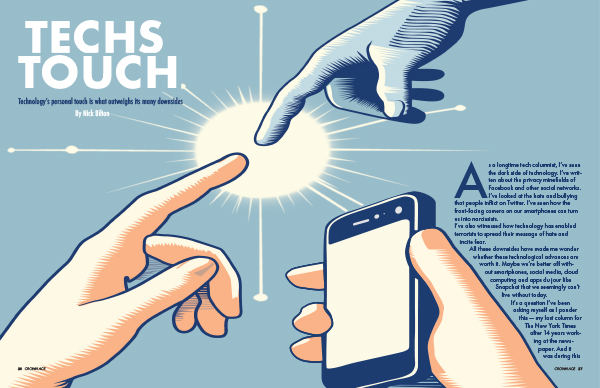
When I first read the personal story I knew that was the one that I wanted to choose. I had a lot of different versions of the same design that came to mind. I wanted to make sure that the image was conceptual enough but was easy to get the message of the article. I wanted to symbolize how technology helps keep people in touch with those that they would have a hard time doing without it. Color played a major role in my design, especially the blues. I wanted the phone and the hand coming in from the top to be the same color to represent that the hand was the technology. The spark-like glow in the center is there tp help show the power that the connection gives to the people that use it. How it is a positive thing like the article talked about. The hardest part for me was making the story fit and work well with the design. I had trouble trying to make the design work in the magazine spread-type design. I wanted there to be limited text on the first page because the main point is the conceptual illustration. For the second page of the spread I also had trouble thinking of how to fill the space. I ended up using the spark like shape on the side of the second spread to bring some of the images to the second page. I added the sidebar to add more and help connect the first two pages to the next two. Making sure that everything was easy to read was harder on the first pages since I wanted there to be fewer hyphenated words when using the text wrap. I think the sidebar on the second spread helped to make the whole spread come together as a whole. Overall, I think the project does a great job of showing the main point of the article.
Category Archives: A. Jacobs
Josef Müller-Brockmann Influenced Poster
Image
When crafting this poster, I started with a grid, Müller-Brockmann style, letting those lines be the invisible guides that shaped everything else. The typography came next, bold and sans-serif, laid out with the kind of clear, no-nonsense communication he championed. Then I played with geometry, stripping down bikes to their core, and basic shapes, and casting them in primary colors for a pop of energy and a nod to the Swiss penchant for simplicity. Layering those elements, I let the colors overlap and interact, adding depth and a sense of movement, hinting at the race’s excitement without any fussy details. It was all about balance, using space thoughtfully, creating focus, and keeping it crisp. In the end, the design emerged as a modern take on classic principles, as functional as it is eye-catching.
The influence of Josef Müller-Brockmann on this poster is unmistakable in its disciplined adherence to grid-based design and the asymmetrical balance that guides the viewer’s eye across the page. The bold, sans-serif typeface is a signature element of Müller-Brockmann’s work, emphasizing clarity of information and a timeless aesthetic that shuns the superfluous. In this design, typography is not merely a carrier of text but an integral part of the visual hierarchy, commanding attention and establishing the event’s identity with authority.
The graphic abstraction, reducing bicycles to their most basic geometric forms, showcases Müller-Brockmann’s influence in the way it communicates motion and dynamism without resorting to intricate illustrations. This reduction to essentials aligns with his belief in a universal graphic language. The color scheme—rooted in primary colors—projects a sense of playfulness while remaining true to the Swiss Style’s limited palette, ensuring that the design remains approachable yet sophisticated.
Crown Ace Publishing
The hardest part for me was bringing out the name of the publishing company that I wanted to use for my logo. I wanted to create something different that I hadn’t seen in any examples or online. I love playing with cards and came up with the idea to put cards and a crown together. I wanted something that symbolized high standards. that reflects what I want this Publishing Company to have and what’s in our brand voice. I wanted to originally do a king and just use the crown for that but it was super hard to not come up with something that I’ve already seen. so instead of going with a king or a queen with an ace that is also at that high standard.
In terms of actually creating the logo, I went through a lot of sketches that were very similar to each other. I definitely wanted to incorporate the crown and the ace somehow so that they were intertwined in some way. I found that the easiest way to do that was to start with my Ace and start with how I wanted my crown to be then combine those together. I ended up drawing each of those separately and then putting them together. The color scheme was very hard for me to figure out but I ended up going with black and red these traditional colors for a deck of cards. I thought having the colors represent a part of what my logo is derived from would be a good choice. The typography was also very hard to figure out because I wanted something that matched the flow of the lines that I have in my design but also looked clean and modern and yet still timeless like a a deck of cards and ultimately books.
Overall I think that I did a good job. There are definitely areas that I can improve on. One of those is spending more time in the sketching phase. Even though I had an idea drawn out it was a lot of going back and forth from Illustrator to sketching. I think my brand guide does a great job explaining what I wanted the logo to look like in all different forms as well as what my company’s message is. I enjoyed working on this project and it definitely helped me work more on each step than rushing to the end.