Personal Touch
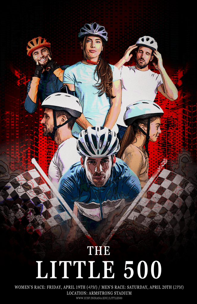
This is one of my versions of a Little 500 poster inspired by the graphic designer and artist John Alvin. When going into this project, I knew I wanted to choose an artist that would challenge me. I love movie poster and theatrical poster design, and I wanted to choose an artist whose style I liked but have never tried. John Alvin came to mind because he created come of my favorite movie posters, specifically the renaissance Disney posters such as “The Little Mermaid” and “Beauty and the Beast”.
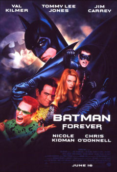
There were a few aspects of Alvin’s designs that stood out to me when looking over his portfolio. I noticed much, if not all of his work, was very art based. Many of his posters seem either illustrated or even painted. I feel that he paved the way, in a sense, for the stereotypical Marvel “floating head” poster since many of his work includes the busts of characters/actors, as can be seen in his “Batman Forever” poster. Additionally, his designs often feature centered type and imagery, as well as vignettes and darker silhouettes. I wanted to use these ideas in my posters and it lead me to my person favorite, which can be seen above.
Initially, I tried a more artistic approach and drew a bike in procreate that I used for different renderings. I felt not entirely satisfied with my first few attempts, so I tried to approach the Little 500 poster as if it was an action movie like the one’s Alvin designed for. I found Adobe stock images of cyclists and used the Filter Gallery and “posterize” feature to make the stock images more artistic. I added a vignette to the sides to make it seem dramatic and put textures on the background because many of Alvin’s designs had a lot of artistic detail in the background. This influence was definitely a challenge for me, but I feel like I learned a lot through this project especially.
For my logo, I knew I wanted to challenge myself to think outside the box. As an actor, the easiest way for me to do this is through storytelling. Since the logo is for a publishing company, I decided to base my company/logo on “The Tell-Tale Heart” by Edgar Allen Poe. The story revolves around an unreliable narrator as he recounts murdering an old man with striking blue eyes. His guilt and hallucinations of the victim’s heart thumping under the floorboards leads him to confess to murder to two policemen. I’ve always loved creepy old stories, and many of my favorite short stories are by Edgar Allen Poe, including “Masque of the Red Death” and “The Cask of Amontillado”. I want more people to appreciate these stories, even if they are old, which is why Tell-Tale Publishing focuses on republishing vintage, macabre stories for new audiences to enjoy.
I wanted to tell the story of “The Tell-Tale Heart” through the logo. So, the logo is made of a drop of blood that features an upside-down heart and a piercing blue eye. The colors of the brand are red, white, blue, and black. The heart is upside down to represent it being hidden under the narrator’s floorboards, and the eye represents the striking blue eyes of the old man who gets murdered. Eye imagery always makes me slightly unsettled, and I wanted the logo to give that off-putting feeling. I chose a clean and condensed font to evoke a modern feel as the company focuses on republishing classics.
The most challenging part of this project was trying not to do too much. I don’t have much experience with logo design, more with posters and ads. I’ve always wanted to develop my skills in logo design, but I have a hard time being able to tell what looks “good”. There are so many iconic logos that I feel set the standard for logo design, and I get in my head about whether or not mine is “good enough”.
Overall, I felt like this project pushed me out of my comfort zone and forced me to be a vulnerable designer. I hope to work on logos more in the future because it was a very fun process and got my creativity flowing.