The beginning of my design process for executing the logo and brand voice for Little Ties Publishing Co. was to first begin to think of how I wanted my work to feel throughout the course of this semester. This publishing logo will be present on all the work I submit throughout J465 so I knew I wanted it to “tie” in with the look and feel I wanted to portray in the upcoming projects. My design style is simplistic, bold, sensitive, and clear. I wanted this to translate into my publishing company’s visual identity, so I began brainstorming names that I felt accomplished this. Some names I was debating between before settling on Little Ties was Innocent Hand Publishing Studios and Do Not Disturb Publishing. But something about them felt either too sweet or too rigid. The publishing company’s purpose is to be the connector between works so I felt that Little Ties represented that in a concise, sensitive, and simple way.
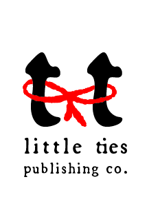
Once decided on the name, I began to sketch out ideas of how I could cleverly represent the publishing company’s purpose, which was to connect the work produced through the course together, and the people viewing work to the work. I really enjoyed the delicacy and simplicity of a small red bow and tried many ways to implement that visual motif into my design. I decided on the color red because of its classic feel and eye catching quality. I wanted my logo to be distinct yet subtle as to not take away from the rest of the work that it will live on in the future of this course.
One of the reasons why I enjoyed the name Little Ties so much was because of the double “t” in the word little. I felt that those t’s could be easily personified. The personification of the two t’s to represented as two people connected was how I want people to feel when they view all of my work; to feel a sense of empathy and connection to a greater message.
I fell on the font choice of Broadsheet, which is an Adobe font, because of its classic old novel feel, while still being incredibly legible and simple. I appreciated the character and timelessness that it gave, while still retaining a bold presence when enlarged.
Overall I had a pretty effortless process when creating this logo, which is mostly due to nailing down the voice, feel, and purpose of the brand before going into the creation stage. One thing I did struggle with however, was fighting back and forth between it being too simplistic, and wanting to add more. I feel confident with the balance that I have created with this design, but its something that caused me to go back and forth on designs for a while before setting on this one.