This was the third project I completed in J465. I picked the story old tech because it resonated most with me and it was an opportunity to illustrate something I was interested in. I started my creative process by looking at pictures of old tech and finding out which route I wanted to go.
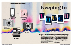
After doing some sketches to brainstorm, I landed on the idea of illustrating old cameras that have came back around. Although the entire story is about all old tech, I wanted to focus on the camera aspect. To do this, I began with putting letters into Polaroid pictures and made them look like they were scattered like they would be on a floor. I picked up colors for these letters from the background I chose, which reminds me of a film camera. For the main illustrative element, I really wanted to express in some way how old tech came back around. At first, I started with a line across the page to represent a timeline, but eventually I decided that a circle would best show how things “came back around.” I kept the circle in other parts of my design on the second spread to make everything more cohesive throughout. I illustrated each type of camera based on an image of a real one. Although there are far too many types of cameras to include on my page, I ended up picking the ones that seemed most popular and in-use to me. For example, in 2016 Instax Mini cameras were the coolest thing, which are comparable to a Polaroid camera from the 90s. Same thing with digital cameras. I remember as a child, my mom had one, and now they are “cool” again in 2024. The iPhone is on there to represent the break in physical cameras and the transition to phones being the preferred type of camera. However, we know now that it is used in addition to old tech even though it can do a lot of things the old tech can.
The headline I chose was to tie in the idea of “keeping in touch” with old technology even though we have improved technology now. I also thought it would be clever to put the word touch inside of the Polaroid pictures since they are something you can physically pick up.
On the following spread, I really wanted to tie in my colors and background, so I found another photo that gave vibes of a film camera for the side bar and I pulled colors from the initial spread into my text. I wanted the photos I used in this second part to have a little more edge and not look like a stock photo. So, I found an image of a record player to highlight before the article, since that’s what it talks about in the first parts. The image definitely adds something to the sea of text. This is also why I chose to highlight certain sentences by changing the font, color, and size so that the reader was not bored with the endless amount of black text. On the right page, I also made my text align to the circle for more visual interest and to bring more attention to the recurring “timeline” idea.
Something I’ve never done before, but I ended up liking, was putting my sidebar on the left side of the right page. I felt like this once again broke up the text nicely and was a main focal point for that page. If I had placed it on the right side, I think it would’ve been too heavy. For the sidebar, I used an image similar to the one on the opening spread. Like I said, I didn’t want my images to look too much like a stock photo, so I carefully chose the ones that went with the vibe of my story for the sidebar and I think they blended nicely. Overall, I was happy with my sidebar, but the biggest challenge was including enough description for each piece of old tech without being too much.
Overall, I’m extremely happy with how my project turned out. It was a challenge at first to land on a final idea, but I liked the one I chose because it resonated heavily with me. My favorite part of this design is the background I picked and I’ve been wanting to design something with it for a while! This project took a lot of critical thinking in ways that I could conceptually represent the resurgence of old tech, but I think I did a great job of representing it with the circular timeline.