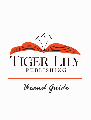
For this logo project, I began brainstorming ideas that could be related to publishing in some way, yet be something almost completely unrelated and I wanted to achieve this through a clever design. It was really important to me that the logo and name I chose was meaningful to me as well. After many brainstorming sessions and ideas later, I landed on Tiger Lily Publishing. I chose this because I liked how it sounded, there are often wild tiger lilies where I’m from, and my sister’s name is Lily. I also chose this idea because as I was initially sketching, the logo gave me an outlet to relate it to publishing and it is visually interesting.
For this logo, I wanted the vibe and brand voice to be traditional and elegant, yet bold. Therefore, I used a bold orange tone for the flower, which I think goes nicely with the name of the company. I began designing my logo with a flower as the visual, specifically a tiger lily, which consisted of orange petals and black dots. I really liked how the black dots looked on the flower, but once I landed on the idea of making the petals an open book, I thought it would be more effective to use stripes on the petals to represent both pages and tiger stripes. I chose this typography because I love classic serif fonts and I made the first letters of tiger and lily bigger for more emphasis. My goal was for the logo to have simplicity upon a first glance, but as the viewer looks deeper, I wanted it to be clever and have an underlying purpose and meaning.
Overall, this project was challenging, but definitely improved my graphic design and ideation skills. The most difficult part for me was deciding on a final logo out of my different versions, but I ultimately went with the one that had the most meaning and was the most visually appealing out of all the options. Since I will be using this logo to animate and put on my website for this class, I wanted it to align with my personal brand and how I like things to look. I think I achieved this well and it was a rewarding assignment.