This project was a lot of fun once I got the hang of using After Effects. Upon initially starting the project I was very lost and overwhelmed because I had never used this program before and we had a very short lecture on its tools in class. However, once I brainstormed what type of animation I wanted for my logo and how I wanted it to all play out it was easier from there. I wanted my 99 to come into the frame first and come smoothly so I played around with a couple different versions of this trying to figure out what would look the best. I started by first trying the drawing tool that we learned in class however this didn’t look right and neither did creating a mask for it to fade into the frame. What I decided on was a smooth combination where the numbers slide into one another from opposite sides. I thought this gave it a classic look while also bringing on some emphasis towards the numbers being linked together. The next thing I wanted to do was have the sheep bouncing in from the top right of the page. I had an idea in my head of a sheep bouncing in a field and wanted to replicate this somehow. It was difficult for me to achieve this exact effect I had in my mind because all the tutorial videos I found were of a basketball bouncing into frame and that was too dynamic for what I had in my mind. I tried to play around with the levels of the position for the sheep to achieve what I wanted based on what I was finding online for a similar effect. I think I did a good job for the most part, there are some details, if I had more time and skill in the program, that I would like to smooth out but I was not sure what I was doing and liked what I came up with in the end. The final piece that I wanted to add was a typewriter effect to the publishing words. This was actually really hard for me in the beginning because I did not understand that the word actually had to be typed in the program to use this effect and then once I got the word looking the way I liked it I had to figure out how to slow down the typing motion and make it fit in with the already established animation. Once I figured it out this was definitely one of my favorite added pieces to my final animation. Final details included making the animation look cohesive, so I added a little rocking into the final conclusion, and making sure the music and sounds went together. Finding music was hard because I was not originally sure what tone I wanted to use and how I wanted my animation to come across, which the music has a large impact on this, so it took me a while to find a piece I liked. Then, I wanted to add some extra sound effects. I started by trying to add a bouncing sound to the sheep, however once I got the sound in place and fully edited I did not like how it looked all together so I ended up scrapping this and just adding a typewriter sound which I ended up really liking the element it added to my overall animation. Overall, this was one of the more difficult projects because I was having to learn a whole new program however, I also found it really fun once I knew what I was doing and started learning my way around After Effects and it feels really rewarding to see the final version of my logo animation!
Category Archives: N. Austin
AUSTIN ~ CONCEPTUAL PROJECT
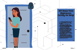
I really enjoyed this project; it felt very simple and took me back to basic graphic design skills that we had learned in J365. What I particularly enjoyed was the creative freedom we had with the conceptual design. I could have chosen to include actual pictures in Photoshop and change the pictures, or choose a classic “drawn” graphic. I had a lot of fun playing around in Illustrator to come up with my two visual elements that tied in to the story and gave the story another dimension. It was tedious to design because, although it is very simple-looking, there were a lot of different details that went into each graphic. The other detail that I had trouble with and had to play around with for a bit was the fact that the journalist story was really short and there was not much text to fill in white space. For this detail, I tried to play around with a minimalistic design, and then it also gave me another opportunity for a second graphic on my second spread. Looking through magazine examples before starting my project, I saw all these minimalistic, very simple designs and wanted to model mine off of that, partly because I liked the design but also because I figured it could speed up the design process if I was not putting too much on my pages. This is very deceiving. For me, holding true to this type of design style proved harder than it looked. I think because I was trying to put less on my pages, this may have been harder than a busy design because you have to make sure each of your elements is cohesive and working together, and everything has to be placed, particularly because if one detail is off, it will be very noticeable. Rather, if I were to model a more busy design, detail could get lost, and there is not as much pressure to make everything look exact. Overall, I enjoyed the process of designing this project and am proud of the end result. It challenged me to think more critically about design elements and how they interact with each other, and I learned a lot about balance and cohesion in design.
AUSTIN ~ INFLUENCE PROJECT
I enjoyed working on this project a lot, and I liked the concept of designing something that could be a professional project for IU’s campus. I worked for the past two and a half years with the Vice Provost Office on their marketing and communications team, which mostly looked like creating different social media engagement content for the undergraduate student body. What I particularly liked about this project was that it closely resembled something I would have been assigned during my internship. I liked the creative freedom we had, but I also liked how it was constrained by the influence we needed to choose and copy their design style.
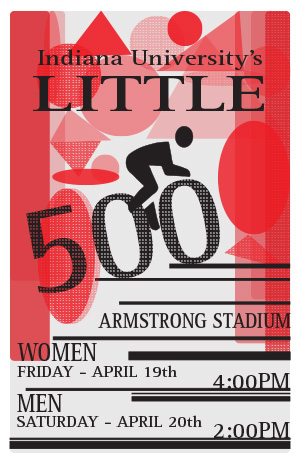
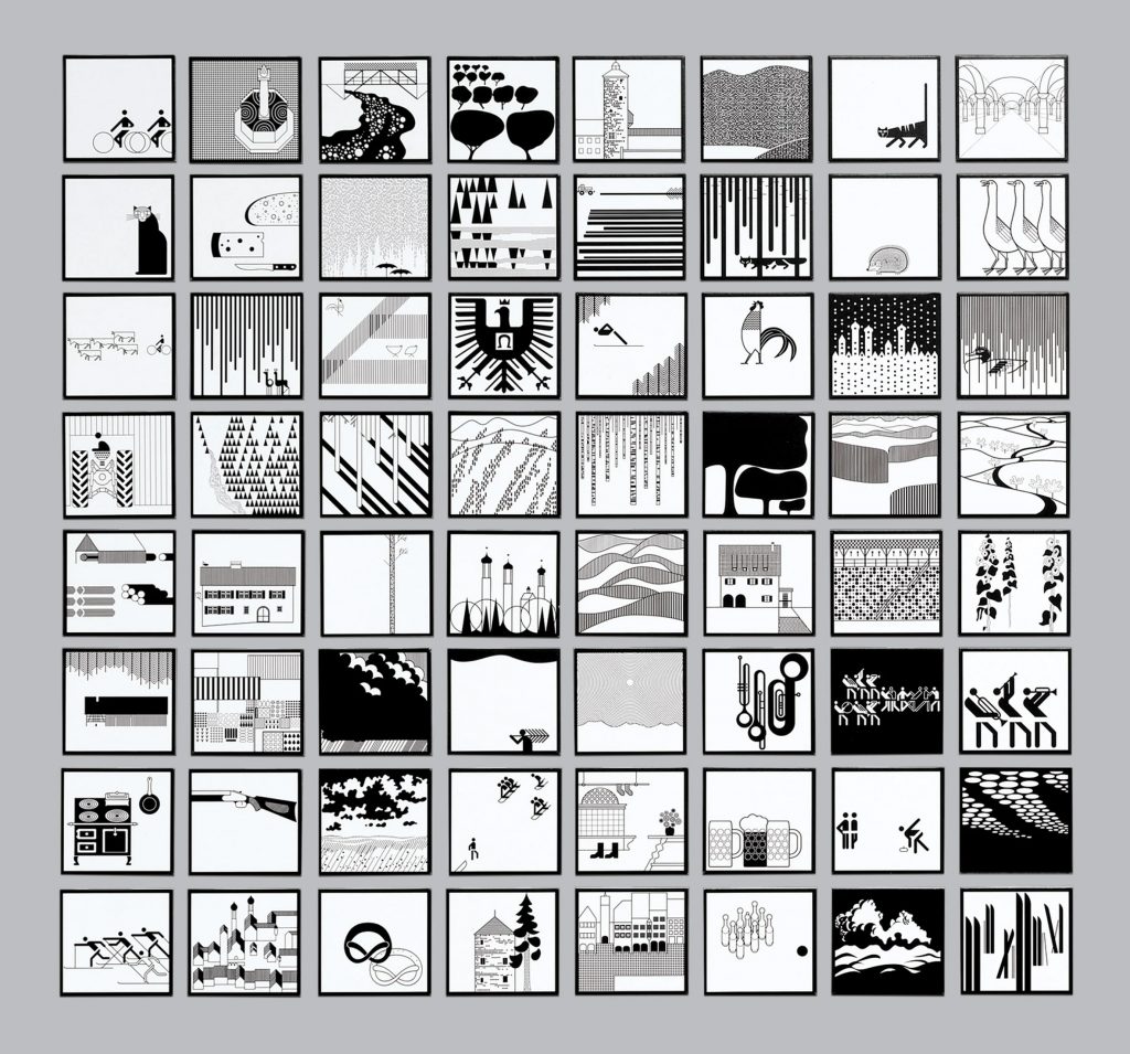
My influence was Otl Aicher, a German graphic designer. Aicher is best known for his graphics work for the Munich 1972 Olympics; however, he is also known for his corporate identity designs, including projects for companies such as Lufthansa and Braun. Throughout his career, Aicher’s design focused on creating designs that were both functional and aesthetic. Keeping a strong “Swiss Style” throughout his design work, he emphasizes clarity, simplicity, and readability through clean lines, bold colors, and an overall minimalist design. It was these identified elements that I tried to replicate throughout my poster design. I focused a lot on one of Aicher’s exhibition designs, which includes a wide range of black and white graphics. One of the first things I noticed throughout these designs was the repetitive geometric shapes and designs, as well as the bold black lines spaced across his work. Aicher seems to create a rhythm with geometric shapes that are seamless throughout his compositions and successfully paint an impactful scene. Even with the minimalism of what is included within his designs, Aicher’s work carries a powerful voice. Beyond this, Aicher also adds a lot of dots or lines to give texture to the shapes that he uses. I tried to copy these design choices through my simplistic geometric inclusion at the top of my poster, which created a frame around the cyclist as well as giving it some texture and the interesting quality of turning some into dotted lines. I also wanted to include the simple bold lines, like Aicher using them to frame as well as put emphasis on the event’s information.
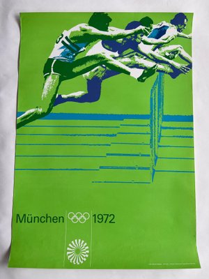
Otl Aicher’s designs also tend to keep to a few simple but bold colors. As seen in his work with the Olympics, he focuses on a bold green color but then uses different shades and tones to create contrast and visual interest. I wanted to emulate this design choice throughout my work, but I also wanted to reflect the spirit of the Little 500 scene. I chose to restrict my color scheme to black and red because it copies Aicher’s design choice while also giving some symbolism to a race flag. In addition, the red color follows the university’s color choices, which adds to the theme of the event. Finally, looking at Aicher’s work, you will see a very simple type is used throughout all his graphics. I wanted to choose a sans-serif font that would remain simplistic and copy the heart of Aicher’s designs while also carrying weight and standing out from the geometric-shaped art behind it. Looking back at the project, I would say the biggest challenge I came across was finding the balance between copying the style of my influence’s designs while also remaining independent and creating my authentic work. It is easy to just copy element for element and apply it to the theme of the Little 500 event. However, it became more difficult to take apart Aicher’s design, understand the meaning and reason behind each of his design choices, and apply his style to my design work trying to stay unique and also remaining specific to the Little 500 event and Indiana University’s brand. This process required a deep dive into Aicher’s design principles and a lot of trial and error, as I had to completely scrap and redesign my poster at least three or four times to ensure that my final product was a true reflection of his style while still being original. It was a challenging but ultimately a rewarding experience that helped me grow as a designer.
AUSTIN ~ LOGO PROJECT
I have never had experience with designing a logo, so I honestly found this process to be slightly difficult. I found myself being really indecisive and picky about what I wanted to design, so I definitely changed and started over the entire process three or more times. My overarching idea for the project was that I wanted to have it centered around a Christian publishing house. My problem with this, however, was being able to implement a biblical theme that still remained simplistic enough to understand what it was referring to and reveal the story while also not overwhelming viewers with a super detailed design that can quickly become confusing. Putting together a complete brand voice was also very new to me. I found this fun to do, but I initially just felt very overwhelmed by it because it was something that we did not go into too much detail about in class, and it was something that I quickly realized to be pretty detailed and time-consuming. I think that is a very important facet to a design process, especially with a logo, and I wish we went over it more in class and went through more professional, real-life examples, but I am very glad that I now have that experience and exposure to this design detail. Overall, I believe this hands-on experience has greatly improved my understanding of the design process. Looking at future designs, I want to build my confidence with the work that I am creating as well as put myself in unfamiliar territory so I can continue to push myself and learn new techniques and skills.