I enjoyed working on this project a lot, and I liked the concept of designing something that could be a professional project for IU’s campus. I worked for the past two and a half years with the Vice Provost Office on their marketing and communications team, which mostly looked like creating different social media engagement content for the undergraduate student body. What I particularly liked about this project was that it closely resembled something I would have been assigned during my internship. I liked the creative freedom we had, but I also liked how it was constrained by the influence we needed to choose and copy their design style.

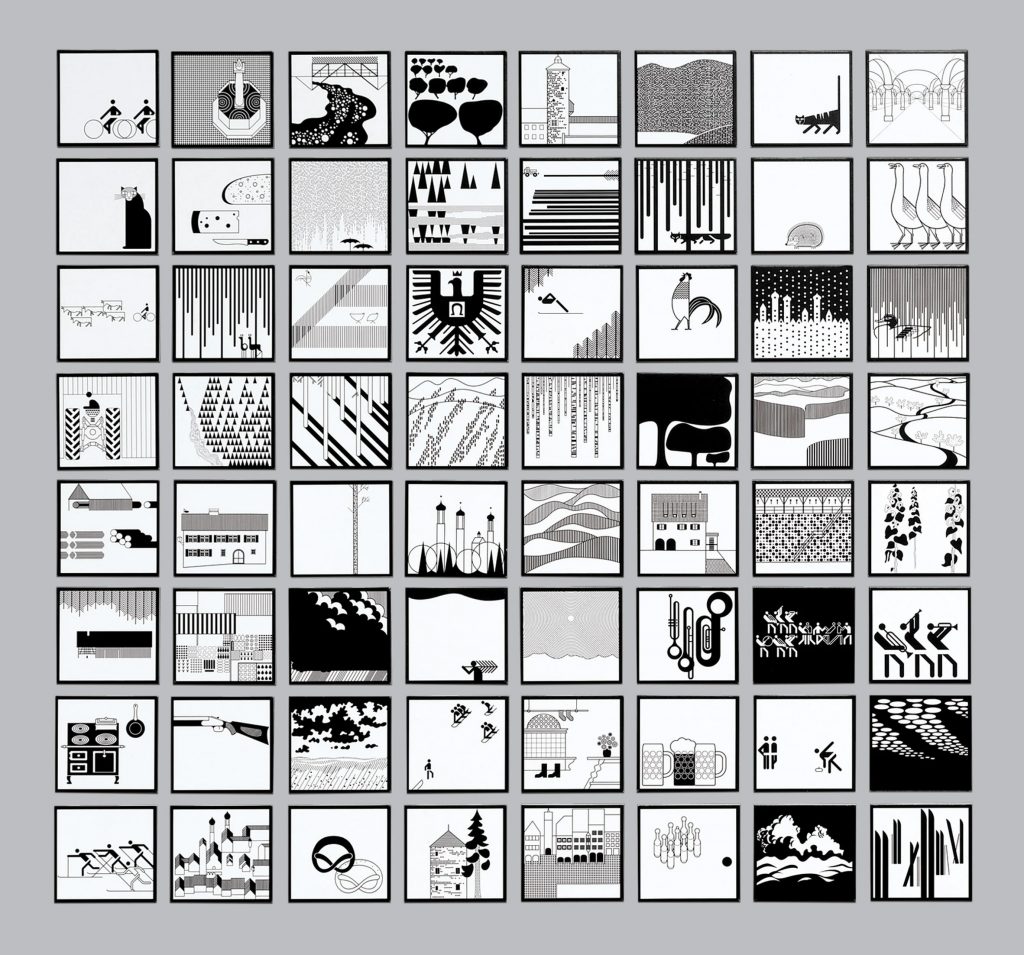
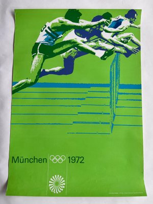
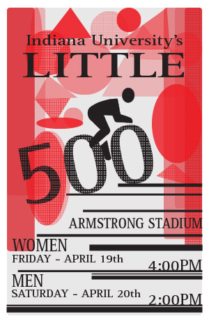
My influence was Otl Aicher, a German graphic designer. Aicher is best known for his graphics work for the Munich 1972 Olympics; however, he is also known for his corporate identity designs, including projects for companies such as Lufthansa and Braun. Throughout his career, Aicher’s design focused on creating designs that were both functional and aesthetic. Keeping a strong “Swiss Style” throughout his design work, he emphasizes clarity, simplicity, and readability through clean lines, bold colors, and an overall minimalist design. It was these identified elements that I tried to replicate throughout my poster design. I focused a lot on one of Aicher’s exhibition designs, which includes a wide range of black and white graphics. One of the first things I noticed throughout these designs was the repetitive geometric shapes and designs, as well as the bold black lines spaced across his work. Aicher seems to create a rhythm with geometric shapes that are seamless throughout his compositions and successfully paint an impactful scene. Even with the minimalism of what is included within his designs, Aicher’s work carries a powerful voice. Beyond this, Aicher also adds a lot of dots or lines to give texture to the shapes that he uses. I tried to copy these design choices through my simplistic geometric inclusion at the top of my poster, which created a frame around the cyclist as well as giving it some texture and the interesting quality of turning some into dotted lines. I also wanted to include the simple bold lines, like Aicher using them to frame as well as put emphasis on the event’s information.

Otl Aicher’s designs also tend to keep to a few simple but bold colors. As seen in his work with the Olympics, he focuses on a bold green color but then uses different shades and tones to create contrast and visual interest. I wanted to emulate this design choice throughout my work, but I also wanted to reflect the spirit of the Little 500 scene. I chose to restrict my color scheme to black and red because it copies Aicher’s design choice while also giving some symbolism to a race flag. In addition, the red color follows the university’s color choices, which adds to the theme of the event. Finally, looking at Aicher’s work, you will see a very simple type is used throughout all his graphics. I wanted to choose a sans-serif font that would remain simplistic and copy the heart of Aicher’s designs while also carrying weight and standing out from the geometric-shaped art behind it. Looking back at the project, I would say the biggest challenge I came across was finding the balance between copying the style of my influence’s designs while also remaining independent and creating my authentic work. It is easy to just copy element for element and apply it to the theme of the Little 500 event. However, it became more difficult to take apart Aicher’s design, understand the meaning and reason behind each of his design choices, and apply his style to my design work trying to stay unique and also remaining specific to the Little 500 event and Indiana University’s brand. This process required a deep dive into Aicher’s design principles and a lot of trial and error, as I had to completely scrap and redesign my poster at least three or four times to ensure that my final product was a true reflection of his style while still being original. It was a challenging but ultimately a rewarding experience that helped me grow as a designer.

