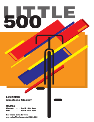
When crafting this poster, I started with a grid, Müller-Brockmann style, letting those lines be the invisible guides that shaped everything else. The typography came next, bold and sans-serif, laid out with the kind of clear, no-nonsense communication he championed. Then I played with geometry, stripping down bikes to their core, and basic shapes, and casting them in primary colors for a pop of energy and a nod to the Swiss penchant for simplicity. Layering those elements, I let the colors overlap and interact, adding depth and a sense of movement, hinting at the race’s excitement without any fussy details. It was all about balance, using space thoughtfully, creating focus, and keeping it crisp. In the end, the design emerged as a modern take on classic principles, as functional as it is eye-catching.
The influence of Josef Müller-Brockmann on this poster is unmistakable in its disciplined adherence to grid-based design and the asymmetrical balance that guides the viewer’s eye across the page. The bold, sans-serif typeface is a signature element of Müller-Brockmann’s work, emphasizing clarity of information and a timeless aesthetic that shuns the superfluous. In this design, typography is not merely a carrier of text but an integral part of the visual hierarchy, commanding attention and establishing the event’s identity with authority.
The graphic abstraction, reducing bicycles to their most basic geometric forms, showcases Müller-Brockmann’s influence in the way it communicates motion and dynamism without resorting to intricate illustrations. This reduction to essentials aligns with his belief in a universal graphic language. The color scheme—rooted in primary colors—projects a sense of playfulness while remaining true to the Swiss Style’s limited palette, ensuring that the design remains approachable yet sophisticated.