placeholder text woopy doopy doo i am reflecting
include works that inspired this
placeholder text woopy doopy doo i am reflecting
include works that inspired this
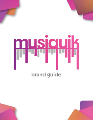
For this project, I knew I wanted to create a concept surrounding music. This industry is of great interest to me, and I have always considered getting involved in some studio oriented business. I wanted to create an entirely new company, and this became musiquik.
The name itself stemmed from an idea to have the letters come downwards like an audio visualizer. I mostly chose letters that had lines that could extend smoothly downward. I wanted to have a clean but also comfortable feel to the whole aesthetic, so I used a smooth gradient of warm colors to amplify that good vibe.
This typography was chosen for similar reasons, bringing across a modern yet classic, comfortable, fun and familiar feeling. It is slightly altered to fit the logo, and the ‘dripping’ letter M was used as another variation of the logo as a recognizable icon, once again symbolizing a sound visualizer. It even looks similar to some clefs used in sheet music. I wanted to make sure that the logo was recognizable, but also simple and effective.