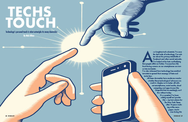
When I first read the personal story I knew that was the one that I wanted to choose. I had a lot of different versions of the same design that came to mind. I wanted to make sure that the image was conceptual enough but was easy to get the message of the article. I wanted to symbolize how technology helps keep people in touch with those that they would have a hard time doing without it. Color played a major role in my design, especially the blues. I wanted the phone and the hand coming in from the top to be the same color to represent that the hand was the technology. The spark-like glow in the center is there tp help show the power that the connection gives to the people that use it. How it is a positive thing like the article talked about. The hardest part for me was making the story fit and work well with the design. I had trouble trying to make the design work in the magazine spread-type design. I wanted there to be limited text on the first page because the main point is the conceptual illustration. For the second page of the spread I also had trouble thinking of how to fill the space. I ended up using the spark like shape on the side of the second spread to bring some of the images to the second page. I added the sidebar to add more and help connect the first two pages to the next two. Making sure that everything was easy to read was harder on the first pages since I wanted there to be fewer hyphenated words when using the text wrap. I think the sidebar on the second spread helped to make the whole spread come together as a whole. Overall, I think the project does a great job of showing the main point of the article.
J465
Design 2 | Fall 2023

