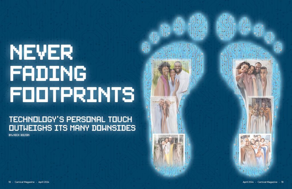
To start my creative process, I first picked the story that I could resonate with the most which was the personal one after reading it. In the article, the idea of a digital footprint was mentioned so I knew that I wanted my conceptual drawing to have something to do with a digital footprint. To make the print look digital, I used a circuit board type texture inside of the feet as well as made them pixelated. I also gave them an outer glow like a phone screen has. I finally chose the color blue to represent the “blue light” that comes off of our phone screens. Lastly, inside the feet are family photos that are melting away but, they persist on inside of the digital footprint. This goes with the theme of the story: being able to remember moments of people from their social media even after they are gone. I did most of the feet in Photoshop except for the texture and actual drawing of the feet which were done in Illustrator.
The font is also pixelated on the opening spread to match the pixelated feet. I also gave the text here an outer glow like the feet have. In the background I also used the same circuit board texture from the feet to give a little more depth to the spread and not just have it be a solid color.
The headline itself came from the fact that as it was told to me, people may not pick up immediately the digital footprint idea so I had to put it in the headline. “Never fading footprints” was chosen because people always tell us to be careful what we put online because it stays there forever hence, “never fading.”
Even though the article was more about the personal touch of social media, I chose to lean more into the digitalization of memories for my theme as can be seen in the opening spread. I continue this idea by making a very organized and almos computer like layout for the article. It is a three column page but, text only takes up two of the columns where a more literal image of social media takes up the two innermost columns and has the “screen glow” like the feet from the opening spread. I also use the same texture that is on the opening spread as well as inside the feet as a background for the page but I lowered the opacity so it wasn’t as hard to read the article. Coming from the central image, I made the same circuit like lines that are in the texture but I connected them to the words on the article to keep up with the digitalization theme. After the article was over, I put the social media by the numbers side bar to take up the remaining space. There was still a little bit of awkward white space after this so I put the feet from the opening spread along the bottom to fill it and make the design even more cohesive with the opening spread.
To finish off the design, I had it looked over and, at first, I had the headline in the middle of the page but, it was pointed out to me that people would not be able to read this in a real magazine so I moved it to the left and have what we see here now.

