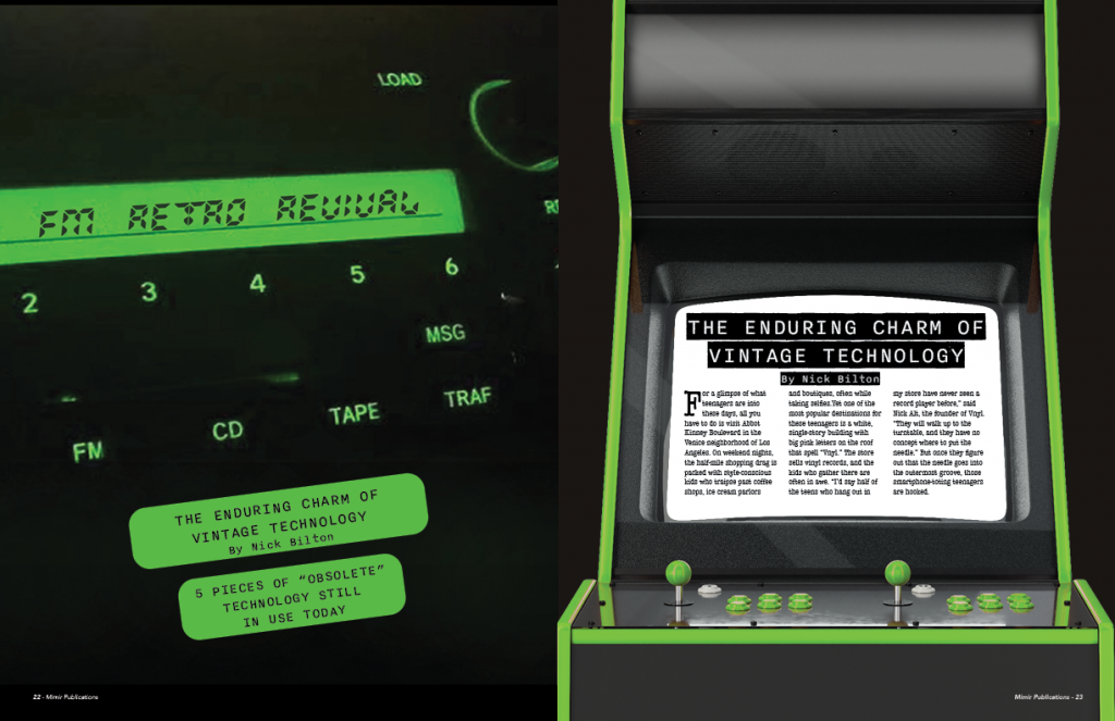
I have always enjoyed doing magazine projects. Although, I struggle in the beginning, I tend to find my stride and come up with some of my favorite designs. For this design, I wanted to make sure I stuck to a theme for the entirety of the spreads. I chose my theme to coincide with my story and everything is a reference to vintage technology. I originally had the main spread covering the entire front two pages, but I did not like the idea of someone opening a magazine and seeing 2 full pages as if they were a title page.
With this idea, I decided to reduce my title page to the left and to have a teaser story on the right. I was attempting to find ideas on how to format the idea on the right and so I decided to encase the story in an arcade machine. For the rest of my story I went with more of a minimal design with some artistic elements in difference spaces. I did not want to overload my 4 pages with a bunch of visual elements. I figured this would take away from the story itself so that is where I came up with the plain text element.

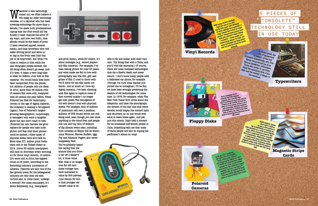
For the alternative story form / sidebar I decided to format the small story into the visual element itself. I wanted to take the “5 pieces of “obsolete” technology” and place them onto polaroids in some form or another. I ended up taking the design and covering it over an entire page because I did not want to compress the text further to where it was almost unreadable if I had it as just a sidebar. This creates a sidebar effect but in a proportion that is still legible to the reader.
This project was fun because I created/altered every graphic composition except for the NES and Walkman. It was fun to take elements of nostalgic tech and implement them into a story format. I think my title page could be done better to be more cohesive to the page next to it, but the deadline approached faster than I expected.
