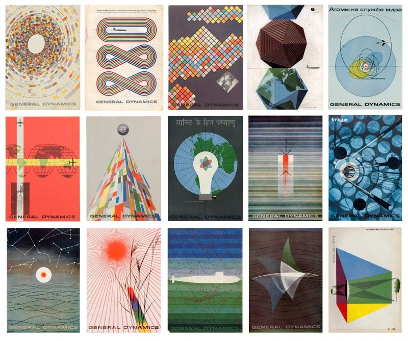
For my influence project, I chose the Swiss graphic designer Erik Nitsche as my influence. I chose Nitsche because I noticed multiple of his designs were in a book that got handed around in class, so I looked at his work online afterwards and really enjoyed his General Dynamics posters and thought they would be fun to use as inspiration for my own project. I felt like a lot of the themes within his work related to what we have been discussing in class, such as the Bauhaus style of design that utilizes many bright colors and geometric shapes. As seen in the thumbnail of Nitsche’s General Dynamics posters below, Nitsche uses these elements in his work along with many others.
Some other elements that commonly appeared in Nitsche’s work are similar background colors, being white, tan, pale blue, and beige as the most common. He also used many transparent shapes overlaid on designs/other shapes, as well as using many circles, ovals, and radial stripes. The color choices for his designs also held many common themes, with many posters from the General Dynamics group having either predominantly blue and green colors or red and orange and yellow. He did also enjoy including broad spectrums of colors, like the rainbow, on shapes in his designs.
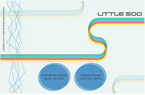
Within my own design, I felt drawn to the simplicity of Nitsche’s posters so I tried to accomplish that by only having the necessary text needed to convey the race’s information, smaller text, and non-dominating shapes in my composition. I also felt like I did a good job choosing color for my design based off what Nitsche’s design choices were within his own work, because I stuck to the blue/pale blue color scheme pretty tightly with my background and bike wheels, but also included a rainbow/adjacent pattern on the bike-body stripe pattern to bring some excitement to the poster. I also used asymmetrical balance which was common in Nitsche’s work, and included transparent versions of all my shapes. I also felt that the design composition as a whole, an abstract construction of a bike with two tires and then a curved line for the frame of the bike/its rider, was very Nitsche-esque because much of his work used abstract compositions to represent literal and specific ideas/themes.
Overall I really enjoyed this project, and my favorite part was getting to research my influence designer and find themes within his work. Because his designs aren’t as compositionally complicated as some other designer’s works are, it inspired me to think that maybe I can create work like this someday once I develop my own personal design style.