Conceptual Illustration Poster

click here to view pdf

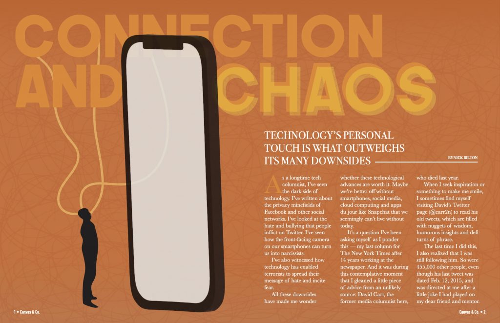
For my conceptual illustration poster, I decided to represent the story of how personal technology shapes our lives, often resulting in both beneficial and damaging influences in our lives. Therefore, for the main headline of this article, I decided to use the phrase “Connection and Chaos”. I felt that this title expressed how our mobile devices, while connecting us to the world, also have the power to overwhelm and consume us.

In terms of design choices, I first chose the orange color scheme to symbolize a balance between the red hue of frustration and the yellow hue of contentment. My goal was to connect this orange color to the state many of us find ourselves in when it comes to our relationships with our phones. Furthermore, the main imagery of my design depicts a small human figure gazing up at a large phone. I represented the imagery in this way to emphasize how our lives can become engulfed by our devices, symbolizing their overpowering presence.

In terms of typography, this played a crucial role in conveying the message I was trying to express. I utilized a blurred version of chaos in the text to emphasize something that is unstable, as well as a more stable font with connecting lines for the word connection. Overall, my choice for this was to reiterate the coexistence of these two forces felt when it comes to our personal technology.

In addition, for the sidebar, I used text message bubbles to add a unique element to the layout while also reiterating the theme. The separation of the sidebar from the main text, in my opinion, helped create a good visual distinction.

Overall, I am pleased with my execution of this project. I believe that I conveyed the message of the story in a minimalistic way, allowing the readers to grasp the main idea without being too overwhelmed. With my consideration of the color, typography, and layout, I believe that I achieved my goal of creating a visually engaging spread for readers. This was one of my favorite projects that we have done so far.

Armin Hofmann Influence Poster – Regan Mathies

Click this image to view PDF

For the influence poster project, I used Armin Hofmann as inspiration for my Little 500 advertisement. Hofmann’s design style encompasses a unique blend of photographic simplicity and typography. More specifically, Hofmann’s designs capture grainy photos that emphasize the ability of visual resolutions and how they can affect the design’s overall appearance. His design style aims to create complex compositions yet allow them to be simplistic and abstract simultaneously. Furthermore, Hofmann was a significant influence on the design style referred to as the “Swiss Style”. His goal was to use his abilities to represent underlying messages of social and cultural issues, along with their values. Overall, I found his work very inspiring and unique for the direction I wanted to take my poster. His design style allowed me to create a Little 500 advertisement that was dramatic and minimalistic at the same time, which I believe helped me achieve the intended feel. 

The direction of my overall design concept was driven by Hofmann’s iconic black-and-white palette and his embrace of low visual resolution to evoke a sense of dramatics. For starters, I used the Adobe Illustrator program to craft a minimalist depiction of a cyclist, intending to create a balance between simplicity and visual interest. I integrated this illustration into my project by using Photoshop modifications. Tools such as motion blur, graphic pen textures, line halftones, and levels allowed me to achieve this intended look. To ensure there was seamless integration with the poster’s black background, I used a mask layer to blend the sharp edges of the cyclist, achieving a cohesive composition. 

Following this, I found a font style that is reminiscent of the bold, minimalist typography that Hofmann integrates into a variety of his designs. More specifically, Hofmann’s typographic choices resign in the sans serif genre, with larger width and lack of intricate details. Furthermore, his typography reflects the manipulation of spacing and line heights for added detail and impact. To adapt to this design style for my design, I noticed that I had a large amount of space towards the lower section of the poster. Due to this, I opted to place the primary text within this region. Additionally, I decided to vertically orient the “500”, which mirrors Hofmann’s unconventional approach to text placement. I also manipulated the text “little” in Adobe Illustrator to manually experiment with kerning and aligned the primary text closely to the margins, both to reflect his attention to typographic spacing. Lastly, I decided to create visual contrast in the typography by using various opacity levels, enhancing the type’s visual emphasis. 

Regarding the layout of the secondary information in my design, I strategically grouped related information for coherence. By using varying opacities within the text, I prioritized emphasis on the headers with the following information being of less visual emphasis. Ultimately, I positioned this information in the top left corner of my design to utilize the black background for effortless readability.

Overall, I feel like my poster demonstrates a solid effort to embody Hofmann’s design style: however, I want to also acknowledge that I feel it does not showcase my design skills to my full potential.  Despite being aware of my decision decisions and why I wanted to make them, I was not entirely pleased with my overall execution. With this being said, I was able to challenge myself by stepping out of my comfort zone and approaching this project with a different perspective of design. The project as a whole emphasized the importance of adapting to the preferences and styles of clients rather than personal aesthetics; therefore, while this project may not have met my expectations, I have learned its importance which will help me in my future in the field of graphic design. 

Armin Hofmann’s Designs :