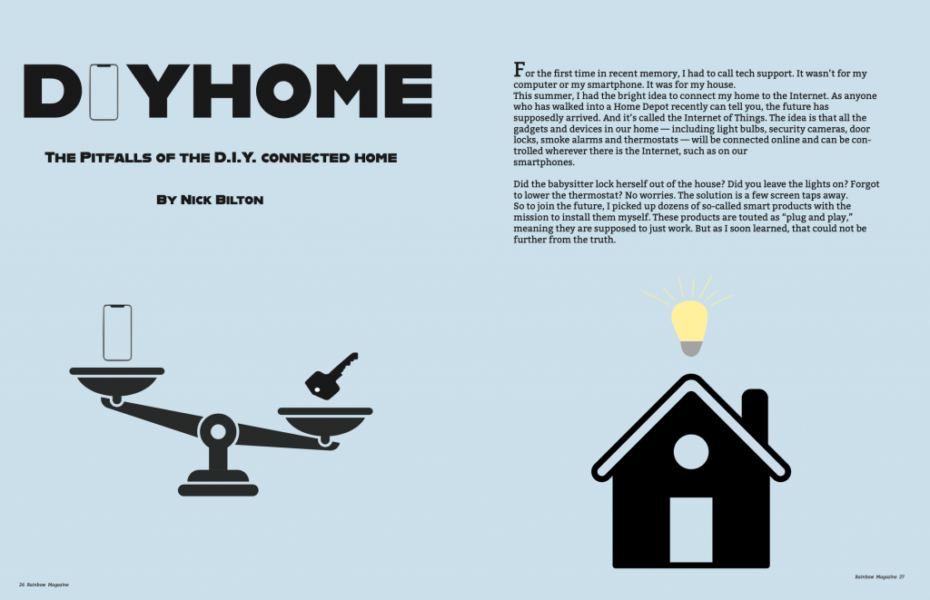
For this project, I chose the story about smart houses. I have always been curious about smart houses and if they are really worth it, so this article stuck out to me. After reading through this article and hearing about this persons debate about the pros and cons of a smart home, I was inspired. I instantly knew I wanted to do a scale showing the traditional key and the “smart key” of a phone. I wanted to show the weight of the two. Taking the term “smart home,” I wanted to show a home with a light bulb because the image of a light bulb means smart and sparks an idea. The font choice I went with reminds me of the fonts they use on HGTV. That was the first thing I thought about because they have done shows that have dealt with smart homes. I think the big, bold font is the type of font used to describe DIYs. I wanted to put an iPhone instead of the “i” to show that this is an article about technology and houses. I went with blue because I wanted a light color to contrast with the black colors. I wanted this to look simple, so I went with simple black outlines of all the artwork. One of the biggest challenges, was just getting started, which always is a problem for me. Getting in the mindset to create an idea is always difficult. Overall, I enjoyed this project. I enjoyed taking a story and turning it into a magazine spread. I think my skills have improved since I did the magazine project in graphic design 1. I am pleased with the way this turned out. I believe I executed the simplistic magazine spread pretty well. There are some ways I can improve. I think I could’ve taken the design a little farther but I am happy with the overall design.