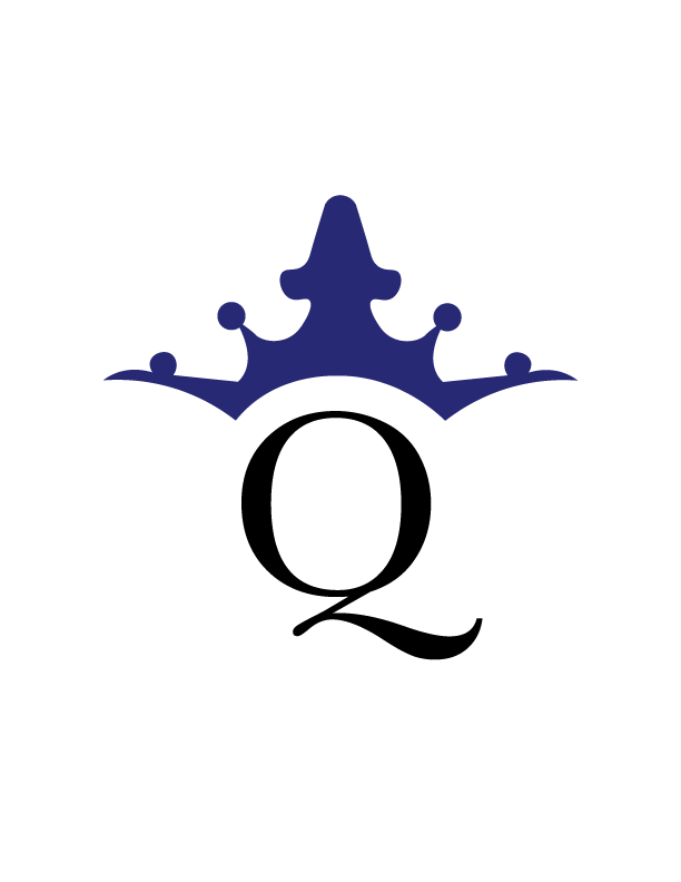
For my logo, I wanted to make something that was simple and clean. I looked at lots of large publishing companies and their designs for their brand. While researching I found that most of the large publishing companies that are clean, modern, and sophisticated, so that is what I wanted to portray. I knew that I wanted to do something with the name “crown” or “queen”, but with further inspection I realized that crown publishing group already existed so Crown Publishing Group it was. I struggled at first with the crown and illustrating it myself. But once I figured it out, I just tweaked parts of it so that it was perfect. I also struggled with the coloring of the logo. I wanted to give off a feel of sophistication without making it cheesy. I first tried the colors purple and gold to see what it looked like and I was not a fan. So I researched sophisticated and luxurious colors as well as colors that are royal. Once I figured out the colors that I like and looked good together everything fell in place. Overall, I really liked the way the way my logo came out as. I think that it could actually be used for a real publishing brand.